#SWDchallenge: where are your eyes drawn?
Knaflic, Cole. Storytelling With Data: Let’s Practice! Wiley, © 2019; Illustrations by Catherine Madden
Have you ever wondered whether the graph or the slide you created is any good? Was the time you spent choosing colors, deleting gridlines, and wordsmithing slide titles, worth it, or for naught? While the answer is certainly more nuanced than a simple yes or no, there is a quick way to gain some insight into this: the where are your eyes drawn? test, also known as WAYED. It’s a simple question, but it can help to refine your own creations, and provides a construct for giving feedback to others.
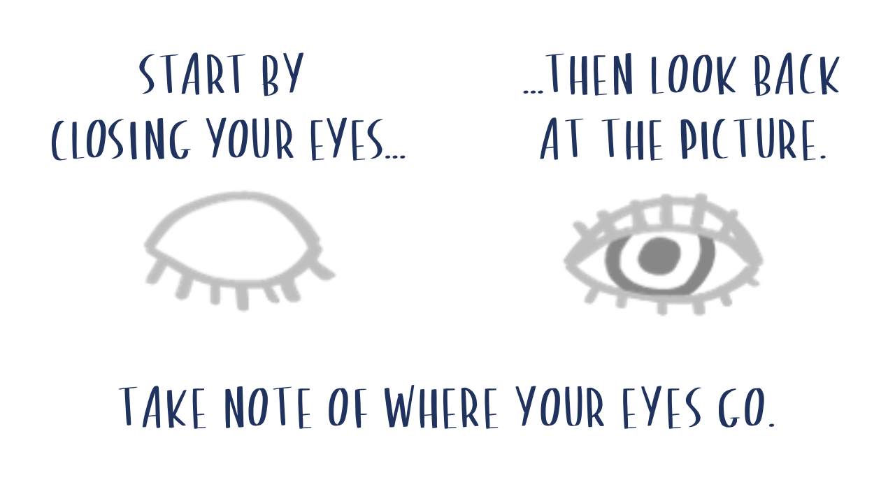
The test itself is simple. You look away from your content—a graph, a slide, a document, an email, etc.—and glance back, taking note of a couple critical pieces of information.
Where are your eyes drawn first? Is there a clear focal point? Does that focal point make sense for your message? If the answer is no, it's an indication that you need to make some formatting and design changes.
Where are your eyes drawn next? You want to create a clear visual hierarchy for your audience—not incorporate so much visual tension that your eyes are playing a ping-pong match on the page. Did you instead find that many things were competing for your attention, making it hard for your eyes to settle down? Or did you find that as you scanned, you missed information off to the side, in the corner, at the bottom? If this is unintentional, consider what steps you might take to improve the visual flow.
Let's look at a couple of examples to see this test in action.
Notice how there is a clear focal point, the stop sign. That’s because the sign is centrally located and large relative to the other elements. It’s the only thing with color (bright red, I might add). The stop sign has capitalized, attention-grabbing text. There is a white border that separates it from the background. The windows and stairs in the background further direct attention back to the middle. I should also point out that this stop sign is important if you drive—you are conditioned to look for it!
Many design techniques that work to create a clear focal point in the image above also apply to data communications. For example, check out the below graph from Exercise 4.3 in Let’s Practice!
Doing the WAYED test yields clear results. We are focusing on the referral series because the designer took deliberate steps to encourage us to do so (words, color, boldfacing, data markers, annotations, line thickness). They even visually tied all of the related elements regarding the referral series to provide a clear hierarchy. There is no mistaking the purpose of this visual.
Now it’s your turn to use this test as a guide for a makeover—ultimately sharpening your critical eye for effective data communications. Where are your eyes drawn…?
The challenge
This month, we invite you to employ the where are your eyes drawn? test (WAYED). Identify some content that could benefit from a redesign—a graph, a picture, a slide, a dashboard, an email, etc.—and use the WAYED test to assess the effectiveness of it. Then remake it so that there is a clear focal point and visual hierarchy. You should be confident that if someone else applied the WAYED test to your revised visual, they would see the key information immediately, and understand the overall message with ease.
Submit the “before” and the “after” versions of your makeover to the storytelling with data community, and outline the results of your WAYED test in the commentary, by 4PM PT on December 31, 2022.
Resources
Here are some additional examples for inspiration. This is a starting point, but certainly not a comprehensive list (if there are other great examples you’d like to share, feel free to include links in your submission commentary).


