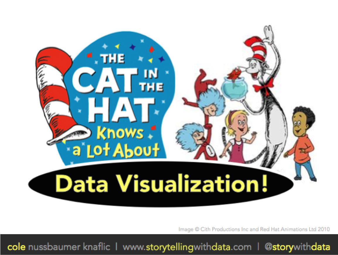
the cat in the hat knows a lot about data visualization
Check out this video of my recent Stanford MBA guest-lecture, where I discuss the importance of being sparing and intentional in your use of color and putting your thoughts into words when communicating visually with data.
"animation" with power point
In this post, I discuss leveraging animation in PowerPoint to build the story you want to tell and show what it can look like live in a video with narration.


