what is a Gantt chart?
This article is part of our back-to-basics blog series called what is…?, where we’ll break down some common topics and questions posed to us. We’ve covered much of the content in previous posts, so this series allows us to bring together many disparate resources, creating a single source for your learning. We believe it’s important to take an occasional pulse on foundational knowledge, regardless of where you are in your learning journey. The success of many visualizations is dependent on a solid understanding of basic concepts. So whether you’re learning this for the first time, reading to reinforce core principles, or looking for resources to share with others—like our new comprehensive chart guide—please join us as we revisit and embrace the basics.
What is a Gantt chart?
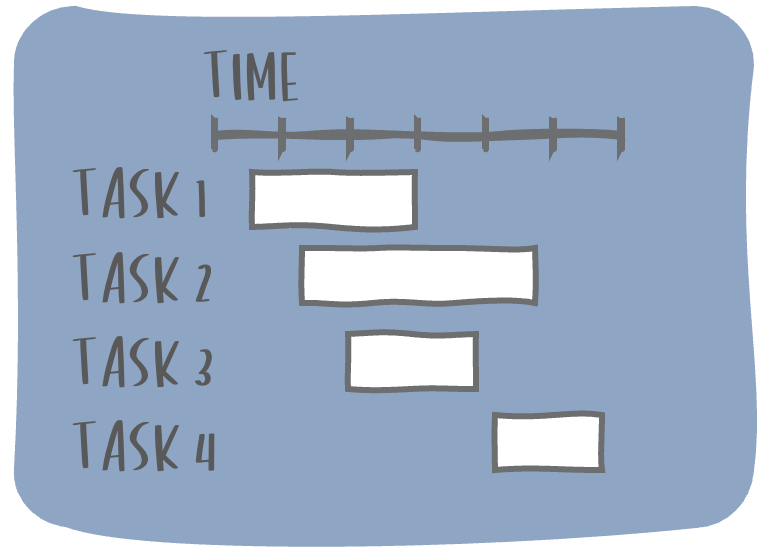
A Gantt chart is used to visually present tasks or events over time. It consists of a horizontal axis of time and horizontal bars representing the duration of each item arranged along the vertical axis.
The visual was popularized in the early 1900s by American engineer and management consultant Henry Gantt, for whom the chart is named. Most commonly, this view is used to see the start date and duration of each task in a larger project to better understand timelines, milestones, and dependencies.
How to read a Gantt chart
To interpret a Gantt chart effectively, start by identifying the time scale along the horizontal axis. Then, scan down the task list on the vertical axis. Observe the length and position of each bar to understand the duration and timing of each activity. Tasks are typically arranged vertically from top to bottom, reflecting their chronological start dates to visually represent project sequence and progression.
Any dependent tasks are usually connected by vertical lines, illustrating how one task's completion directly impacts the start or progression of subsequent tasks to help identify relationships and potential bottlenecks within a project's workflow. In the example above, Test A requires the completion of Task 2.
Take note of any milestones or key dates—usually represented by a shape like a circle or a diamond. In the example above, the go-live date is January 30 and there is a vertical dashed line to indicate the current date for reference.
When could you use a Gantt chart?
Gantt charts are particularly useful during the project planning phase, as the detailed visual schedules help managers identify when or where there might be bottlenecks or a need for additional resources. Project managers and teams often refer to Gantt diagrams throughout the project lifecycle to monitor and control progress and assess risks.
Gantt-style charts can be used for more than just project scheduling. The combination Gantt and line chart below was used to show how the evolution of an eLearning system affected employee satisfaction over time. The Gantt elements denoted the timing of certain events (when a survey was deployed when a tagging initiative began, and when courses were split), while the line chart revealed the concurrent positive impact these events had on employee sentiment.
SOURCE: https://community.storytellingwithdata.com/members/alex-velez/gallery/5101035f-d3df-431e-bcdb-ddda87f83c6b/images
Although commonly shown horizontally, a Gantt chart can also be flipped vertically. In the example below, SWD Community member Chris Smith used a vertical Gantt-style visual resume to show their professional experience over time. Since, in the Western world, time is most naturally read moving from left to right, take care when switching the orientation, as it can feel uncomfortable or require a bit of mental gymnastics to understand.
SOURCE: https://community.storytellingwithdata.com/challenges/aug-2021/inspired-by-coles-book-acknowledgement-section
Limitations of Gantt charts
However useful Gantt charts are in theory, there are drawbacks to relying on them in practice. They can become complex and cluttered for very large projects, may require frequent updates in fast-paced environments, and don't always capture the full complexity of task relationships. Creating and maintaining Gantt charts manually can be challenging and time-consuming.
While project teams often use Gantt charts, not everyone understands how to interpret them accurately or quickly. Consider your audience's background and potential learning curve when selecting this visualization. Choosing a different display altogether may avoid confusion for audiences who do not know this graph or how to interpret the information it depicts.
To make a Gantt chart more accessible and engaging in a presentation, use animation to build the chart gradually. First, walk your audience through the structure to explain the timeline and tasks, then layer on each horizontal bar in a meaningful way to communicatey our message. By breaking down the Gantt chart's complexity and guiding your audience through its components, you'll help them understand the project timeline more effectively.
Tools for creating Gantt charts
Some graphing applications, like Excel or Tableau, have built-in templates to help you create a Gantt chart. If your tool of choice lacks this capability, you can still build one using a combination of a horizontal bar chart to show the task duration and a dot plot to depict milestones.
There are also software packages that focus specifically on task or project management. Tools like Microsoft Project, Asana, Trello, and Smartsheet not only have Gantt templates built in but also offer additional features like collaboration and automated updates, making it easier to create and maintain accurate charts throughout the project lifecycle.
Best practices for designing a Gantt chart
To create effective Gantt charts, consider the following design tips:
Choose an appropriate time scale (days, weeks, months) based on the duration. Keep in mind that providing too granular of a view could overcomplicate the visual.
Limit your color palette to reduce visual complexity. Use color strategically to focus on specific aspects, like the critical path or milestones at risk.
Add meaningful context, like key milestones and a current date reference line, to enhance the chart's utility.
Simplify the view by removing extraneous elements, like borders and gridlines, to make it easier to consume.
Final thoughts
In summary, Gantt charts are invaluable tools for visualizing project tasks across a timeline. However, before using them to communicate your project’s progress, assess your audience's familiarity with this chart type and the specific insights you wish to convey to ensure the visual fits the purpose.
To further enhance your understanding of various graph types, we invite you to explore the rest of our “What Is...?” chart series. Explore our comprehensive chart guide page for additional views, like bars and lines.
Do you want to learn to create and communicate a powerful data story? Join our upcoming 8-week online course: plan, create, and deliver your data story. Data storytellers Amy and Simon will guide you through the world of storytelling with data, teaching a repeatable process to plan in helpful ways (articulating a clear message and distilling critical content to support it), create effective materials (graphs, slides, and presentations), and communicate it all in a way that gets your audience’s attention, builds your credibility, and drives action. Learn more and register today.


