telling multiple stories (part 1)
I often emphasize the importance of identifying the single most important story you want to tell and crafting a visual to support this. But how should you approach the visualization challenge when there are multiple stories you want to tell with the same data? Check out this post for a strategy.
lessons from GMN
This post recaps my recent presentation at the annual Grant Mangers Network Conference and shows a makeover of one of the visuals we discussed in the hands-on workshop.
grables and taphs
In this post, I look at a solution for embedding a graph within a table in an effort to help the audience more easily visualize the tabular data.
death to pie charts
I hate pie charts. I mean, really hate them. In this post, I discuss why and show an illustrative makeover.
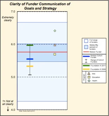
CEP chart redesign
In this post, I show and discuss several makeovers of the Center for Effective Philanthropy's comparative data.
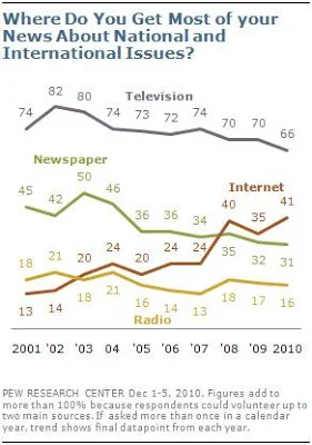
FlowingData challenge
My makeover of a Pew Research Center graph in response to a recent FlowingData visualization challenge.
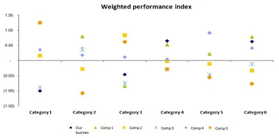
from points to poignant
I love a good makeover challenge. I received the following graph in response to my call for visuals ahead of my visit to a Midwest retailer last month to run a session on data visualization. Check out this post for my thought process when it comes to visualizing this data and my resulting redesign.
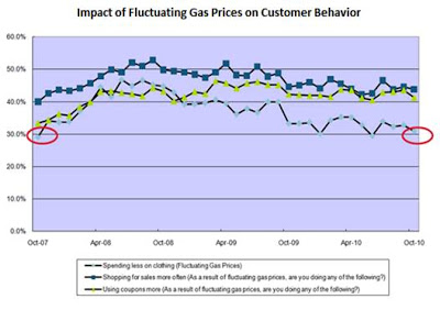
a new year's resolution: declutter your graphics
It never ceases to amaze me how relatively minor changes can take a visual from a mess of data to a clear message that pops. In this post, I'll walk you through one such transformation.


