color considerations with a dark background
When it comes to slides that communicate data, I don't typically recommend anything other than a white background. That said, sometimes there are considerations outside of the ideal scenario for communicating with data. Check out this post to see what I did to visualize data on a dark background.
more Americans are tying the knot
The Pew Research Center reports on some fascinating data. But I tend to be underwhelmed with the way they illustrate this data visually. In many cases, some relatively minor modifications would transform the graphs from "not horrible" to great. Check out this post for an example.
multifaceted data and story
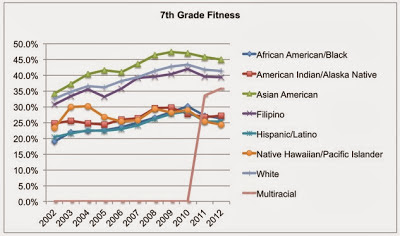
This is a rich dataset on 7th graders meeting fitness standards by race over time from kidsdata.org in terms of the number of facets one could focus on and the number of stories one could use it to illustrate. In this post, I look at some of these stories and how to make them visually clear.
logic in order
There should be logic in the order of your data. While I would say this recommendation is universally true, I'll focus in this post on a very specific example to illustrate the concept: leveraging order for categorical data in a horizontal bar chart.
I like [candy] bars better than donuts
See my makeovers for Naomi Robbins' Forbes blog 2012 makeover challenge. This post features two remakes, the first a pair of donuts and the second a big table of data.
to stack or not to stack
This post features a couple remakes of a graph shown in the Wall Street Journal summarizing a recent Forrester report that concluded Microsoft is late to the market expansion into mobile and has lost its dominant position.
my penchant for horizontal bar graphs
I have a penchant for horizontal bar graphs. Check out this post for discussion on why and a remake illustrating the use case for horizontal bar graphs.
evaluating word clouds
Word clouds created a bit of buzz when they first became popular. However, I often find that upon further evaluation they tend to be a letdown—full of fluff without so much informative value. Check out this post for my discussion on why and a word cloud makeover.
drawing attention with data labels
While it's easy to put your data into a chart and feel like you're done, this is a disservice to both your mission and your data. Here, I focus on an example from a recent workshop and discuss teasing the story out of the data, using data labels to help draw our audience's attention to where we want it.


![I like [candy] bars better than donuts](https://images.squarespace-cdn.com/content/v1/55b6a6dce4b089e11621d3ed/1438217933465-DI67KK4MEEW0YKAMMFUR/image-asset.jpeg)


