the power of categorization
I am writing this post on the heels of a lovely albeit short European trip. It was part work, part play. In our spare time, my husband and I ventured out to one of our favorite restaurants. As I was perusing the wine list, I was reminded of the importance of categorization (yes, apparently my data-brain is on even at dinnertime). In this post, we'll take a quick look at how categories help us make sense of things: both in life and in data visualization.
the biggest bang for your buck
You've likely heard of the 80-20 rule. Basically, in business it's the idea that you can put in 20% of the effort and get 80% of the result (and avoid the remaining 80% of work that only yields an additional 20% of result). I was posed the question: "how can we apply the 80-20 rule to what we've learned today?" In other words, out of all of the meaty content we've covered, where should you start when it comes to having the greatest impact? Or, as I'll paraphrase it - where should you focus your energy to get the biggest bang for your data visualization buck? In this post, I'll discuss two easy things you can start doing today to have greater impact when it comes to communicating with data.
annotate with text
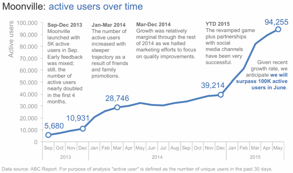
When it comes to storytelling with data, one very important component of stories is words. There are some words that absolutely have to be there: every graph needs a title and every axis needs a title. Label directly so your audience doesn't question what they are looking at. In this post, we'll consider the important role of words when it comes to communicating effectively with data.
consult for context
Often, when you are putting together a communication, it is at the request of someone else: a client, a stakeholder, or a manager. Sometimes, the person requesting the work has things in their head that are important to understand that they may not think to say out loud. In this post, we discuss some questions you can leverage in this situation. Being clear on the context up front can drastically reduce iterations down the road.
show the full picture!
I've posted a number of times about Pew Research articles. Well, not the articles exactly, but rather the visuals they contain. To be honest, it's rare that I read the actual article. I scan the headlines as they hit my inbox and if something piques my interest, I follow the link and scroll through the article, not reading, but taking a discerning look at the graphs. Check out this post for makeovers of two Pew Research graphs on the topic of women bosses.
lead with story
When asked to write a guest blog post for this month's focus on storytelling on the Tableau Public Blog, I spent some time reflecting: if I had just a single lesson to share, what's the #1 piece of advice I'd give in this space? I'd boil it down to three simple words: lead with story. The following is the guest post I authored.
leverage animation: what you present vs. what you circulate
A common challenge in storytelling with data is the following conundrum. When presenting content live, you want to be able to walk your audience through the story, focusing on just the relevant part of the visual. However, the version that gets circulated to your audience - as pre-read or takeaway, or for those who weren't able to attend the meeting - needs to be able to stand on its own without you, the presenter, there to walk the audience through it. In this post, we examine a strategy for dealing with this challenge.
HelpMeViz
We've all created a graph before and thought: Does this work? My advice when this situation arises is to seek feedback. Jon Schwabish has brought this critical feedback loop online, with his recently launched site, HelpMeViz, which was designed to "facilitate discussion, debate, and collaboration from the data visualization community." Check out this post for more info on this resource.


