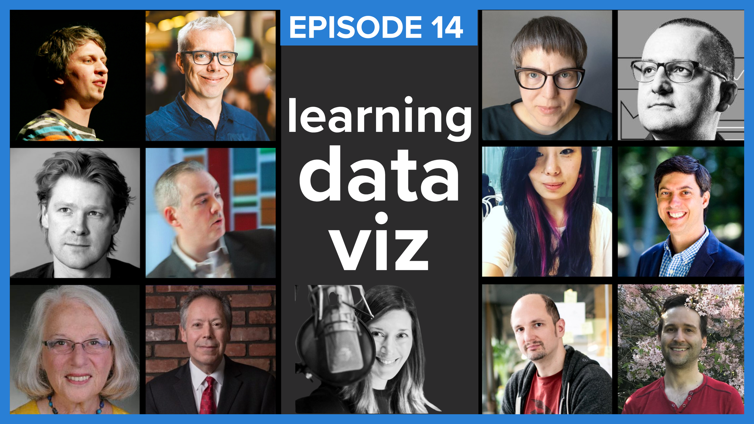
EPISODE 14
learning data visualization
How did you learn to visualize data? Professionals in this space hail from a wide variety of backgrounds and in this episode, you’ll hear a dozen responses to this question, from artists, mathematicians and more. Listen to these industry leaders’ captivating stories and anecdotes—while learning lessons that you can apply to hone your own data visualization skills.
FEATURED IN THIS EPISODE:
Moritz Stefaner: @moritz_stefaner | truth-and-beauty.net
Andy Cotgreave: @acotgreave | gravyanecdote.com
Jen Christiansen: @ChristiansenJen | jenchristiansen.com
Alberto Cairo: @albertocairo | albertocairo.com
RJ Andrews: @infowetrust | infowetrust.com
Jeffrey Shaffer: @HighVizAbility | dataplusscience.com
Jon Schwabish: @jschwabish | policyviz.com
Naomi B. Robbins: @nbrgraphs | nbr-graphs.com
Steve Wexler: @VizBizWiz | datarevelations.com
Robert Kosara: @eagereyes | eagereyes.org
Elijah Meeks: @Elijah_Meeks | elijahmeeks.com
WE’D LOVE TO HEAR FROM YOU
Did you enjoy this episode? Do you have ideas for future episode guests or topics? Let us know!
Listen to the SWD podcast on your favorite platform
Subscribe in your favorite podcast platform to never miss an episode.
Like what you hear? Please rate & review. Thanks for listening!


TIMESTAMPS
0:00:32 | Intro
0:01:42 | Moritz Stefaner
0:11:22 | Andy Cotgreave
0:21:16 | Jen Christiansen
0:25:40 | Alberto Cairo
0:36:16 | RJ Andrews
0:43:37 | Jeffrey Shaffer
0:54:42 | Shirley Wu
1:03:48 | Jon Schwabish
1:09:47 | Naomi Robbins
1:15:19 | Steve Wexler
1:24:26 | Robert Kosara
1:31:34 | Elijah Meeks
1:39:15 | Summary
1:40:26 | Updates
TRANSCRIPT
Welcome to storytelling with data the podcast where listeners around the world learn to be better storytellers and presenters with bestselling author, speaker, and workshop guru Cole Nussbaumer Knaflic we’ll cover a wide range of topics that will help you effectively show and tell your data stories so get ready to separate yourself from the mess of 3D exploding pie charts and deliver knockout presentations and with that here’s Cole.
0:00:32 | Intro
Hi this is Cole! I am extremely excited to bring today’s episode to you. The question is frequently posed to me: how do you learn to visualize data? I’d been thinking for a while that this would make a good topic for the podcast, but as I started sketching out my thoughts, realized that I have merely one perspective to share, so instead of me talking about this—you hear enough from me—I decided to invite some friends and colleagues from the data viz world to share their stories and tips. I posed a few questions, but invited people to go off script, simply asking that they share what they think would be interesting and helpful when it comes to their respective paths for learning to visualize data.
Data visualization hasn’t been around as it’s own field for very long when we consider the grand scheme of things. So one of the cool things about this space is that the people who’ve been doing it for a while hail from from diverse fields with very different backgrounds. Today, you’ll hear from twelve of my peers—some are names you’ll recognize and I hope to introduce you to some new people as well. You’ll hear from engineers, artists, journalists, musicians, a mathematician and an economist. What they share is a passion for visualizing data.
With that, I’m going to turn it over to my first guest.
0:01:42 | Moritz Stefaner
His may be a familiar voice if you’re a listener of the Data Stories podcast, which he co-hosts. Moritz Stefaner. Moritz is an independent designer of data visualizations, based in Germany, his work has won multiple Information is Beautiful Awards and he has some fantastic tips to share with us today. Let’s have a listen to Moritz!
Hi, Cole. Thanks so much for inviting me to share a few thoughts on your podcast.
My name is Moritz Stefaner. I'm an independent designer of data visualization. Under truth-and-beauty.net, you will find all the work I've been doing over the last 10, 15 years, because that's actually how long I've been doing data visualization already.
So, you know, to think about how I got started, I actually have to think back quite a bit. And for me, there was, I don't think, such a clearcut point where there was a clear before and after, but I've sort of eased into that topic. I sort of have a diverse background to right after school, I first applied for art schools because I was interested in doing something creative with media and so on, but they wouldn't accept me. So I then did, for one year, a multimedia producer course and worked in a few web agencies mostly doing flash websites around the turn of the last century, and built a few online games and just played with technology and tried to do cool stuff there.
And then when the first dot com bubble burst, around 2003, I decided to go back to university to study cognitive science, because I was really interested in how the mind works and how the brain works and also how we can really use the internet and digital media to enhance our knowledge and, you know, augment cognition as is the goal of every data visualization designer. And so I was really, really, excited by this field of study, and so I looked a lot into linguistics, psychology, philosophy of mind as well, but also neuroscience and neurobiology and so on.
These were a few really inspiring years for me, and I thought a lot about how the mind works, how language works, and we did crazy things. So we built a belt, for instance, that would, sort of like a haptic compass. It was called field space and there was, you have vibrations around your waist that would also point north. And we gave it to people to wear for six weeks just to see how that sort of affected their sense of navigation. And the idea was can they develop a new sense of direction. You know, could this be this technology enhanced sense on the same level of seeing or hearing at some point. Super fascinating.
In a way, you know, a way into physical ambient, you know, data visualization, if you will. And so, yeah, so I did this during my time with the B.Sc. And there was an Osnabrück at the University, and in my bachelor's thesis, I looked at how we can get an overview of large collections of text documents, technical documentation in that case, and so I learned a lot about dimensionality reduction and statistics and text analysis. Then I thought oh, we could make maps of these huge information spaces. So I got into cartography, right. And then I discovered Edward Tufte's books, as so many of us have, and sort of got really fascinated by this old craft of, okay, information design. I think this was ultimately then when I decided that -- I was always interested in the display of information, but then I thought, oh, that's actually the perfect field for me given the background of user interface design and my new knowledge about knowledge representation and data analysis. And so I think this was probably the one point where I was like, oh, yeah, this is something that could really work for me ultimately.
I then went to Potsdam, University of Potsdam, University of Applied Sciences, to study with Boris Müller, whose work I knew. I applied there and entered a masters in interface design. So bachelor of science, master of arts. Then, after working a few years on a research project related to e-learning contents for architectural students and, yeah, we did cool stuff there as well in Potsdam. And it was sort of halfway on the way to a PhD, but also on the side, during my studies, I would always do freelance works just to finance my life and my studies. So at some point I knew I had to decide. I had really good freelance jobs at the time, so I was, like, I'll do this PhD later or not at all. Turned out not at all, that is what happened, and went full freelance around 2007, I would say.
Yeah. Since then, I've been doing all kinds of projects, been helping and working with a lot of different people, large organizations, companies, small teams. Did very quick projects, matter of days, some took months and had, like, big teams. Yeah, it's still a fascinating field for me. I think data visualization is so—it sounds like a niche to outsiders, but once you're in it, you see how many different approaches there are, how much different things you can do. For me, it doesn't stop to be interesting. It's kind of fascinating, really, how such a niche field can remain so fascinating. It's because it keeps developing and moving. I think the key thing, really, also is to always question your own practices and learn new approaches, learn new tools maybe, new programming language, just keep going and keep exploring.
So also in terms of practical tips, how to get started, yeah, I have a few tips. So the first one is really when you come up with a new data visualization, really be open to what the data can tell you. Let the dataset change your mindset, as Hans Rosling says. So don't come in with a preconceived notion of this is how I would like to have the data look, but really listen to what the data has to say and find the perfect form of expression for that data set, of course, given your objectives and your personal perspective that you should bring in, but also be open to listening to, yeah, what—or be open to being just a medium for the data itself and don't use it just as a vehicle, basically. And so I think that's a very important feedback loop at the beginning of a project.
The other important feedback loop is after you put out a visualization, make sure you understand how it's being received, how it's being used, how people respond to it. So often we just put out something and send the invoice and send out the tweet and next project or holidays or whatever. But make sure to check back or have a way also to find out if the thing you have designed works the way you think or if you find it didn't work as well or it was used in a different way than you thought it would be used. You know, there's all kinds of interesting things that can happen once we put out these things into the world.
The third tip, I think, is have interests outside of data and data visualization and, you know, all this technical computer world, and think about maybe how your hobbies or how your other interests or your cultural activities, you know, how they can maybe improve your data visualization work. So I really try to go to a lot of museums. I keep bees. I live on countryside, so I try to get a lot of inspiration from outside, you know, this very narrow niche of data and data visualization, and really think about, yeah, what are like totally alternative ways of experiencing something and how could that inform again my much more mundane, maybe, data visualization practice, right? And I think that's really, really important. And this can sort of also define your unique style, is what external inferences you can bring in.
The other thing that can make your style unique are your own deficiencies. So anything that you know you cannot do as well, don't be defensive about it or shy. In a way, this also defines your own very personal handwriting. So, yeah, just don't feel bad for the things that you can't do already, but turn it into actually an advantage. And keep going, keep exploring. It's a fascinating field.
Thanks so much, Cole, again. I wish you all a great start into 2019 with, hopefully, much more exciting data visualization work around the corner. See you around. Bye-bye.
/ Great advice from Moritz on using other interests to fuel how you visualize data, and I love this idea that you can actually use your deficiencies to help define your style.
0:11:22 | Andy Cotgreave
Next up, we’ll hear from Andy Cotgreave. Andy is Technical Evangelist at Tableau and one of the authors of The Big Book of Dashboards. Let’s hear what he has to share with us.
Hi, Cole. And hello to listeners of the podcast.
My name is Andy Cotgreave. I'm technical evangelist at Tableau and I am the author of The Big Book of Dashboards and a live blog at gravyanecdote.com.
How did I learn to visualize data? I guess it kind of started in 1996 in my first graduate job. I was a software engineer, and my manager showed me a book called The Visual Display of Quantitative Information by a certain Edward Tufte. Now, we weren't doing data visualization in that job. I was writing software for schools, but I do remember seeing that book and thinking this is amazing.
Fast forward another 10 years to 2006, and I've been a software engineer and I've done a whole bunch of stuff, but I find myself working for a business research company where we had to give our boss information on business lead tables we were researching. He was, like, how many companies, what's the net value, what's their growth over the last few years, all these amazing things, and there was no summarized information. Everything was being run in Excel and I was, like, there's got to be a better way to show him this data.
So I started building dashboards in Excel. I was a real Excel expert at that time, really advanced in VBA, lived Excel. You know, it was clear it was kind of my future. I don't actually remember at that point where I was learning how to actually visualize data. I was just kind of making charts and information that seemed correct.
Well, then everything changed when I moved to the University of Oxford as a data analyst in 2008. Soon after that, after moving to Oxford, I downloaded Tableau Software version 3.5. I found Stephen Few's review of Tableau 3.5 on his blog; thought I'd download the trial. That changed my career and my life and sent me on the path that I'm very much on now. By reading Stephen Few's blog and his books, Now You See It and Information Dashboard Design, it opened up this whole world of why visualization works. For me personally, discovering Tableau at that early stage, here was a product that allowed me to explore, have fun, iterate, and share. And, really, that was sort of ground zero for my proper involvement in this field.
Over the next two years, I was one of the early names in the Tableau community. I was just driven to blog about what I was discovering in data visualization and in Tableau, coming up with just -- it was just such a creative period for me. You know, I was able to come with ideas and tips and tricks on how to use the product, but also, how to visualize different scenarios. And then in 2010 or 2011, Tableau released Tableau Public, and again that blew things wide open once again because now we can share our work either as finished beautiful pieces or just share experiments. That was an amazing period.
I joined Tableau in 2011, largely with a mandate to continue exploring the field and growing the community, and I was very lucky to go to The Guardian where Simon Rogers was the data editor at the time and he'd been establishing the data blog. Spent a week with him just working in the newsroom, doing some great vizes. The one I was most proud of was, it was the week that the LIBOR rate scandal broke, when banks were fixing the overnight interest rates and serving themselves, and we built some really amazing vizes there.
So that really set me on the path to getting to the point where I could then write a book in The Big Book of Dashboards, but also set up and really grew #Makeover Monday with Andy Kriebel in 2016, and then again, that's how I learned to visualize data once again; once a week, viz and explore a new data set.
So it's really been over 10 years of concentrated effort, but one of the things, as I look back from school to now, I have, at times, been an artist, a geographer, a software engineer, a database administrator, a journalist, a business researcher. I saw a bicycle guide, you know, working in hotels, communicating to customers, and an analyst, and finally, I'm technical evangelist. And I think the reason that story resonates with me is it links to Andy Kirk's Seven Hats of Data Visualization. Inadvertently, I went and picked up all the skills necessary to be somebody who can communicate effectively with data. It's been a brilliant journey so far, and I'm still living the thrill of being on it.
Something I do regularly to be successful when it comes to visualizing data effectively. Practice. Things like #Makeover Monday, storytelling with data monthly challenges, these are great ways to get out of your comfort zone and have fun. Have fun. My gosh, you are allowed to have fun and break out of your normal day-to-day and do different things with different data sets to explore your own limits and to collaborate with others and see what they do.
I also always seek feedback. One lesson I learned very clearly was when you're building charts and building dashboards, you can very easily fall into a trap of thinking you've created the most effective chart ever. And you have done, because you've put every single mark in a place that you understood. So you understand every single pixel and, therefore, of course it's the best visualization because you know every single pixel of what every single thing means. As soon as you share that to the real world, they're looking at this thing anew and they don't have any of that experience or knowledge of what it says. So always seek feedback. It's very humbling, and what you think is beautiful people might look at and go, yeah, you know what? I don't really understand what all that says. So iterate and keep feeding back.
Is there anything I've created that makes me cringe today? Well, yeah, generally, when I look back at my early visualizations on Tableau Public, they look really dated, and some of the visualization choices I made, yeah, maybe I wouldn't have made today. Certainly one thing that's dated is the design has moved on, so the cutting-edge flat, non-3D style of Tableau version 3 and 4 just looks dated today. Most of the work doesn't make me cringe. It's actually a sense of pride looking back because you can see your own progression. And it's also very good to show that to new people, because whenever somebody says all these people who do #MakeoverMonday and storytelling with data makeovers, challenges, that's so brilliant. How could I ever be like that? To which the answer is well, look, once upon a time I wasn't. You know, we all started somewhere. We were all naive users exploring our way in a new discipline.
Now, advice. What piece of advice would I give to someone who's just learning to visualize data or who is interested in improving their skills? If you want to improve your skills in this area or learn to visualize data, then my advice is to go and read Austin Kleon's book Steal Like an Artist. It's a really short book. It's a great manifesto on how to become a great artist. But his principle is you learn by copying others, and when you copy people honorably, you take their style. And even in the process of copying it, you're actually putting your own style into them. Or your understanding of what they did. And this is a great way of learning. Take a look at what other people do. Take inspiration and put those into your own work. Eventually, through that, you will discover your own voice and your own style that will evolve over time. That was certainly one of the principles behind The Big Book of Dashboards. We wanted to create a resource of, well, many case studies, 28 case studies, that people could steal from and take inspiration from in their own work.
Now, there's no shortage of opportunities for you to practice these skills. Cole, you do your storytelling with data challenges each month. They are amazing. Andy Kriebel and Eva Murray are still running #MakeoverMonday. They, too, are incredible opportunities to play with new data every week, see what others are doing, and even get feedback on your work. So practice, practice, practice, iterate, collaborate, and don't be intimidated by when you see masters at work because everybody who's accomplished and a leader in the data visualization field started out where you are at some point.
With that, I hope that's okay. Good luck.
/ I love that idea of copying people honorably as a way to discover your own voice and style. I’ve just added Steal Like an Artist to my Amazon cart.
0:21:16 | Jen Christiansen
Speaking of artists, next up we’re going to hear from Jen Christiansen. Jen is Senior Graphics editor at Scientific American, where she relies on her strengths to understand, interpret, and communicate scientific content visually. Let’s turn it over to Jen.
Hi. This is Jen Christiansen. I'm senior graphics editor at Scientific American.
I think it's safe to say that I entered the data visualization world through a bit of a back door. I was trained as a science illustrator and a science communicator. The extent of my data visualization training in college and grad school was in teaching myself to create Excel bar charts and tables of my geology undergraduate thesis data on grain size as a tool for analysis and reading one or two of Tufte's books.
In my first publishing gig at Scientific American Magazine back in the mid to late 90's, it became evident pretty quickly that I'd have to expand beyond my illustration comfort zone and push past drawing animals and processes. Being a magazine that was rooted in science, most of the content we were illustrating was rooted in data, and charts and graphs have long been critical elements in the scientific literature. I mean, journal articles are filled with them. So I had to get comfortable quickly with translating as more technical charts into a visual language that could be understandable by a nonspecialist.
But at the time it wasn't really common for scientist to say share their raw data, at least not with journalists, and especially not on the magazine's deadline cycle. So most of the time I resorted to tracing existing charts, with permission, of course. And it's not something I'm incredibly proud of, but in retrospect, it was kind of a great way to learn since it forced me to figure out how I could style and label a set chart type to make it as accessible as possible. I couldn't change the form, so rather than get distracted by all of the possibilities, I was forced to focus on the elements that I could change; things like colors, scale, labels, annotations, and captioning, for example.
In subsequent years, I think it's safe to say that scientists have grown much more open to sending raw data and open to having conversations about different ways to visualize their data. So the playing field is much wider now. Personally, I still rely on Excel and Adobe Illustrator since I'm extremely comfortable with those tools and Illustrator is ubiquitous in the publishing industry. And that also keeps me focused on what I learned early on and the pieces that I think a lot of data designers consider as afterthoughts, things like labels and annotations and how to set up the key so that a cold reader can quickly understand what they're looking at.
Now, when I want to expand what a scientist might provide as reference material and if I think the project could benefit from a data visualizer that works with tools and skills that are beyond what I can bring to the table, I have the luxury of being able to hire freelance designers on a project-by-project basis. I learn so much from those freelancers simply by watching the progression of their sketches and getting a sense of how they work through challenges.
My personal learning curve was rooted in illustration and design principles. Then it was shaped by the science communication and science journalism world in terms of putting a high premium on things like focusing on shaking out jargon and trying to make the point of the chart as clear as possible, as quickly as possible. And it has since been informed by the amazing number of resources that have become available over the last decade or so in the form of books, podcasts, conferences, blog posts, and the data viz Twitter community.
/ I find this very interesting, this idea of tracing existing charts as a way to learn and only having limited elements to play and change to facilitate understanding. I also learned a new term “cold reader,” which is something I think we can all likely benefit from thinking about in our own designs.
0:25:40 | Alberto Cairo
Next, we’re going to hear from Alberto Cairo. Alberto is Knight Chair at the University of Miami and author of a number of books including The Functional Art, The Truthful Art, and he has a new one set to come out later this year, “How Charts Lie.” Let’s listen to Alberto.
How I learn to visualize data. Well, it's sort of a long story. So I am a journalist by training. I studied journalism in Spain, my country of origin, and when I was finishing my BA, a professor of mine who knew that I can draw a little bit recommended to me to an infographics department in a local newspaper in Spain called La Voz de Galicia. And I didn't know anything about infographics at the time or charts, maps, diagrams, or whatever. I knew very little about this at the time because my plans, when I originally decided to study journalism, was to work in radio. I loved radio. I even did internships reading the news in the public radio in Spain for a while.
But then this professor recommended me to that position. I accepted the internship knowing very little about design, and I fell in love with the field. So I remained in that department at La Voz de Galicia for three or four months, and then later on I was hired as a professional. I learned, basically, on the job.
The kind of work that I used to produce at the very beginning of my career, between 1997 and 2005, or something like that, I did very little data visualization. What I did mostly was pictorial visualizations or infographics. Right, visual representations of events or phenomena that happens in the real world, right. So a volcano explodes and you do like a 3D rendering of a volcano, explaining how it works. Or a plane crashes somewhere and you do a visual reconstruction of the accident again using animation or 3D rendering and things like that. It was mostly pictorial infographics or visualization is what I used to do at the time.
But then I was offered a position as a professor at the University of North Carolina Chapel Hill, and I moved to the United States in 2005. I stayed in that position for almost five years. And I started reading. I got interested in learning a little bit more about maps and about graphs. And the reason why I started doing that is that I realized that I lacked a lot of knowledge in those fields. I knew quite a lot about drawing, 3D modeling, animation, and things like that, but I lacked some conceptual foundations on how to design a map correctly or how to design a statistical graph correctly. So I started reading quite a lot about these.
I read William Cleveland's famous books, The Elements of Graphing Data and Visualizing Data. I read Colin Ware's masterpiece, Information Visualization. And I read many other authors. And I also read several books about thematic cartography or data cartography, right, such as Terry Slocum's—I believe that the title of his book is Thematic Cartography and Geovisualization, which is a wonderful book. I also read The Elements of Cartography and many other things. These books basically helped me educate myself into designing better data visualization. They also helped me realize that many of the graphs and many of the maps that I had designed up to that point were basically crap. That was actually really worrying discovery. But anyway, we all make mistakes,right? And we learn from those mistakes. So that's how it all begun.
Then from UNC Chapel Hill, I moved to Brazil for three years. I was the director of graphics and multimedia at a large group of communication down there in Brazil called Globo, which is the largest group of communication in Latin America. I was the director of graphics at the magazines of the group. My interests in data visualization only kept growing. Right, I remember, for example, being extremely inspired by the presentations by Hans Rosling, for example. That was an absolute blast to see Hans Rosling's presentation at the time and realizing that scatterplots, for example, of data visualizations and animations could be combined into attractive and very readable and very interesting presentations for the general public. So I started experimenting a lot with data visualization at my job over there.
Then I started writing about visualization. Not only data visualization, but also, pictorial infographics or pictorial visualizations. I wrote The Functional Art, which the my first book published in English, in which I cover both a little bit of data visualization and a little bit of pictorial visualizations. And later on I also wrote The Truthful Art, which focuses almost exclusively on data visualization. My following books, the ones that keep pushing inside my brain to get out and be written at some point, are also related to data visualization.
What is something that I regularly do that helps me be successful when it comes to visualizing data effectively? I would say, and this is a recommendation that I give everybody who begins in data visualization, is to approach data visualization not as a set of principles or rules that you can apply strictly. There are certainly some principles and some, you know, guidelines or even rules that we should keep in mind, but at the same time I believe that we should apply data visualization a little bit like we approach writing, right. So writing, if we want to write correctly and in a way that people can understand, we should follow certain grammatical principles and symbolical principles, syntax, et cetera, right, in order to be understood. But at the same time, those principles or those constraints are actually quite flexible, right. So they're very, very flexible. And you can experiment with them. You can experiment with new forms. So what I would say a principle that I try to apply myself and I also recommend everybody to apply is learn those rules really, really well in order to understand what their limitations are, when they can push them a little bit or even break those rules a little bit sometimes in order to create new ways of representing information to the public.
At the same time, another important principle to keep in mind if you want to design effective data visualizations is to never trust software defaults in the sense of never letting the software do what the software wants you to do, but to force the software to do what you want to do. Right. And always remembering that visualization is purpose-driven. So never, you know, download a data set from the internet, rush to the computer or start visualizing it right away. First of all, sit down, get a piece of paper, a pen, and, first of all, try to think about what it is that you want to communicate; what tasks the visualization that you are about to design is supposed to enable? Do you want to enable comparison? Do you want to enable seeing change over time? Do you want to enable seeing geographic patterns? Right, those are possible purposes or possible tasks, and there are certain graphics forms or ways of representing data that are better suited to those purposes than others. So this is the way that I believe that we should all design visualizations.
Looking back, what's something that you created that makes you cringe today? Why is that? Any learnings for this to share? Well, when I didn't know better at the beginning of my career, I did tons of crap when it comes to designing maps and graphs and things like that, right. So I committed all the most common things that I denounce in my own books or that I have read about in many other people's books, right, such as perspective, putting perspective on 3D effects into statistical graphs, for example, distorting the information. Cropping, you know, the axis of graphs in completely random ways. I don't know, using color pallets that were absolutely insane. Or thinking more about the visual appeal of the graphic instead of about the informative power of the graphic, right, and ending up creating graphics that looked fantastic, but at the same time that provided very little information.
Nowadays I want to believe that I'm a little bit wiser, right, although, we always keep learning, right? But, you know, I try to encourage people, and it's a principle that I try to apply myself, to try to balance out everything. Right, to try to balance out the visual appeal of the graphic with the informative power of the graphic. I do believe that still people who come from a ground in graphic design tend to emphasize the visual appeal or attractiveness of the graphic a little bit too much at the expense of the informative power. And at the same time, people who come from backgrounds such as engineering or computer science or statistics or other sciences tend to emphasize too much the informative power and they tend to forget that the visual appeal of the graphic really, really matters. Both things are really important, because if you create a fantastic graphic with tons of information, but then your graphic looks, you know, sloppy, badly designed, bad layout, bad typography, bad colors, nobody's going to read it. Therefore, all the informative power that the graphic has will go to waste, and you don't want that to happen, for sure.
/ That’s great advice from Alberto on balance. It’s not just about the visual appeal, nor is it solely about the information. It’s when both of these pieces exist in harmony, that we’ve really set ourselves up for success for getting our message across. You can hear more from Alberto in Episode 7 of the SWDpodcast, where he and I discuss “truth” in data visualization.
0:36:16 | RJ Andrews
On the topic of truth, let’s shift next to author of newly released Info We Trust: How to Inspire the World with Data—RJ Andrews. He’s actually going to take us into his childhood to tell us about his path to becoming a data storyteller.
Hi. My name is RJ Andrews. I'm the author of Info We Trust: How to Inspire the World with Data. I'd like to tell you a little bit about how I became a data storyteller. So I am a junky for data stories that instantly impact how I see the world. I still cling to a vivid childhood memory of this kind of experience. I must have been only seven or eight years old, sprawled over the red carpet of my bedroom floor, lost in a Zoobooks magazine about elephants. One striking spread illustrated and Indian elephant with all the food it consumes in a single year. I can still see towers of hay and towers of alfalfa surrounding the elephant, tanker trunks full of water stretched to the horizon. I've since gone back and looked up this infographic. It was conceived by Mark Hallet and painted by Barbara Hoopes for Zoobooks Magazine way back in 1980.
One of the great things about data stories is that you can certainly affect an instant impact on your audience, but also, you can inspire an impact that you may never really get to observe. You know, Mark and Barbara probably never thought way back in 1980 that decades later, a future data storyteller would still remember this graphic fondly and still see it as sort of an inspiring force.
So I want to mention one other aspect from my childhood, which is my father. My dad's an architect and, like data storytelling, architecture is a human center practice that combines technical and artistic talents to build something that's useful, for sure, but not only useful. Architecture and data stories can also be inspiring. And so my dad and I engaged constantly in projects throughout my childhood, whether it was working on the house or working on school projects. I learned essentially, across all these activities, to make anything out of anything. It really helped lower my activation energy level, I'm really always ready to dive right in into another creative project, and just generally gave me a general zeal for making.
I went to college to become an engineer. So I studied mechanical engineering, and engineering gave me a lot of skills and talents that are really essential to my data storytelling. Of course, it gave me a certain mathematical and statistical literacy, but more important, it fine tuned my introvert hammer. An introvert hammer is my ability to sit down alone in a room for hours or days on end with a single problem and just crank on it without giving up. I'm very comfortable in this environment. Actually, I really delight in it. It sort of is almost like a flow state where you lose yourself and you give yourself over to the problem and you and the problem become one and you sort of go out on a journey, you know, trying to crack it.
Engineering also requires a broad range of technical talents in order to create a solution. So as a mechanical engineer in the workplace, after college I interfaced with controls and software and electrical engineering and project management and business. And working as a young mechanical engineer gave me my first information design projects where I sort of, you know, had the craft of data storytelling starting to whisper to me, because the types of info design projects I was engaged in really lit me up and really got me excited, more so than even creating physical things, which is what mechanical engineers do.
After working in the workplace as a mechanical engineer for a while, I went to graduate school for my MBA and I, strategically, from day one, knew that I had to sharpen my emotional intelligence. I had my introvert hammer, but I had realized by that point that technical problems are never the biggest problems. The biggest problems are problems with people, and so I really wanted to go to MBA and learn how to work with people and learn how to create solutions together.
Dedicating myself to becoming an extrovert in MBA school really worked well. I essentially rose to become my class's social chair. So I was the guy who was not always showing up to everything, but also being the constant cheerleader for everyone to get to know each other, everyone to be friends, everyone to have an impactful experience with one another, which is very much what the MBA experience is about. Then and now today I see great potential for all of us to do great things together. I'm always hopeful for that to happen.
On the academic side of the MBA experience, I cored really hard on strategy, TA'ing two different strategy classes with entrepreneurial strategy expert Scott Stern, who continues to be one of my most impactful mentors. My first job after MBA combined strategy with academic medicine data projects where I really made the connections between strategy and data. In short, I learned all about the real business value of data, plus it gave me a rigger for how to operate with sensitive data. Today my clients benefit from my data strategy perspective as much as they do from my data storytelling talents.
Soon after this point in my career a few things happened that secured my fate to being a data storyteller. So I bought and read Alberto Cairo's The Functional Art. It wasn't the first book I read on the topic, but it is the one that completely turned me on to the craft of data storytelling and made me very, very excited to learn all that I could and to become the best data storyteller I can.
I also launched a blog called Info We Trust: a punny named picked on a whim. In less than a year, it went viral. And it went really viral. I mean, Oprah and Richard Branson were tweeting out my work. And it was as if the world were sending me a signal to keep pursuing this craft, that what you're doing is interesting, worthwhile, useful, keep going. And so in addition to the blog and Alberto's book, I also found the data viz community on Twitter and then attended the Tapestry data storytelling conference. I remember being very intimidated and honestly in awe at my first Tapestry, as if my whole data viz library and my Twitter screen had all come to life. But now, only a few years later, I return to Tapestry and I feel so comfortable at home there.
The data storytelling community is a very generous and encouraging set of fellow makers and doers, and I really appreciate and credit the generosity of this community to my own personal development and my eagerness to participate and stay engaged with this craft.
So this is just a cartoon overview of a few of the milestones along the way to becoming a data storyteller. A more complex version might reveal a more twist of fate. My name is RJ Andrews. I'm so lucky that the craft of data storytelling found me. I'm so lucky to be a data storyteller.
/ I love this concept of the introvert hammer! I think the zeel for making that RJ describes is something likely common across many people who work in this space, and it’s interesting how that manifests in different ways.
0:43:37 | Jeffrey Shaffer
Next, we’re going to hear from Jeffrey Shaffer. Jeff is one of the authors of The Big Book of Dashboards and he teaches data visualization at the University of Cincinnati. Let’s turn it over to Jeff!
Hello, everyone. Jeff Shaffer here. Cole asked me to talk about how I learned data visualization. For me, I guess it started on the job, creating charts and graphs at first and later dashboards. When I started, it was mostly in Excel. I was creating visualizations to answer my own questions. Sometimes for management and executives, but more often just for me. I had read a few things and heard a few authors speak on data visualization, but I hadn't read too much or studied that much. A number of years later my boss was the chief operating officer and he, before joining our company, was a Fortune 500 CEO, and he was very particular about the way he wanted his visualizations. Some of his requirements were good practice and others were not. For example, everything had to be done in stoplight colors, red for bad, green for good. Time, elements like dates, need to be on the X axis, always going from right to left. Empty space on a visualization was always filled up with something often cram-packed with information.
I also had a statistics professor during my MBA, and she was even more particular about the way graphs and charts should be designed. She had assignments in class related to how to visualize data, and she would even deduct points for the smallest things. For example, bars on a histogram needed to touch or be very close, but there needed to be space on bar charts.
I started reading more and more. I bought all of Edward Tufte's books and Stephen Few's books. I read lots of books and watched videos that were available, and I continued to build data visualizations at the office. I was building dashboards in Excel, and the owner of a consulting company here in Cincinnati saw a few of my dashboards, and he was very impressed with the work I had done, so he asked me to speak on the topic of data visualization and showcase the dashboard at a business intelligence symposium.
That happened to be—that was the first time that I presented on data visualization. So before I did that, I studied even more, specifically best practices. And as it turned out, the head of the department at the University of Cincinnati was in attendance at that presentation. He came up to me afterwards and asked if I would be interested in building out a data visualization course at the University of Cincinnati, and I was really excited about this and I immediately began working on a new visualization course. At that point in time I didn't find a ton of resources out there for building a data visualization course, so I studied even more. I started reading research papers in the field, reading all of the books that I could find about data visualization, and trying to distill all that down into course content.
Now my course at UC is part of the business college, mostly graduate students and business analytics and information systems, so it's an applied course. I wanted to focus on the foundations of data visualization and best practice, so I start with visual perception and the preattentive attributes and the chart types and the use of color, and I do a lot of compare and contrast. I actually find that that's one of the best ways to learn data visualization; it's to compare something that doesn't work well with something that does and explaining why they do or don't work.
Along the way, you know, I've used lots and lots of tools. I started, I guess, in Excel. I've used Minitab and Microsoft Reporting Services. At our company we migrated to Cognos. I learned R and started doing visualizations in R. And then, at our company, ended up choosing Tableau, and we've been using Tableau ever since for many, many years now. I also picked Tableau early on at UC and been using Tableau in the beginning of the course at UC since I started teaching back in 2012.
Now, regardless of the tool, all those tools I mentioned, I really focused a lot of learning on the tools themselves. Regardless of what tool I was using, I tried to learn the tool as best I could. So when it was Excel, I pushed Excel to the limit. I learned VBA and hacking Excel to create different visualizations, whether that was building a map or bullet charts in Excel, things that Excel doesn't do out of the box. And there weren't tons of resources back then as I was doing this. I would tell you, in addition to learning data visualization, I think it's important to learn the tools really well regardless of what that tools is, because each of those tools, it becomes important in learning visualization.
So the next question was something I do regularly that helps me be successful when it comes to visualizing data effectively. I guess the answer to that is if I'm creating a visualization for an audience, then I always start with two questions; who's the audience and what's the message? This is a core thing that I teach in my class, and it's something we teach in our workshops, in our Big Book of Dashboard workshops; who's the audience? What's the message? Is the audience the general public, an executive, a manager, a technical group of people, someone with a specific domain knowledge? Each of those require a different level of detail, a different complexity or simplicity.
The second part is the message; what's the purpose of the visualization? Is it exploratory or is it explanatory? Are we telling a story or creating an interactive visualization? Is the view static for print, a PowerPoint presentation, or is the data updating from a database in a dynamic view every day? The answers to these questions will really drive many of the decisions we make when creating our visualizations.
As an example, if a visualization is static and presented at a meeting, then I would reference many of the great concepts from Cole's book, storytelling with data: focus on the story, highlight something, provide detailed titles and subtitles and an annotation layer to help that story and think about the arch of that story.
However, if the data is dynamically changing or the visualization is interactive, then it would be important to build a view that can handle different scenarios. You might give the user the ability to highlight or filter something that they want to see rather than guiding them through it. Instead of a detailed annotation layer, you might focus on giving user instructions on what to do; click here or filter this or hover to highlight. Titles and subtitles might need to be dynamic as well depending on the data.
I guess the next question is, looking back, what's something that I've created that makes me cringe today and why is that and any learnings from this? I would say, you know, one of the first big dashboards I did in Excel, I had over 30 versions of this dashboard. In fact, I wish I had screenshots of all of them over the years. The early versions of that particular dashboard were terrible. In addition to being forced to use the stoplight colors at the time, I also used 3D charts, including a 3D pie chart and a 3D cylinder. You know, later on I changed these to colorblind friendly colors, I removed the 3D effects, and changed the chart types to bar charts. And once it migrated over to our Tableau server, we've redesigned the entire dashboard several times. But the early versions of the dashboard were really, really terrible.
What piece of advice would you give to someone who is learning to visualize data or who is interested in improving their skill in this area? I would say read the books in the field of data visualization. That's a great place to start. I tell my students in my class that for the price of a typical textbook in other classes, you can buy many of the books in the field of data visualization. In addition to my own book, The Big Book of Dashboards, I would recommend Show Me the Numbers and Now you See It and Information Dashboard Design by Stephen Few, all of Alberto Cairo's books, and, more recently, Cole's book, storytelling with data, the new #MakeoverMonday book by my good friends Andy Kriebel and Eva Murray. All of these books focus on the practical application of data visualization.
Now, that's not to say there's not other great books out there, and they're certainly valuable. Colin Ware's book is the bible of data visualization. I mean, it's just a masterpiece, but in my opinion, it's not the best place to start when first learning data visualization. It's more for somebody who has a deeper understanding of data visualization and would appreciate it. There's also lots of resources now for learning data visualization online. Just simply going to YouTube, you can find things that didn't exist 10 years ago.
My other advice for somebody starting out, keep it simple, especially at first. Focus on the basics. Don't get caught up with advanced chart types and functionality of the tools. Build simple and clean visualizations, build visualizations without color and then add color at the end. Remove all the text and the labels and then add them back. People starting out, beginners tend to do too much, especially if relying on the tools to do the work, so visualizations end up often cluttered, overpowering and over-colored, and it just, it's too much. So I think starting basic is a good place to start.
I'd say steal like an artist. Find people that inspire you. Find visualizations that you like and study them. What makes them effective, what do you like about it, what do you dislike, and try to incorporate those things into your own work.
Finally, I'd say practice, practice, practice. You know, in a former life, I was a musician, and you don't become good at something without practicing it. You know, hours in a practice room, you know, as a musician, you need to do that with data visualization. If you want to become good at data visualization, then it requires practice just like anything else. Learning what works and what doesn't and iterating through that process. Pick a data set you enjoy or a topic you enjoy. If you like sports data or you're into health data or quantified self data, participate in some of the community projects, #MakeoverMonday or Cole's projects, or doing good with data, things like that. Build visualizations, share them, ask for feedback, and improve. Those are really my comments.
So I'll just close by saying a big thank you to Cole for inviting me to share my thoughts and words on the topic. Cole, keep up the excellent work you are doing in the data visualization community. Love your work. Thank you all very much.
/ I found myself nodding nearly the entire time listening to Jeff speak. I think he and I share some common experiences. I really like his advice to keep it simple and clean and add color at the end.
0:54:42 | Shirley Wu
On the topic of color… my next guest uses quite a lot of color in her data-driven art and visualizations: Shirley Wu. Shirley is an freelance designer whose work has won numerous Information is Beautiful awards and other accolades. Let’s have a listen to Shirley.
Hi. My name is Shirley, and I'm an independent creator of data visualization. When I first graduated from college, I went to this big data company to work on one of their front end teams. When I was there, the team that I was working on was using pie charts for a lot of our visualization, a lot of the dashboards, and my manager at the time was interested in D3 as a possible alternative. So he asked me, as the new kid on the team, if I was interested in looking into D3, and it turned out that I really enjoyed it. So that became my very first project at that company, to use D3 and use it with Backbone to make this sort of kind of visual XML editor. And I remember that my very first D3 chart was a treat to do this XML editor. I had so much fun with this project. I was super enamored. Then I started kind of doing these on the side for fun, started doing side projects with D3, and I eventually started writing about my experiences just because I -- I think at the time I might have been the only person on the team, definitely on the team and maybe even the whole company, that was using D3 so extensively. And so kind of whenever I got stuck on D3, the feedback I got was a little bit more limited, and so I started writing about my experiences and I gave my very first talk, the local Meetup, the Bay area d3 User Group. I think that was the community that I was able to find and that I'm now still a part of and that I've made really great friends from, but that was really the community that kind of gave me the confidence to pursue D3 and to pursue data visualizations, that kind of taught me that this was a thing that people actually did because I had no idea about it before.
It was kind of through my involvement with the D3 meetups that I remember in the summer of 2013, I gave a talk about my experiences and I did a hackathon with them. And that project, all of that together eventually led me to my second full-time job, and that job found me to kind of— the road was still to be a software engineer, but it was really cool because they hired me to specifically do data visualization. They hired me to do kind of these web-based visual tools and to work on that full-time and build that for the project.
So I got to do that for a few years, for two and a half years about, and there, in those first two full-time jobs, I was really able to hone my technical skills, my coding skills. And I was able to kind of work with product owners, work with designers, work with the back end, and figure out how to implement the vision that product and design had. That's where I picked up a lot of my knowledge about D3 about SVG, about Canvas, and about different web technology and about how to use D3 together with Backbone and then eventually with React to make kind of the interactive applications and visual tools that I'm so fond of making now.
But after kind of those four years, I realized that I was at a point where I was really interested in exploring elsewhere. I worked on kind of the same project and the same products for about two and a half years and I started to realize that data visualization was a thing that I was interested in, but what I wanted to explore was different products and different projects and kind of being able to go out and see what kind of industries are out there, the companies that are out there with what kind of challenges that needed data visualization as a solution.
So I left to do freelancing full-time, and that was about two and a half years ago. That was really interesting because I realized I was suddenly having to do, instead of just the coding, I was suddenly having to do the whole spectrum of data visualization, of having to go through the data myself and kind of design and prototype something for the client and eventually come to the code and technical implementation. It's through all of those kind of client projects, personal projects, the projects I've done with Nadieh for Data Sketches that's kind of really made me realize how lucky I've been with design. So I've been teaching myself that kind of information, data visualization design, like information design, to kind of learn how to best visualize so what kind of data should be visualized in what sort of way, what makes a visualization easier to read and what makes it harder to read, what kind of color pallets work well. So I've been really, like, following different people on Twitter and reading different books to learn more about that.
I think I'm still really learning on the daily, but I think these days I'm starting to feel like my limits are actually with the data. So because my technical skills are really firmly grounded on the front end, I feel really comfortable kind of visualizing maybe thousands or tens of thousands of rows of data. But beyond that, like if I want to go to hundreds of thousands or to millions, I've started to kind of realize that I'm not quite capable with my current skill set and that I need to learn more back end data engineering skills, and that's something that I'm really kind of wanting to learn next.
So my learning over the years, over these last few years, has been super ad hoc, and they are all kind of really based on what I need to know to do a certain project that I'm working on. That really tends to be the learning style that really works for me. I really learn by doing, so I'll either be going through a blog tutorial online and then coding side by side, or I'll read a textbook for a little bit and then try it out with a code. I find that, at least for myself, that sort of kind of instantaneous feedback of being able to apply that theory and get that feedback of whether it's working or not, I think that that's really the learning style that really works for me.
In terms of what I do regularly to effectively visualize data, one of the first things is that when I'm starting out with the data, I always try to explore them, to go through them with a set of curiosities in mind. And I really learned this one when I was working on a project for google, because they have these massive, massive amounts of search data, that I realized I needed to list out all of my questions and all of the things I wanted to understand about the subject or the data set that I'm going through so that I can focus on answering those questions instead of getting really distracted by all of the possibly interesting tangents I can find in a data set that huge.
I've also learned from my more story-driven projects that I need to consistently ask myself throughout the process questions like, why am I doing this? Why is this story meaningful? If someone sees or reads this, what do I want them to get out of this? And that's because, as someone that comes from a more technical background, I find that I really actually tend to love doing things for that technical challenge and that's what makes me the happiest. But I have to kind of temper that and remind myself that I need to really focus on the end user or the reader instead, that I need to be sympathetic or empathetic to their time and their needs and what they're viewing the visualization for.
I think the most important thing I've learned over the years is that even though our job is to visualize the data, it's not actually the precise numbers that are what's going to stick in a reader's mind and, instead, it's kind of the analysis that we've done, the story we're telling, and the, quote/unquote, how we made them feel that they'll remember, and that's what I try to optimize for.
/ I appreciate this idea of exploring the data with curiosity and in thinking about not only what data we visualize but also how we show it in light of the way it will make our audience feel.
1:03:48 | Jon Schwabish
Let’s shift next, from art to economics. Jon Schwabish is an economist at the Urban Institute, he’s the voice behind the PolicyViz podcast and author of Better Presentations. Let’s turn our attention to Jon.
This Jon Schwabish from the Urban Institute and from Policy Biz.
I learned how to visualize data as an economist. Going through undergraduate and graduate work and then, ultimately, into professional service, I worked with a lot of data. There were research questions and hypotheses to ask, there were answers that needed to be found, and so what I and my colleagues do at different places would be to read the research and find the data and explore the data and do some analysis. One way in which we did that was to make graphs. And those graphs weren't always great. When I'm sitting at my desk by myself or with colleagues, how those visuals look isn't really that important because it's a task of understanding the data in front of me.
Then when it comes to communicating that data, that's a different question. And we should have been and I should have been thinking harder about that, but one of the things I found in retrospect is that in graduate school, in professional service the communication part of the job was really not emphasized; how do we take complex, sophisticated, analytical work and communicate that to people who may have never seen the analysis before? They may be sophisticated readers. They may have PhDs in mathematics or economics or statistics, but we're showing this information to them, potentially, for the first time. So I went down a path to think about how to do a better job communicating my work and the work of my colleagues to our audience and to think about how we could do a better job of visualizing that data.
If you're listening to this podcast, you're probably already working with data. You're probably already making graphs, and the question you're probably facing yourself is how do I make those graphs better? How do I make them look better? How do I make they clearer? And the one piece of advice I think I would share is to just keep making things. The only way you get better in this field of visualizing data is to make things.
The first few graphics and infographics I made when I first started thinking harder about communicating data were really awful. I remember making an infographic, one of my first infographics, when I was trying to learn how to use Adobe Illustrator. One of my first infographics that was accompany a report about the food stamp program which is now known as the Supplemental Nutritional Assistance Program, SNAP. The first infographic I made was colored in red and green. It looked like a Christmas tree. And that was a very bad infographic, not to mention that my boss at the time was colorblind and so probably couldn't even see the differences between the different lines and the different bars on the graph.
But I found a web designer to help me out, a graphic designer, to help me improve the way that graphic looked. So over a period of time, working with people, graphic designers and web developers and touching base with people in the field, I learned some of the best practices. Learned how to create things that people would be able to see and to use.
And so I slowly developed my skills. I learned different tools, like Adobe Illustrator, and tried to make things that people could critique. And, now, this is several years ago now, so the world has changed and, in general, the world is a little bit meaner, I think it is than it was when I was trying to share this work. But I think you'll find projects like the #MakeoverMonday project, Cole's storytelling with data challenges, my HelpMeViz project. There are more opportunities out there to play around with data and to make things and to improve the way you make them, both how they look at the very end and your process, your individual process.
So, again, if you're listening to this podcast, you probably are working with data. You're probably already making visualizations, and so you don't really—you probably don't need to go out there and find new data sets to play around with and new data sets to explore. There's probably stuff at your work or your organization that you can use to explore different ways to visualize data. So try different graph types. Try things that maybe you've never tried before, both in graph types and in tools, and explore and play around and solicit advice. Maybe that advice comes from people in your own organization or maybe it comes from the public. But I would say really go in there and test and play around.
I made a bunch of things when I first started out that, you know, make me cringe; 3D, ribbon, line charts, infographics with red and green, using icons that were not sized accordingly. But you learn, and you learn how to do these things better as you get more and more practice. Data visualization is really a merge of data work and art, and it's the art that takes time for a lot of us, especially those of us who are coming at this from a statistics or a data background. We're coming at this without those design skills, and so those are the things that need to be developed and need to be improved. The only way you improve those sorts of things is to practice and to try and to try and to try.
So I wish you luck on your path to doing a better job communicating your data, and I look forward to seeing all the work that people do in the coming months and years.
/ I like the distinction Jon talked about early on: when you’re sitting at your desk discussing with colleagues, it doesn’t matter what it looks like. But it takes time and practice and playing and making things to figure out what works when it comes to communicating that same work to others.
1:09:47 | Naomi Robbins
Next, let’s shift to someone who was making over graphs long before makeover challenges were popular: Naomi B. Robbins. Naomi is a consultant and seminar leader who specializes in the graphical display of data. She is the author of Creating More Effective Graphs. Let’s listen to Naomi.
I'm Naomi Robbins, and I'd like to thank Cole for inviting me to participate in this podcast on how I learned to visualize data.
Before I entered the data viz field, I worked at Bell Laboratories. In 1997, the lab sold the division I worked for to another company. For personal and geographic reasons, I decided not to go. That left me with the question of what I wanted to do for the rest of my life.
I started to pack my personal belongings from the labs, including books I had bought for myself. One of the books was The Elements of Graphing Data by William Cleveland. The stated audience for this book was people in science and technology. I had wanted to read it since it was published in '85, but when you work and you have a family, you don't always get to read all the books you intend to.
I left Cleveland's book out when I packed the rest of my things. The first thing I did when I left was to finally read it. I found the book to be absolutely fascinating. While reading the elements, I kept thinking that many people other than scientists would benefit from the ideas in the book; teachers, administrative assistants, business people, nonprofits, and so many others.
Graphs were getting to be more and more ubiquitous, and computer software was making it easier and easier to throw a bad graph, such as bar chart with pseudo-third dimensions. I recognized a need to educate the public on the principles of effective graphs and the contributions of Cleveland. I called Bill Cleveland, who I knew since he also worked at the labs, and told him how much I enjoyed his book and that I'd like to teach from it, but I didn't want to step on his toes. He encouraged me, saying that improving the graphs in science was more than can be accomplished in one lifetime, and he suggested that I try to improve the graphs in nontechnical fields. He even suggested in that call that I write a book on the topic for a nontechnical audience. I spent the rest of the year reading all I could find on the subject.
In addition to the elements of graphing data, Bill Cleveland wrote Visualizing Data. That book touched on exploratory data analysis, graphical statistics and diagnostic, while the elements of graphing data did not require a statistical background.
Then there were the books by Edward Tufte, The Visual Display of Quantitative Information, Envisioning Information, and Visual Explanations. His book Beautiful Evidence was not out at this time.
Another book that inspired me was Howard Wainer's Visual Revelations: Graphical Tales of Fate and Deception from Napoleon Bonaparte to Ross Perot. There was a little book by Gene Zelazny, Say it With Charts. This book was very simple, but it had some gems in it. I particularly liked the way he discussed how to choose titles for charts and graphs.
In addition to reading, I attended a number of short courses and lectures. There was Edward Tufte's one-day course on information design and Ben Schneiderman's one-day course on information visualization. I became active in professional societies. That's a great way to learn as well as to make professional contacts. Organizing sessions for professional society conferences allows you to contact experts you'd like to meet and to hear about topics that interest you.
During this period I started a collection of bad and misleading graphs. Then I would redesign them to make them clearer and more honest. This was long before the graph makeover contest became so popular. There are many more resources available today than there were then. There are numerous books, many of which offer poor advice. There's some excellent MOOCs, and colleges and universities now offer courses in data visualization.
By the way, I did write that book that Cleveland suggested. Creating More Effective Graphs came out in December 2004.
My final advice to the listeners is to network, network, network.
/ I don’t know about you, but I found myself smiling listening to Naomi. So many great anecdotes and tips. Plus my jaw sort of dropped when she talked about picking up the phone and calling Bill Cleveland. I think that’s the first time we’ve heard networking as a tip for being more effective in this space.
1:15:19 | Steve Wexler
Naomi also shared a ton of book recommendations, and actually, playing off that topic, let’s turn our attention next to author of a book I frequently recommend—we’ve heard from both of his coauthors already—Steve Wexler. Steve runs Data Revelations and does data visualization consulting and training. He’s author of The Big Book of Dashboards. Let’s check out what Steve has to share with us.
Hey, Cole. This is Steve Wexler from Data Revelations, and thanks for the opportunity to chat.
The question about how did you learn to visualize data, I'm going to turn that verb into a gerund and say learning data visualization, as I'm constantly learning new stuff. There isn't a day that goes by when I don't look at something and it makes me think, you know, I did something like this a year ago and I think this approach is a little bit better, a little clearer, imparts the information to a larger number of people with less effort. So I'm constantly learning how to do it.
I can mention how I got started in it and what my path was and how bad I was at it for a pretty long time. In any case, my first foray was pretty early on in personal computers, and to a major extent, I was poisoned by early versions of Excel and PowerPoint, PowerPoint with gradient fill backgrounds and Excel with 3D charts, either 3D pie charts or 3D bar charts—and I'm talking three dimensions, an X, Y, Z dimension—and would spend countless hours trying to just figure out the perfect perspective for this stuff and, oh, if I make the light source here and the elevation here, will that make it clearer, not realizing I was doomed to failure. There was nothing that was going to make this stuff particularly clear. I didn't understand how the mind worked in terms of perception and I didn't really understand how to convey what was important about the data.
So a lot of us suffered from that and, unfortunately, we still suffer. A lot of the poison that was in these products still permeates a lot of data visualization that we see today, as well as just people's love of rows and columns with just plain numbers. We'll save that for another time.
I got into this in earnest in 2006. I joined the e-learning guild, an organization passionate about people who use technology to help people learn and perform better. They have thousands of members worldwide, and I joined as their director of research and emerging technology. I was tasked with taking all this survey data that they had and the surveys they were conducting and turning it into something that would be useful for their members. My idea was instead of publishing static reports, why don't we make interactive dashboards where people could filter the results and explore things that met their needs as opposed to guessing what the needs might be.
My colleagues there thought that was a great idea, and they said well, what tools shall we get for this. I looked at a variety of different tools, and the one I settled on at the time was something called Tableau. The main reason I went with Tableau, by the way, was it had undo and the other major contender didn't.
In any case, download, start using Tableau, a very potent tool, but one of the things that surprised me was you couldn't make a pie chart with it. And you would think isn't a pie chart one of the kind of a fundamental visualization? Everybody loves pie charts, right? From their kind of first version to today's versions, they try to embody best practices of data visualization and, as we both know, a pie chart is rarely the best way to present the data that supports it. There are times when it works. So this got me thinking why are they not wanting me to create a pie chart?
Now, since Version 4, you can create a pie chart tool, mostly so that you can have it on a map. They still don't think a pie charts are a great way to show stuff. But I wanted to learn why is that way, let's say a bar chart, considered a good way to present the data, but the pie chart isn't, and I started trying to learn about this stuff.
Now, the first book that I had gotten on the subject, and I think I got it in the late 80's, was Edward Tufte's The Visual Display of Quantitative Data. It's a seminal work and I recommend everybody should have it in his or her library. But it really wasn't helping me with business data visualization. So I discovered the works of Stephen Few and, in particular, Show Me The Numbers and Now You See It. And this was exactly what I was looking for. It was, hey, here's what humans do well in terms of visual perception; play into their strengths, avoid their weaknesses. So now I'm off to the races.
Now, that doesn't mean I'm not creating God-awful stuff in 2006, 2007, 2008. And I'm going to transition to another talking point you had, which is do I ever cringe when I look at my early work? The answer is yeah, I have remarkably cringe-worthy work, and I make sure to show it to people in my workshops, both for critiquing purposes and to let them know you can not be naturally good at this stuff and you can get quite a bit better.
Well, how do you get better at this stuff? Well, one is hopefully you have someone who will show you, hey, you see this, this example? Here's another way to present it that I think is clearer and here's how you should go about doing it. So I started getting involved with the community that very much embodied that and will be looking for examples of how to do things better. Oh, I recognize that scenario; it's similar to what I had to do and I'm getting the information so much better. Let me apply that to what I'm doing now.
So two takeaways are you don't have to be great at this to begin with. It's wonderful. I've seen some people who are remarkably gifted right out of the chute. And the second is there's plenty of places that you can look to get guidance on how to do this better. So if I were making a recommendation now as to what would help you get started, I would say start with some good books and then good people to follow, and then maybe some good magazines or periodicals to read.
So the good books are Cole Nussbaumer Knaflic's storytelling with data. And no, I didn't just get the idea of mentioning that book from visiting howtogetinvitedback.com. I can recommend it without any hesitation. A couple books by Alberto Cairo, The Functional Art and The Truthful Art, although if I were to only recommend one, I'd go with The Functional Art. And two those Stephen Few. He has a couple others out that I don't like as much, but I think Show Me The Numbers and Now You See It are very, very strong.
As for good people to follow, gosh, there are too many names to mention, but I'm going to mention one only because he has curated a huge number of links and other people to follow. So this would be my fellow author of The Big Book of Dashboards Jeffrey Shaffer, and if you go to Data Plus Science, which is his website related to data visualization, he has curated links on how-to articles as well as people that you can follow.
Two more things to consider. One is magazines that have really good work. Now, I live in the business communication world. I don't live in the infographic world, so I can't point you to an artist to follow in Wired Magazine. But if you're looking to make really clear, well-designed business visualizations, Financial Times, The Economist, stellar work. FiveThirtyEight, Nate Silver's website, stellar work. New York Times, stellar work. Wall Street Journal, sometimes a little hit it and miss, but mostly stellar work.
I will also say there's some very good courses and workshops out there. There are also some really bad ones, but I'm going to have to leave it to—you can contact me privately to ask for a recommendation on which of the ones to take and which are the ones to avoid.
Hope folks found this helpful. Thanks so much.
/ I love this anecdote, that the “undo” feature and lack of pie charts in early Tableau is part of what set Steve on the path he’s on today. Note that seems to be something common across the folks we’re hearing from: no one set out saying “I want to be a data visualizer”—rather each was exposed in his or her own way and fell in love with the space.
1:24:26 | Robert Kosara
Next, let’s shift to our penultimate perspective in this episode: Robert Kosara. Robert is a research scientist at Tableau focusing on data visualization and visual storytelling, including research on visual perception and cognition, with the goal of making data easier to understand and develop tools to communicate it more effectively. Let’s listen to Robert.
Hi. I'm Robert Kosara. I'm a research scientist at Tableau Software, and before joining Tableau about seven years ago, I was a professor at university doing data visualization research and teaching. I've been in this field and doing research for over 20 years now.
I'm telling you this not just to give you an academic bio here that you didn't ask for, but also to frame my answer a little bit, because when Cole asked me how do you learn to visualize data, I realized that I never really did. I mean, I did take visualization classes at university and I did love reading and I still read a lot of books and papers and I review papers for conferences and, of course, I'm trying to stay on top of what's happening in the field, but I don't know if that's really how you learn visualization.
The books are useful, of course, and the papers are useful, especially the papers because they're moving the field forward, but I feel like we're doing the field and the type of work that data visualization is a disservice by trying to boil it down too much at this point, and so I'm really uneasy with this idea of having learned because that would imply that I'm done, which I'm certainly not.
So what I do is I do a lot of research still, not just as a researcher, but also in terms of just following what people do, what people in data journalism do. There's a lot of good work happening in lots of different places, like obvious places like the New York Times and the Washington Post and The Guardian and Financial Times and other places, National Geographic and Popular Science. And you can find lots of this stuff on Twitter when you follow the right people.
There are also blogs like FlowingData and Andy Kirk's rounds-ups of the best data visualization work, and he has these huge lists of lots and lots of interesting work that's been done over a quarter or over six months or a year. These are incredibly useful because they are a good starting point to start to look at those and see what works and what doesn't work, and really asking yourself and critiquing other people's work and trying to understand what they do right and what you think they're doing wrong and then those answers will be different for different people.
I think that what the key question is, is really to think about visualization in a way that's different from, perhaps, other things where we feel like we know what it means to do something because we have, like, decades or centuries of established knowledge, because visualization really is still very much in flux. I think we're still trying to figure out what it even is. There's a lot of misunderstandings, a lot of debates, about analysis versus presentation and questions about how we perceive things, how we even read even just basic chart types. There's lots of debate about basic questions like should an axis start at zero, or not. So there are still lots and lots of questions where you can find answers where people claim they know, but I think, for the most part, they're just making claims. They're not actually—they don't actually know.
So to me, what visualization really is is about communication, and it's really much more like writing or like giving a good presentation where you have to think about who you're doing it for and why you're doing it, and then looking at it from the other side, looking at what you're producing from the other side and trying to figure out if you're actually achieving what you're trying to do. So asking who is the audience and what do they know, what do they need to know, what do I want them to know, what am I trying to show them, what am I trying to tell them, and can people actually find that in what I'm producing. And that's actually very soften much harder than you think, so looking at something with fresh eyes or having somebody else look at it and seeing if they can find it because they haven't actually been working on it. You would know it because you've done it, but would somebody else actually be able to figure it out.
Then what do I want people to take away? Am I actually making a point? And I'm very much talking about presentation style visualization here. I'm not talking about analysis. But the questions I think are actually much more important in that case because it's done for other people and because it's so much easier to mislead people or to just confuse them, which is the much more common thing. But once you've asked about the audience, about the sort of the tasks, the message, then you have to look at your -- and once you've been clear about what that even is, then you have to ask yourself well, does it do that? Does your work, the result of what you've done, really accomplish that? And if it doesn't, what is it not doing? Where is it falling down? I think that is actually very helpful to do that and to understand that and not try to apply rules or follow, you know, ask questions about what is the data type or what are different chart types and go at it from that side, but really looking at it from the other side and saying is what I'm doing really getting the point across? And you will find that very often it probably isn't, but you can work on it and revise it and keep working on it and learn a lot about how things work that way.
So I don't think, as I said in the beginning, that I ever learned how to do the visualization, and that's because I keep learning and I keep asking questions. I really think that that is still the way to go in data visualization, and I hope that even if this may not have been very concrete in terms of pointing to books or pointing to specific pieces of work, I hope that, as an approach to doing this kind of work, it has been helpful.
/ I love the questions Robert outlines for assessing whether your work works. Who are you doing it for? Why are you doing it? What do you want people to take away?
1:31:34 | Elijah Meeks
My final guest has come to realize readable, useful and impact-generating are goals that beat fancy geometry that can be great fun: Elijah Meeks. Elijah is a Data Visualization Engineer at Netflix and author of D3.js In Action and Semiotic, the React-based data visualization framework. Let’s hear from Elijah.
My name is Elijah Meeks. I'm a senior data visualization engineer at Netflix, and I started in data visualization via GIS, geographic information systems. When I was studying in grad school, I got involved in environmental science, and I was using maps and GIS to better understand the movement of peoples and the changes in the environment. From there, I started doing a bit more in action script. This is back in the day when Flash was still a viable technology. For the most part, I was using just custom mechanisms, and somebody mentioned to me that new technology had come out called Protovis, which was Mike Bostock's initial data visualization library, had slightly different abstractions. And very quickly, D3 was released, and from there, I started just doing data visualization in D3, felt like I was pretty good at that. I was working at Stanford. I was making sort of data visualization products for research.
I was using Gephi a bit for network visualization because visualizing networks in the browser was still a real challenge. But I don't think I really understood how to use D3, how to really sort of create performant data visualization and a wide variety of data visualization, until I had written a book about it, which is a lot to ask someone if they're expecting to get good at data visualization. I don't think you have to write a book at it, and you definitely don't need to understand all of the ins and outs in the libraries like D3 to be able to do data visualization, especially nowadays when data visualization technologies across the board, whether they're in charting libraries or BI tools or notebooks, are allowing you to do a lot of the kinds of data visualization techniques that you used to only be able to do with custom data visualization.
So when I think about the work I've done in the past that I'm not so proud of, it mostly falls under the category of fancy geometry and fancy sort of visual display of information, using as many different encodings as I could onto some sort of network diagram or other complex chart. I really love those kind of things. I think it was great fun and, obviously, it's one of the reasons why I was very enthusiastic about data visualization early on. But what got lost in the creative process of using all of these cool techniques was this idea of whether or not the chart I was making was actually readable, whether it was useful, especially whether or not it had any impact.
If you're getting into data visualization today, I think it's a different pattern than when I got into data visualization. The technologies at the time were immature and, really, you had to do a lot of your own geometric calculations, you had to do a lot of your own shoe-horning of different tools to display different things. I remember one time when I used Gephi just to show a dot plot, which is absurd. You don't have to do that anymore. Nowadays there's a lot of functionality available via tools and libraries that will allow you to really hit the ground running in a way that you couldn't, say, five or ten years ago.
I still think it's valuable to learn how to write code for data visualization because, fundamentally, the more complex data visualization technologies are going to require you to write code. That doesn't mean learning the most obscure parts of D3 or even learning D3 itself, but it does mean having some control over the UI and the UX and the experience that a person has when they're using whatever application it is that your data visualization is showing up in. Or even if you're using BI tools, learning a bit how to code allows you to takes advantage of the extensions API and things like that to let you take, for instance, Tableau and make it display more than just the default charts. And I think that's very important, because I think that data visualization fundamentally isn't a technical problem; it's a design problem, and you can't really use the tools that are available to you today to fully address that design problem. You're still going to be constrained at the high end beyond making individual sort of graphical charts. It's going to be a hard time building an actual dashboard or application that's really going to have impact if you don't know how to do a bit of coding.
I think the best way to improve your skills in data visualization is to read and read and read about different approaches that people take to design, whether that's information design, data visualization design, or design more generally. It's especially useful for me to look to historical data visualization. And here I mean, perhaps, like the work of Brinton or Bertin or just things that you wouldn't typically think of as data visualization, such as historical diagrams and other drawings that are more abstract, perhaps, than what we typically see in data visualization products. The reason why I find that useful is because people building things by hand uninformed by our sort of modern practice are going to do things that we think of as unconventional and abstract and might, in those ways, push boundaries that we might not think are even capable of being pushed because they're not constrained by some tool set or best practices.
I also think it's extremely useful to think about how our tools and how our modes and how our audiences tend to constrain us to particular types of data visualization products. So if you work with data scientists or you are a data scientist, you might think the only useful thing about data visualization is exploratory data analysis in a notebooking environment, whereas if you're an analyst, you might think reports are the primary use in data visualization.
So I think it's extremely useful to get outside of the modes and the tools that you're accustomed to based on what role that you feel you're in and start to think about how you might combine modes or combine audiences or combine techniques to create novel data visualizations, but always with the purpose of having impact of revealing insights and being actionable.
/ I think that’s a excellent sentiment with which to close. If you’re interested in hearing more from Elijah, check out Episode 12 of the podcast, where he and I discuss the Third Wave of Data Visualization.
1:39:15 | Summary
As a quick summary...
I’ll echo one thing that both Steve and Robert touched upon, which is that none of us have really “learned” data visualization, we are all learning. Irrespective of where you are on your path today, be appreciative of all of the resources that are available. You heard from many self-taught data visualizers here, because these resources have not been around for that long! So be appreciative and take advantage of the resources that exist. To recap some common tips raised: read—I think nearly every person was influenced by their reading in this space (we heard multiple mentions of Tufte, Few, and Alberto’s books among others)—in terms of one specific other, I appreciate Jeff’s advice to “steal like an artist,” another tip that was brought up multiple times. Practice. Get feedback. Learn from and contribute to the community.
I’d like to extend a huge thank you to everyone who took the time to record and share their thoughts. You’ll find links to twitter and sites of everyone you heard from today in the show notes. I hope you enjoyed this episode as much as I did!
1:40:26 | Updates
Before we wrap, a couple quick updates:
We’ve had awesome public workshops in London and Charlotte over the past couple weeks. I’m also very excited that we are offering real time captioning for those who might need it in Milwaukee. There are additional upcoming 1-day storytelling with data workshops in SF, NYC, Auckland, Melbourne, Sydney, Dublin, Copenhagen, and Zurich. Details at storytellingwithdata.com/public-workshops.
The February #SWDchallenge is currently live and runs through Sunday, Feb 10th. This time, I challenge you to visualize variability. More details in the link the show notes. Be sure also to check out last month’s challenge to try a new tool, the recap features more than a dozen data viz tools—it’s a great overview of a number of instruments in this space with related commentary.
Stay tuned for the next episode of the podcast, where I’ll be talking with RJ Andrews—whom you heard from briefly today—about his newly released book, Info We Trust.
Speaking of the podcast, If you like what you hear, please subscribe and share with a friend.
...with that… be sure to follow @storywithdata on twitter and instagram. Also check out all the great resources on the blog at storytellingwithdata.com. Thanks for listening!
Listen to the SWD podcast on your favorite platform
Subscribe in your favorite podcast platform to never miss an episode.
Like what you hear? Please rate & review. Thanks for listening!