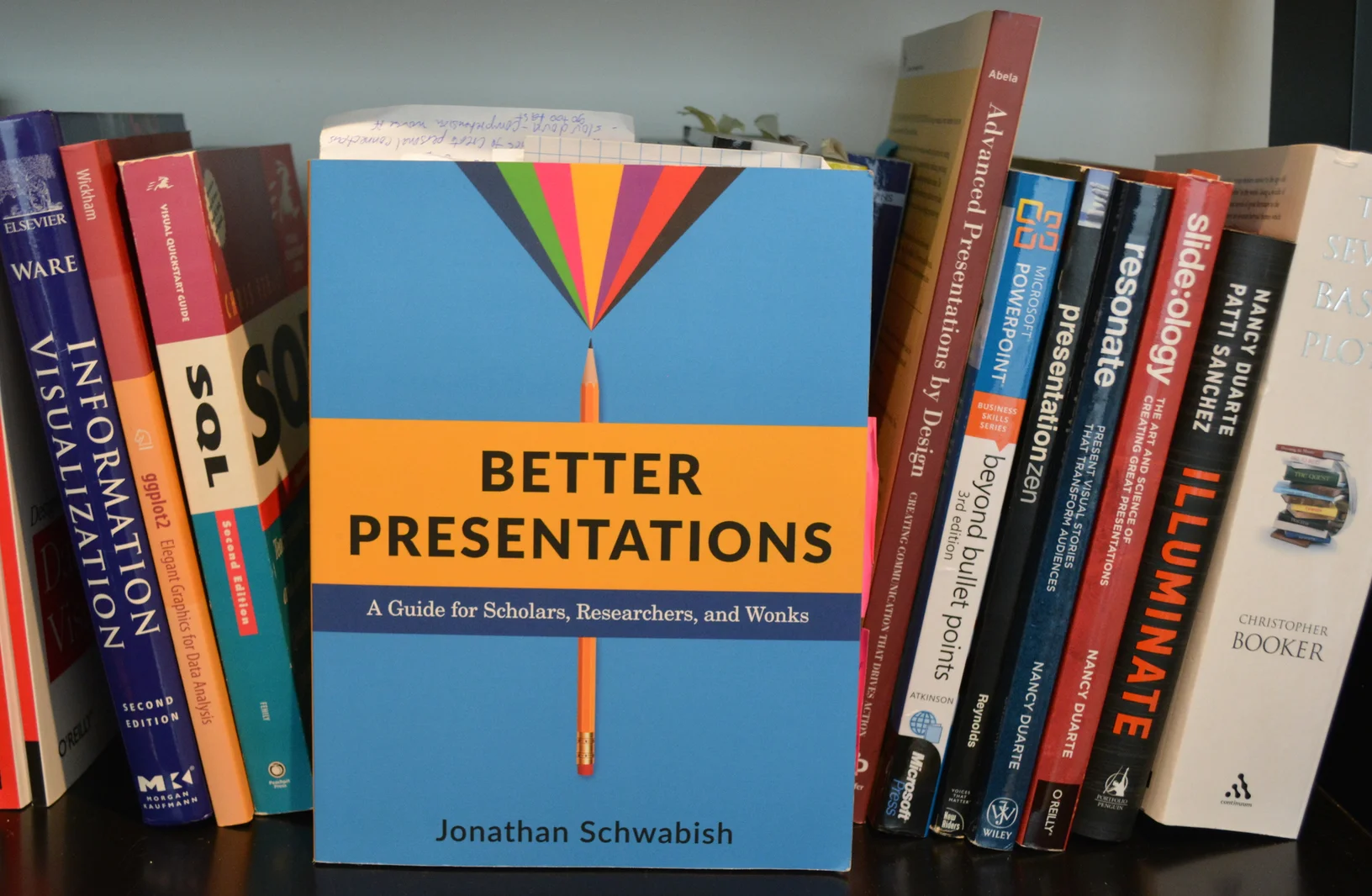
recommended reading: Better Presentations
My copy of Better Presentations is filled with shakily written notes on post-its (I've been reading it during take off and landing of my last few flights). While the subtitles says it's for "scholars, researchers, and wonks"—and the book is clearly written with them in mind—nearly all of of Jon's thoroughly researched and well written tips and strategies are applicable to business presentations as well. If you ever give presentations, you should read this book.
Better Presentations is organized into three sections: 1) designing your presentation, 2) building your presentation, and 3) giving your presentation. The first section includes chapters on planning, color and type (some standout resources in this part of the book include the Presentation Worksheet, hourglass structure for ordering a presentation, and discussion on how to pick a color scheme). Section two is divided into the text slide, the data visualization slide, the image slide (yes! I'm always looking for a good resource to point people to in response to questions about this and I took a ton of notes in this section) and the scaffolding slides. The final section has a chapter on presenting—one of my only gripes with the book is that I wish this part had been longer...but alas, it mainly comes down to practice, practice, practice, so I guess it's difficult to turn that into more than a chapter—and a final section on the technical nitty gritty. Each chapter ends with a schematic of "visualize, unify, and focus," with the main points summarized along these dimensions.
Jon and I are quite aligned in our thinking, and as I read the book I found myself saying, "yes! yes!" in response to many of his points and tips. (One area of clear agreement—Jon writes—"Even more difficult than discerning information from a single pie chart is discerning information from two pie charts.") He includes a number of awesome straightforward slide redesigns, all using real examples (mainly from the public sector—eduction, government, socio-economic stuff that anyone can understand and relate to). He discusses multiple strategies for many of the scenarios presented. Jon also includes super practical/tactical tips (e.g. step-by-step to set up the color palette in your presentation software, or how to remove the background of an image in PowerPoint).
I came away with a list of "food for thought" items—things I either haven't been doing, or new potential language to describe and reinforce ideas that I also recommend:
- Delete the actual bullet points (ah, the irony of starting out my bulleted list with this one! ...but this isn't a presentation, so my bullets are ok, right?) and instead using space to differentiate the points. He's totally right. The points themselves have no purpose and add clutter!
- Use icons in place of text for category names in graphs where there is something easily recognizable (Jon uses an education example where the dollar sign is used to represent tuition, a house icon is used to represent housing, etc.). I've done this with logos for brands in the past, but never considered the use of icons in this manner, which could be interesting.
- Make use of the "Picture Superiority Effect"—Jon points to research that indicates an audience is twice as likely to recall a topic if it includes and image and also cites several studies with findings supporting images help recall and comprehension. Images used well will serve your presentation well.
- Design for the back row. I love this simple advice. I'm always advocating that text should be bigger than you think it should be, but this language gives something more concrete to that idea—I actually picture the room when I think about it, which I think could help lead anyone to a more audience-centric presentation.
- Aim for "Twitter-like" headlines. I find myself using words like "active, pithy slide titles" for this same concept (clearly, Jon is more concise!).
- Use more slides. I actually wrote "YES!!!" on a post-it note where this tip is written. Jon describes and illustrates what he calls the layering approach, which is similar to how I use animation in PowerPoint to build a slide or graph, one piece at a time, drawing the audience's attention to where you want it as you talk about the relevant point. You may end up with a ton of slides using this approach: a ton of slides that are super easy for your audience to process and reinforce what you're saying. Win!
Overall, Better Presentations is a great and relatively fast read that I'd recommend to anyone who is preparing or delivering presentations. Also be sure to check out the many great supplementary resources on Jon's site.
