stickies!
Earlier this month, I challenged you to put some sticky notes to good use. It made me happy to see the variety of work shared: examples illustrate using this low tech tool for agile planning, a Kanban Christmas list, informal surveys, brainstorming, and—of course—storyboarding.
It’s fun to see the spin-offs, too. Dennis, Joost, and others organized their own challenge looking at 11 years of traffic incidents in the Netherlands and used sticky note storyboarding (in Dutch!) to plan their creations. Mr. Adams at The Rivers School had his high school stats students create storyboards after analyzing data to plan the narratives for their blog posts. I LOVE hearing about data storytelling making its way into the classroom: we need more of this!
People lauded a variety of benefits from sticky note storyboarding. Several people commented how helpful it is for the creative process, removing the constraints of our tools and putting us in a different head space. The size of the sticky notes forces concision, and the simple nature of them makes them super flexible so we can organize and reorganize. Lisa used her stickies to align ideas to the narrative arc. Brittne tested the effectiveness of her headlines. Dennis recognized the value of the discard pile (YES!). Tiago appreciated how the low tech nature keeps us from forming attachment like we do when we work in our tools (be sure to scroll all the way to the bottom, as he combines another low tech tool—colored pencils—to create a beautiful storyboard!).
I’m very happy to hear that those who participated found this challenge useful. I encourage anyone reading who hasn’t spent time with sticky notes to get a pack the next time you find yourself needing to communicate. A few minutes can go a tremendous way for collecting and organizing your thoughts and streamlining the rest of the process for communicating effectively with data.
To everyone who submitted examples: THANK YOU for taking the time to create and share your work! The examples are posted below in alphabetical order by first name. If you tweeted or thought you submitted one but but don't see it here, email your submission (including your visual attached as .png) to SWDchallenge@storytellingwithdata.com and I’ll work to include any additional entries this week.
The next monthly challenge will be announced on December 1 and will run through midnight PST on December 9th. Until then, check out the #SWDchallenge page for the archives of previous months' challenges and submissions.
Scroll down to see stickies put to a variety of great uses!
Adam G.
'Paper free' sticky note challenge!!! helping save the trees one digital sticky note at a time!
Blog: coffeetableviz.wordpress.com
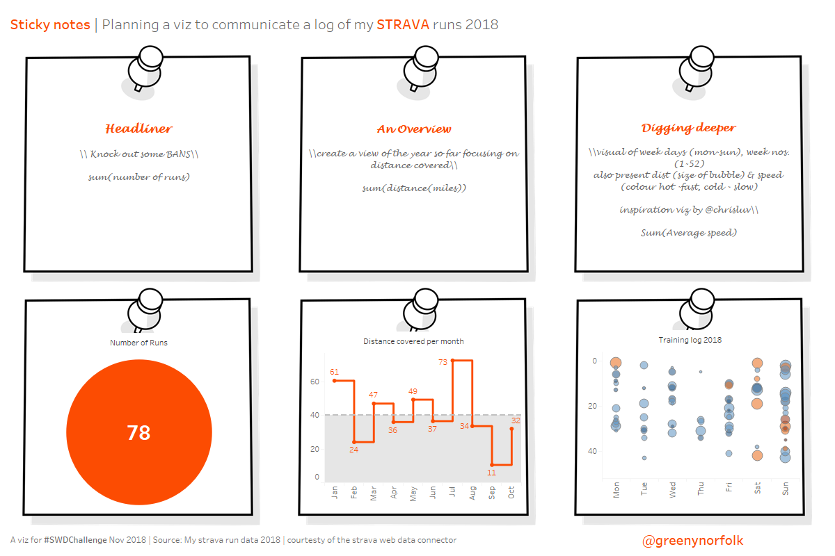
Twitter: Twitter.com/greenynorfolk
Linkedin: linkedin.com/in/adam-green-29a2b886/
Adam H.
This is a visualisation to show dependencies between applications during agile spring planning:
Amanda
Love the analog approach to this month’s challenge! Finally motivated me to send in a submission, and sent me back to fond memories of all of the ways I’ve used stickies in workshops and other settings (particularly in remote/low bandwidth environments overseas) for everything from journey mapping to skill mapping along dot continuums or on scatters.
At the 2018 DC DataCon, our Data Viz DC meetup group wanted to create a quick, interactive visualization station for attendees. We focused on two questions: who are you (plotted on a parallel coordinates diagram) and what’s your favorite chart (plotted with voting dots on a bar chart). While our approach didn’t yield the same granularity or tidy data as having someone respond to a survey, it was a fun way to engage and start conversations with conference attendees, hear about their experiences, and debate the merits of different chart types without any tech requirements. We summarized a few of our key takeaways on a few little stickies. A surprise to us: scatterplots were the runaway favorite chart of those we listed, which may have something to do with the number of data scientists (rather than business decision makers) who participated! Credit also goes to my co-organizer Ben for the effort. @abmakulec
Brittne
Section by section post its for a report. I ask myself “Does this story make sense without the numbers?” If not, revise the headline.
Dennis
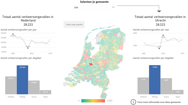
Last Saturday we organised our own data visualization contest with a small group of data-enthusiastic people. We worked with a large dataset containing a 11 year history of traffic incidents in The Netherlands. For me this was an excellent opportunity to work with the dataset and combine it with this months #SWDchallenge. The end result I worked on looked like this:
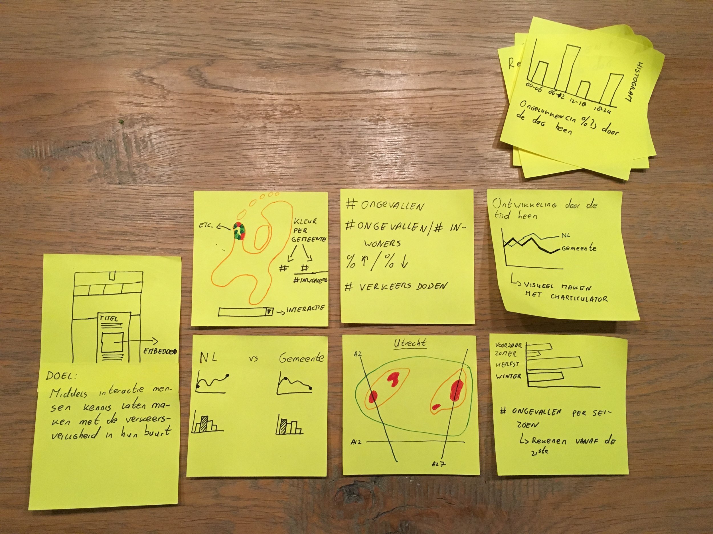
To get to this point I first worked out some ideas on post-its. This helped me make up my mind and think before I act. I found out that this way of working made me more creative, as I was able to think outside the box and not be delimited by the possibilities of the software (Power BI in my case). Of course it also resulted in a couple of ideas ending up on the discard pile (as visible in the top right corner of the image). Unfortunately the post-it’s are in Dutch, hope you don’t mind!
Joost
Last weekend we organized our own so-called Data Challenge. A day of data visualization with a group of data enthusiasts. We worked with a large dataset containing a 11 years of history for traffic incidents in The Netherlands. This was a great opportunity for me to work on this month's #SWDChallenge.
Before I started working on this post-it challenge, I briefly scanned the dataset for initial ideas about the possibilities with this data. I then sat down to map my ideas with the post-its as instructed (the text is in Dutch).
With this general outline of my story, I got to work. Though I normally work with QlikView for data analysis, I decided to use Tableau for my visuals in this challenge and used PowerPoint to present my conclusions I derived from the Tableau worksheets.
I enjoyed this month's #SWDChallenge and learned a lot from it. Instead of diving straight into the data and getting lost in endless analytic possibilities, this outline gave me a clear direction for my story and saved me a lot of time during the day. I think it also contributed to the overall effectiveness of my story.
Josh
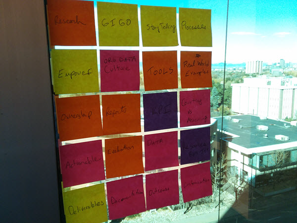
I let out an audible “yay!” when I read this month’s SWD challenge email. Below is a photo of the sticky notes I have had on my window for the past month (with downtown Denver in the background). It’s the result of a brainstorming session that I had with our prospect research director for a presentation on fundraising prospect research, analysis and reporting. As you mentioned in your post, I also like using sticky notes for brainstorming but I prefer the 2”x2” notes, which forces me to be even more concise with my ideas.
Kranthi
For this month’s challenge, I sort of hit two birds with one stone. I am currently working on launching my own website and used the sticky notes to map out the content, visual and design aspect of the site. I decided on starting with four pages and mapped out the necessary elements for each.
Lisa
For this month’s Storytelling with Data Sticky Note Challenge, I am “sticking” with Cole’s suggestion to use the low tech sticky note method to brainstorm and align ideas along the narrative arc. This method was taught at Cole’s workshop. I used a new set of sticky notes that I added to a notebook page from Cole’s workshop. More information about my sticky note work in progress can be found here: https://lisaadell.com/home/2018/11/8/sticky-note-challenge
Naomi
Not a storytelling use, but thought I’d share this sticky note Christmas Present Kanban.
Neil
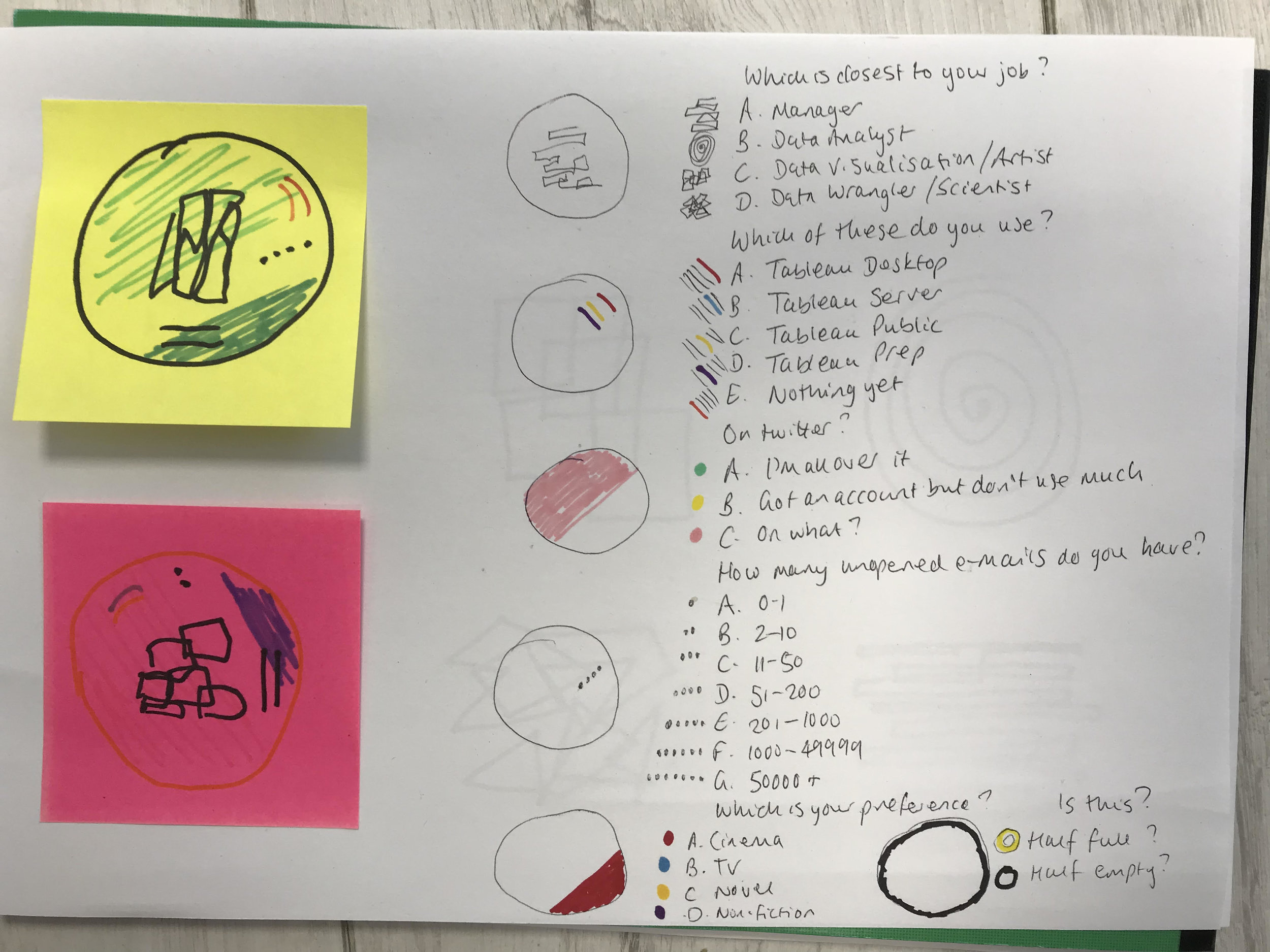
Great timing for the sticky note project! I’m attaching my pen/paper sketch notes including sticky notes for a project I’m planning to unleash on Tuesday, which is to generate Giorgia Lupi style data portraits in Tableau when the Manchester User Group meets. Only two sticky notes here but I wanted my images to be circular and fit onto squares that could be tiled. The yellow versus pink was enough to convince me to stay away from different colour backgrounds and stick with light!
Update: Neil finished the project he was planning blogged about it here.
Steven
I often use sticky notes as a creative medium for warm-up exercises in data visualization workshops. For example, in one activity, I give participants a data set of 2 numbers and ask them to draw as many unique visual representations of that data set as possible, drawing one visualization per sticky note. I then aggregate them all together across individuals to highlight common and diverging visual intuitions. Last year, I aggregated all responses (300+ sticky notes) and created a summary visualization that categorized and classified those responses by type.
@stevengbraun | https://fluidencodings.com
Suzy
Informal data collection at a meeting: People answer a survey on a 1-11 scale, and share results immediately in a stacked histogram. There are two groups (above/below the numbers), and four different questions (red/green/blue/yellow stickies). Not much difference between groups (pretty symmetrical), but for both groups the green question is getting lower scores than the blue question. Great for sharing in low tech contexts! @suzyjstyles
The Rivers School
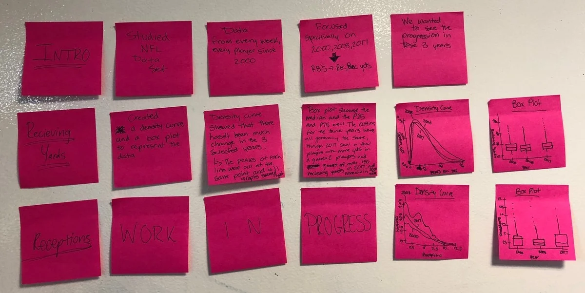
High school students at The Rivers School created visualizations and calculated statistics using @rstudio and then storyboarded using sticky notes as they plan to write their blog articles—some of their creations follow. Thanks #TidyTuesday for data and @storywithdata for the sticky note idea! - Mr. Adams
KB & JC: Our sticky notes tell the story of two separate runs taken by a test subject (Mr. Adams) in Cambridge and Concord. The two runs had very different qualities that we explored using summary statistics and visualizations.
Havi & Estelle: How well does Mr. Adams run?
Who’s the best Quarterback in the NFL?
Are running backs in the NFL receiving more as the NFL progresses?
Has NFL rushing become less relevant?
Tiago
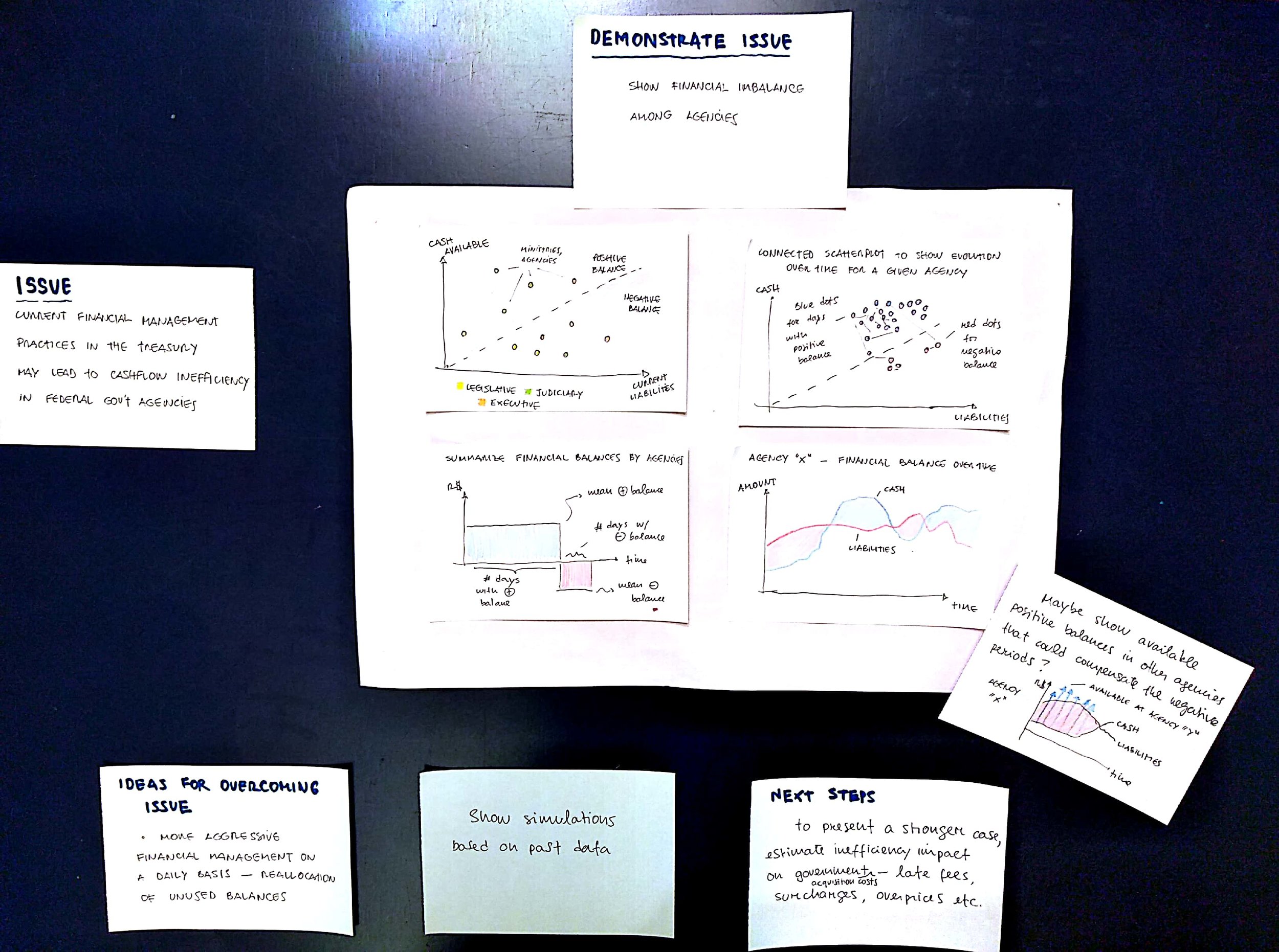
First thing, I must say that storyboarding (and using stickies to do it) was one of the most "revolutionary" takeaways for me after reading your book. I mean, I have always liked to draft with pen and paper before preparing a presentation, but never in such a structured, systematic and organized way. And the attachment (to content we create in the computer) that you mention in the book was a real thing for me. Storyboarding made me feel much more flexible and free to create. So, thank you for that. :)
For this month's challenge, I made a storyboard for a report / data story (in the form of a web page) to communicate the results of a real project I am starting to work in at my job. I have already implemented some of the visualizations that I drafted with pen and paper (and colored pencils! another advantage of storyboarding: I can use my kids drawing supplies at my WORK!). But it's a complex topic and I still have to dig further (and include more stickies) in order to come up with a sound recommendation (another thing your book made me realize: "If you can't concisely articulate that [what I want my audience to do or know about what I am communicating], you should revisit whether you need to communicate in the first place"). Some technical terms were a bit hard to translate to English, but I think the readers can get the overall idea.
Click ♥ if you've made it to the bottom—this helps us know that the time it takes to pull this together is worthwhile! Check out the #SWDchallenge page for more, including details on the next challenge. Thanks for reading!

