#SWDchallenge recap: your choice makeover
At the beginning of July, we issued a readers’ choice makeover challenge: find a less-than-ideal graph and improve it with the two-fold goal of honing your dataviz skills and teaching others by sharing the intentions behind your design choices. 45 people submitted makeovers—slightly lower participation than prior months, due to the 4th of July holiday in the States (and general summer travel), overlap with Europe Tableau Conference, and I think the freedom of choice and lack of constraints may have actually made this particular challenge a little more intimidating. For those who did participate, I appreciated the thoughtful commentary and tone, which in general was less about what was “wrong” with the original and more about your intentions with the redesigned view.
The less-than-ideal before examples included line graphs loaded with markers and numbers, bars with non-zero baselines, bubble graphs, pie charts (trying to compare across multiple, 3D, exploding), a couple novel (and confusing!) radial views, rainbow colors, and many had lack of focus or clear takeaway. You remade these into bars (you know your audience, I do love a good bar chart!), lines (including a number of slopegraphs), maps (be sure to check out Klaus’ trapezium tile map), and more. Many of the redesigns made a clear point and focused through strategic use of color and words. Great job!
Elizabeth and I each chose a few submissions to call specific attention to this month. Here are a few that caught my eye—Sanne changed numbers into percents, turned bars on their sides, and added an overall comparison point for a clearer depiction of Dutch slavery in Suriname and the Caribbean in 1857. Serge explained his approach to redesigning how his team presents customer satisfaction metrics, moving from showing each survey item to focusing on areas of impact, while making the data easier to compare in his shift from pies to bars. Mark took an exploding pie chart and turned it into an easy to follow story. Josh transformed corn and silos into a slopegraph, including targeted commentary to answer the question “so what?” Jonathan switched from bars to lines and from absolute to indexing to illustrate increasing health cost. Brandon recognized that categorical data is usually better served by bars than lines and also ordered meaningfully and focused effectively through color and words.
Elizabeth’s call outs focus on standout thought processes shared as part of the various makeovers—check out Anna's use of color in her revamped visual where she utilized red to call attention to the proportion of patients who have been waiting the longest for a hip replacement. Crystal considered ease of audience interpretation in her makeover when she chose to put the elements together that the audience should compare. Simplicity was the theme in Agata and Adam’s makeovers as they each demonstrated how a small change—switching from vertical to horizontal bars—can have a big impact. Zak took context into consideration as his makeover included both the average and the range to see the variation in his data’s distribution. We often emphasize that there is no single “right” answer and we saw evidence of that from Sarah and Emily: both chose the same “before” graph and approached focusing attention with text and color in different ways in their remade bar graphs.
To everyone who submitted examples: THANK YOU for taking the time to create and share your work! The makeovers are posted below in reverse alphabetical order by first name (+ last initial when needed; we omitted full last names in respect of those who would rather remain anonymous; reverse alpha to make sure our submitters at the end of the alphabet get some visibility!). If you tweeted or thought you submitted one but but don't see it here, email your submission (including your graph attached as .png) to SWDchallenge@storytellingwithdata.com and we'll work to include any late entries this week (just a reminder that tweeting on its own isn't enough—we unfortunately don't have time to scrape Twitter for entries, so emailing is the sure way to get your creations included in the recap posts).
The next monthly challenge will be announced here on August 1st, so stay tuned for another chance to participate. In the menatime, have fun perusing the following makeovers—we sure did!
Zak
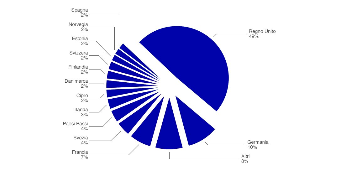
Shortly into my search for poorly designed data visualizations, I came across the one that I've redesigned here. Although the data behind the chart is simple, it's obscured by overly complicated visual elements that confuse the reader. On top of that, the 'Pie' chart format that was chosen, was not used in the way it should; to represent parts of a whole. I've reconstructed the chart into an easy to read format and updated it with current data. You can find more of my work on Tableau Public or by following me on Twitter @zaksviz
Young
I pulled out one of the figures that I have made back in 2012, as a part of publication work for masters degree program. Design-wise, the figure itself isn't so bad. When it comes to utility, it presents some flaws. The numbers at the top of the columns (labelled 1 to 45) are the Sample IDs shown at tables on the pages 5 and 6. This table contains all the important information about the environmental samples, from which the data in the figure are originated. So to relate the information in the figure with the other vital information, one must scan back and fourth different pages in this journal. To eliminate such issue, I've designed a dashboard. Here, I take some of the key facts from the table and incorporate them into the heatmap. Geographical information is drawn into the map, and this becomes the vehicle to navigate between various sampling sites.
Thomas
This reminded me of a series I once started on my blog while teaching myself data visualization. The tools I used were R/ggplot2 and finalized in Sketch. At the time, I also created a little blogpost to explain my thinking.
TWITTER
Sue
Here’s the original graph I found on Tableau Public of 5 years of U.S. Air Force Spending. If you have the time to go check this out on Tableau Public, you’ll see I made heavy use of the new, fantastic viz-in-tooltip feature in Tableau.
BLOG
Vidya
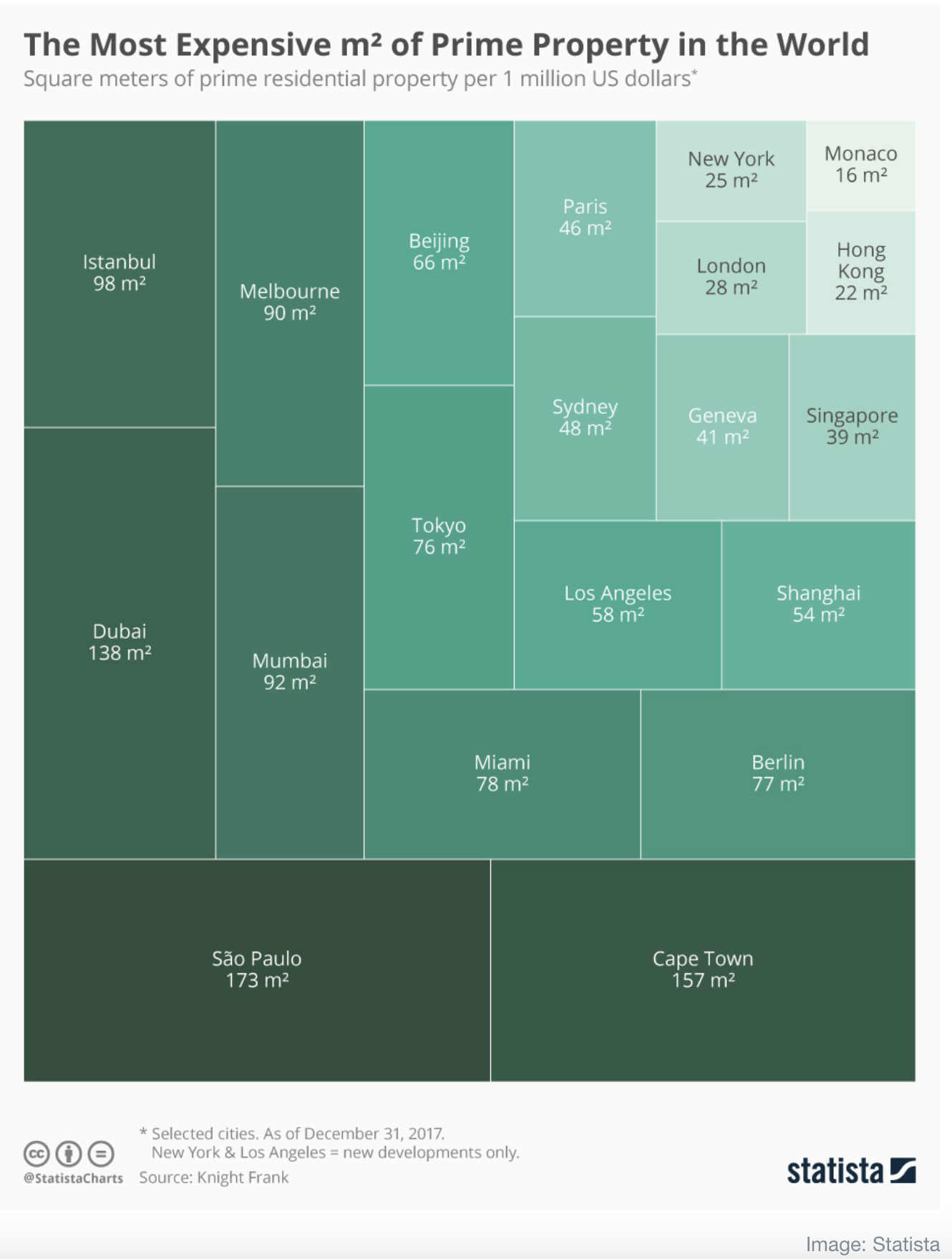
This is a treemap showing the most expensive square meter of property around the world. It took me a bit of time to orient myself to the message. The graph shows how many square meters of property one can buy for 1 million US dollars. The more square-meters of property one can buy, the less expensive the property. While there is nothing wrong with this approach, a simpler approach is to show the cost per square meter of the property. We measure expensiveness of property by the cost per square footage, not by how much we can buy for 1 million dollars (given that most of us have never seen a million dollars). So here is the same data, after a small calculation to arrive at the cost per square meter. The message is straightforward and the graph ranks the top 20 places in terms of most expensive real estate.
SOURCE | BLOG
Serge
One of the first was the presentation of the results of an internal customer satisfaction survey, a presentation that would be given to all our heads of service. We started off with a slide set of over 40 slides, good for almost an hour of endless percentages and pie charts. My first aim was identifying the message that would be interesting to push forward, and rather than the results on each individual question, we choose to highlight the categories where the service was doing well, and where improvements would be useful. We added these areas Categories to the data, ordered the responses by satisfaction and quite quickly saw that the ‘Customer Friendliness’ and ‘Training’ categories actually scored well, while ‘Contact’ was in need of improvement. To be frank, like this we could wrap up the presentation in about 5 minutes, which gave time to focus on the improvements the Service was putting in place.Graph was made in Excel.
Sanne
The topic of the makeover is quite serious. I saw a graph on Twitter form the Dutch Bureau of Statistics on the anniversary of the end of slavery in The Netherlands on 1st July 1863. The tweet said: "How much % of the population of #Suriname and the Dutch islands in the Caribean were #slaves in 1857?" Even though it felt uncomfortable to see this in a tweet, with hashtags and all, I wanted to know the answer. I wanted to know how black this page in our history was. However, I couldn't find the answer in the accompanying graph. Units were in thousands instead of percentages and Suriname's population is so much bigger than the rest, that the other bars were almost unreadable. The data source was a book by the Vereeniging voor de Statistiek (Association for the Statistics) from 1860. I changed the format of the graph to a stacked bar chart and the units to percentage. I added an "overall" bar to make sure the impact of Suriname with its large population and high percentage of slaves would remain visible. And now I know the answer to the question in the tweet. A shocking 57% of the people living in Suriname and the Dutch islands in the Caribbean were slaves.
Sarah
For this month’s #SWDchallenge I made-over a bubble chart I found online to create a much simpler bar chart in Tableau. I documented my design process and choices in my blog.
Interactive viz
Samuele
Here is a simple chart where I've changed the visualization to improve legibility and overall information clarity, using just one color and fixing proportion and information order. Also the font choice (Roboto) responds to clarity and legibility. I've used the free version of Infogram.
Rodrigo
Original (released by leading candidate for SP State Governor in Brazil) and makeover (focused on informing the audience on (1) who is leading the race and (2) that more than 50% either don't have a candidate or will not vote in anyone). The main point of an election pool is to provide the people with a snapshot of the current scenario regarding the race among the candidates. As it is a race it is important to inform who is in first and, when data is available, who is moving up and down the race. As this was the first pool there wasn't the change in preference to be informed. The big insight is that besides who is winning the race now, we still have 50% of people that don't have a candidate or will not vote in any of them. So the race is wide open. The original was very misleading with bad use of Y-axis and bar lengths to give the impression the leading candidate has +90% of the votes. In the age of fake news, the fake pools can be powerful to confuse the election process. We all need to have to exercise our critical thinking skills to avoid falling in election marketing traps.
Rob
I found the original graph and I used Python 3.5, Pandas and Matplotlib.
Rachel
I wanted to change the chart to highlight the big increase in internet use by teens in the US and thought that a slopechart would show this nicely. I used Tableau.
Pietro
I've found on WTF visualization this simple graph that need only a little adjustment. The scale is wrong for the mean of the graph, so I've changed it. I've used google sheets.
Paul
I found this "before" viz on the New York Times website showing how many people gained insurance through the Affordable Care Act between 2010 and 2015, and how many could potentially lose it if the law is overturned. While it's easy to see the number of insured for an individual state, it's very difficult to compare values between states. I initially looked at creating a filled map using only the insured population data. However, since population varies by state, it makes for a better comparison to divide the number of insured by the state population. In my version it's easy to see which states had the highest and lowest amount of insured per their population.
Interactive viz
Patricia
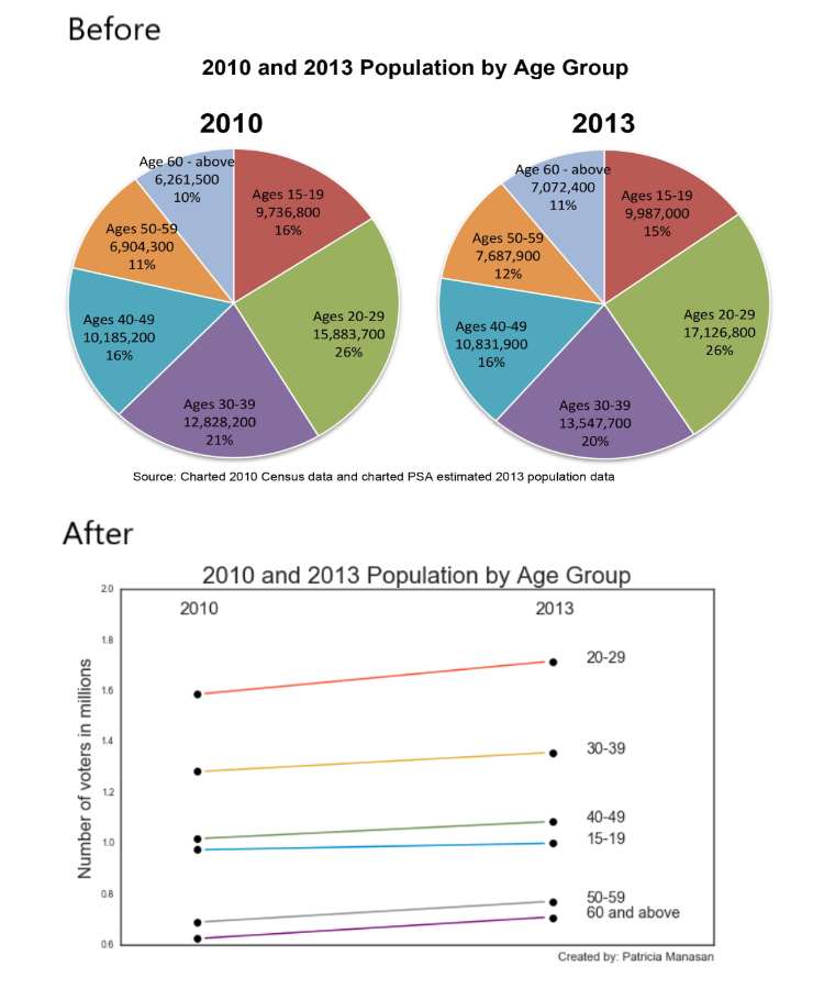
I chose to makeover a graph from an old opinion piece from a local newspaper. The focus was relaying how the population has changed from 2010 to 2013, but the author used a pair of pie charts to illustrate this. A better approach is to use a slopegraph when focusing on changes in values. My makeover (done with Python) is able to clearly show the changes in the population per age group and in addition it highlights that the 20-29 age group has the highest population among all age groups.
Nicolás
For this submission I improved a graph from a published article about Wave propagation in composites. This visualization was done using Matplotlib/Python and added details in Inkscape.
my blog
Nick
The reason I chose the original viz to makeover is I think the original creator was trying to use the body object to help add some flare to the viz, but it doesn't match up with the data. When I see the body image with the different colors I'd assume that something was going to add up to 100%. With the different percentages being used in the viz, I think having them separated out with their own images works better and cuts down on any confusion of what the percentages mean.
Munazzah
I picked something "of great importance" for the makeover challenge: inconsistent clothing sizes. I split the clustered bar chart in the original into 2 separate charts - a bar chart which just looked at the perception of sizes being correct, and adjacent to it a diverging bar chart showing the direction in which each brand's clothes were more likely to be.
More details on my thought process here.
Molly
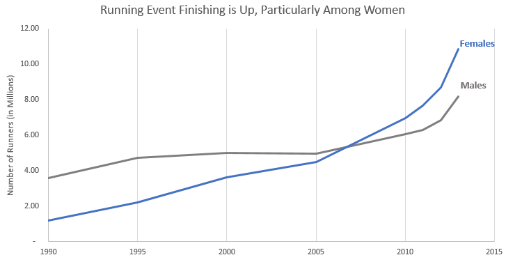
The 'before' in this challenge comes from Running USA, depicting running race event finishers by gender. The original included a stacked bar with the % male/female, which I deemed unnecessary in the redesign, as that became apparent changing the chart type and adding a more descriptive title. As running is one of my favorite hobbies, I enjoyed the challenge of remaking this graphic!
TWITTER
Mark
Lynn
My client had a lengthy evaluation report on a terrific program they had initiated - a behavioral coaching intervention for teachers in early childhood classrooms. Behavioral coaching has been shown to help teachers effectively manage challenging behavior. They had great data, as they had a really smart evaluator with them from the beginning of the project. They were able to show that behavioral coaching not only improved teacher skills and the environment in the classroom, but the social-emotional development of the children who were in the coached classrooms. I was hired to write an impact story, and chose to use an online storymap, and revisualized the key outcomes data in Tableau. This particular chart ostensibly shows greater achievement in coached classrooms, as compared to the control classrooms, of teachers’ implementation of practices that improve children’s social-emotional development (as measured by the “TPOT assessment”). But it’s not readable for many reasons which I will bet are immediately understandable to you and your readers! I decided to create a dot plot, that would plot the scores at different assessment times horizontally. And I decided to stack the coached and control classrooms vertically so that the difference in scores was more immediately noticeable. Using a gray dot for the baselines, and the gradations of a single color for coached and control respectively not only decluttered it, but made it easier for the eye to track change from baseline. I also gave a brief title that described the results, using the blue font color for coached and orange for control in the title itself. Since the data are in Tableau, the tooltip upon hover (which is not accessible in this static image, of course) also provides key information - classroom, assessment point and score.
Lisa
This pie chart was a perfect candidate for a chart makeover. Bar chart to the rescue in making this data story more clear and concise. I highlighted the important stuff by adding a blue color bar and an annotation to the Hindi language bar in order to emphasize the language that is most commonly spoken. My initial makeover chart had y-axis labels and bar labels placed above the bars. Cole suggested removing the y-axis and pulling the bar labels into the end of the bars. I also added more context to the lead-in text to better introduce the story and to answer questions that the audience may naturally ask about the data.
Source | Interactive viz
Klaus
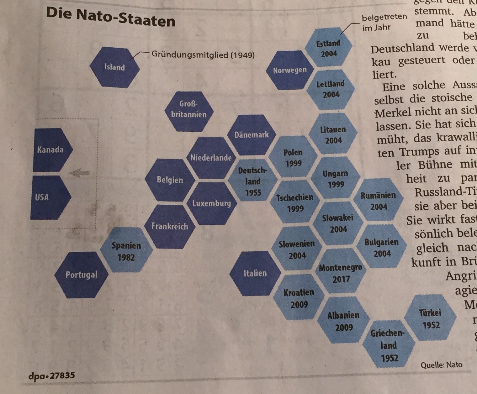
Hex maps don’t really work for Europe. A trapezium tile map is an alternative to keep the characteristic shape of Europe.
Interactive viz | Blogpost
Kelly
The original chart appeared in a family member's company newsletter, and he forwarded it to me for my opinion. It's an interesting question, and the colors are eye-catching, but I didn't care for the left-pointing bars and uneven time buckets. To stay in line with the original purpose (a pdf newsletter), I matched the original size and tried to keep the visualization simple, yet colorful. Created in Tableau.
Kat
Something I do for fun (acknowledgment of my data viz obsession…) is collect graphs I think could be presented better differently - so this was a great monthly challenge! The graph I picked for this challenge is one on my local council’s website. It shows how Wellington City Council allocate rate payments across their service areas. I've kept a lot of the original branding elements but added more alignment, grouping and a different view of the data. You can read more about my thought process.
Joshua
I grew up in the Midwest. I live in the Midwest. I love it here, and I appreciate the attempt to capture the feel and culture of the Midwest, but we really aren't that excited about corn. Besides that, there was a lot this chart was doing really well - good headline, the necessary labels were there, and grouped bars worked well enough for me. Here's my retake.
BLOG
Jonathan
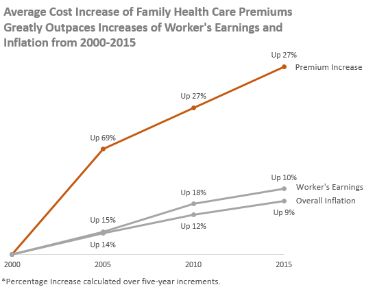
The original graph wasn't bad, but I wanted to draw more attention to the disparity of how medical insurance premiums have increased much more quickly than wages in recent history. To that end, a line chart seemed a better way to go than a bar chart. This allowed the cumulative nature of the increases to be seen. To do this, I ended up using different tic marks across the x-axis. The line graph would show the change over time, so I didn't need to label the x-axis with "Year X - Year Y". I also changed the title to state the conclusion that I wished to exhibit so that people would see it first. For color, I changed everything to a gray, and labeled the lines directly, rather than using a color-based legend, since the color wasn't meaningful. Then, I used a dark orange to make the line for insurance premium stand out from everything else. Because I simply wanted to show the relative increases, I didn't include a y-axis with any units and let the slopes of the lines speak for themselves. My only major concern with my updated chart is whether starting all the lines from the same point leads viewers to think that the chart is making a statement about actual values, rather than percent increases.
SOURCE
James
In October 2012 Rangers FC were liquidated and a new club entered the bottom division of Scottish football having bought the assets of the old club. There was a lot of media attention at the time and one of the key messages trying to be put across was that despite the liquidation, season tick sales has increased. The main point of the story is told in the top left so the reader knows exactly what to take from the graph. I have focused on the change between seasons and relegated the absolute sales into the background via use of light grey. I have used large arrows/labels to distinguish between the ‘old club’ and ‘new club’, highlighting the impressive sales despite the liquidation.
Heather
A big thanks to ThinkProgress for exploring the topic of a paid paternity leave across the globe. I am proposing a few adjustments to their 2014 visualization to highlight the fact that the United States does not guarantee any paid paternity leave. Several components of the chart were hard to process: the different units of weeks, days, and months; the many different colors; the disconnect between the amount of space occupied by each chunk and the amount of time represented by the chunk (14 days seems to get more space than 15 days). It was hard for me to realize that the US had zero days at my first glance due to its size on the chart - the US occupies almost the same amount of space as the one week countries. I decided to change the viz to a minimally-colored bar chart with standard units (days) to try to make it more obvious at first glance that the US is zero.
Genna
This is from a project I did for work. The original visualizations were too condensed and overwhelming to pull out the important information. The updated visualizations took the approach of less is more and narrowed down the information to one singular year. The waffle chart made it easier to see the breakdown of race and ethnicity and highlighted the lack of diversity in a clean and clear manner. The final visualization can be found here on Thoughtwell's website. The source is Cooperative Children’s Book Center School of Education, University of Wisconsin-Madison.
Eric
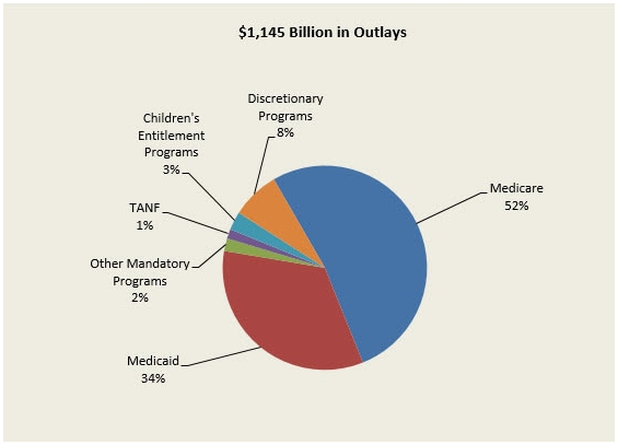
I found the information publicly shared on the U.S. Department of Health & Human Services website. The information shared is the distribution of the 2017 budget as a pie chart (see HHS_Before.png). I noticed the single digit percentage were more difficult in telling apart; for example, the slice for 2% and 3%. I also noticed the percentage values did add up to 100%. During the makeover, I played around with a stacked bar chart to keep the part-to-whole idea, but decided to use a bar chart to emphasize that a majority of the budget is split between Medicare and Medicaid programs. I was also trying to incorporate the dollar values, but had trouble figuring out how to do so.
Emily
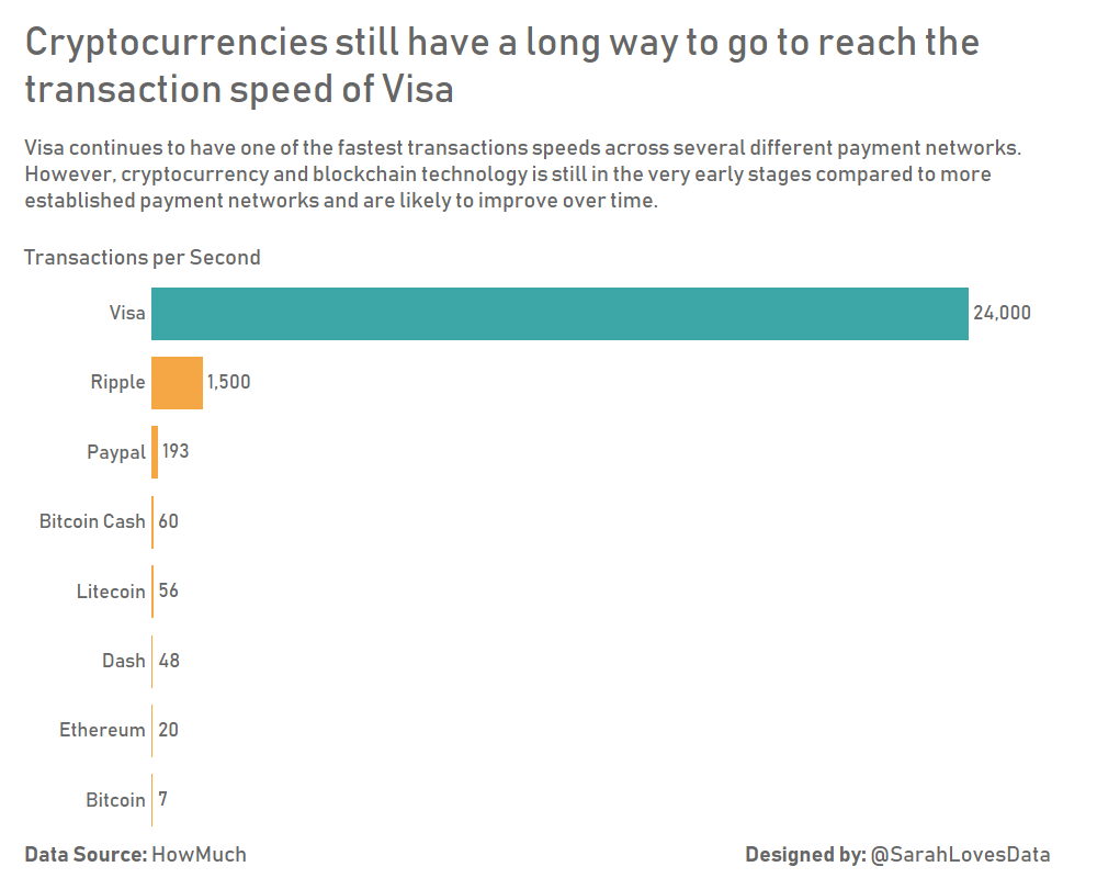
I found this chart from howmuch.net and to me, I thought there was a more effective way of showing the data. To me, this is a good example of how annotations are making up for a less desirable chart choice because labels have been added since the bubbles are not effective. In addition to the annotation, I found the colors to be an interesting choice and I thought the logos were redundant. When thinking about the colors for this visualization, I was inspired by an image I found with various cryptocurrencies. The contrast really resonated with me, as I tend to think the lighter shades pop against the navy blue background. In the end, I went with a bar chart because I thought it was the best chart choice. I labeled the bars because I had space and thought it was more effective than having the axis.
Dan
For this month's #swdchallenge, I decided to show how an improved graphical technique can improve an already reasonable design. Original interactive design was recently published in online version of The Wall Street Journal. In a recent article, I introduced a superior jittering technique that uses density plot logic in arranging a large amount of values. Because of its statistic support, this design provides a superior access to details removing the usual clutter found in existing graphs like “jitterplot” and “beeswarm”. The symmetric version (that has a violin like contour) goes by “Stingray Plot” name. The author of the original design from The Wall Street Journal had a similar idea, but without having access to this new technique, he used a random arrangement within the violin plot area. The idea is not exactly bad, but the whole design can get some improvements: remove the unnecessary fancy symmetric distribution shape, break down the distributions by sectors, good sense of the reference salary position within each distribution, clear detail view (on the right) with improved access to the companies that give salaries within a given range, not only to the closest companies (in original design). Being an interactive design, the cursor provides the required tooltip for hovered companies, on both views, but for a static version the detail view can be easily replaced by a bar chart showing the companies found in that selection, above and below the chosen salary reference.
Crystal
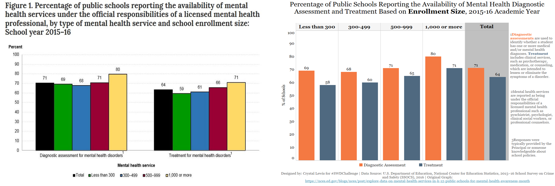
As part of Mental Health Awareness Month in May, the National Center for Education Statistics wrote a blog which included a graph depicting the availability of mental health services for students in public schools based on 2015-16 data from the School Survey on Crime and Safety. Things I appreciated about this graph include insightful/important content and that it gives percent of schools rather than number of schools so data is comparable. Things I wanted to change include the colors were hard to follow (had to keep checking back to see what each color mean, the total percent did not stand out to me and I wanted to be able to more easily compare assessment to treatment.
Interactive | Twitter
Cindy
The before graph was built according to the specs I was given using investment accounting software. While I built the report as requested, as time went by and I learned more about data visualization, I realized how bad the report was! I mean…pies??!!??! The updated graph was built in Excel. I took to heart the notion of drawing the reader’s attention to the important points by leaving the opacity at 0% for the maximum value, and lightening the remaining bars.
Brian
I used Tableau to improve an overly complex chart by using highlight tables and marginal histograms. Complete step-by-step Tableau highlight table tutorial available on NewPrediction.com.
Brett
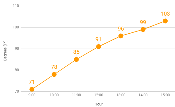
I originally found a version of this graph on WTF Visualizations. In the WTF version, the months were not aligned with the graph at all, so it was very hard to read. I found the source of the data and found a better version of the graphic, but it was still a little hard to read because the lines were not aligned on the same axis. It is not the worst graphic, but I think it could be improved. The designers seem to use the same graph for every U.S. park, so I decided that I would try to create a graph that was a little easier to read and could be replicated easy by just plugging in data from different parks. I think the actual temperatures is the most critical data, so I explored using a table, but a table was not good at comparing months or showing the range of temperatures for each month. The graph I decided to use is a dumbbell plot that shows the ranges from average high to average low. I included the data labels as I think they are useful when you want to know the exact temperature. This was created in Excel.
Brandon
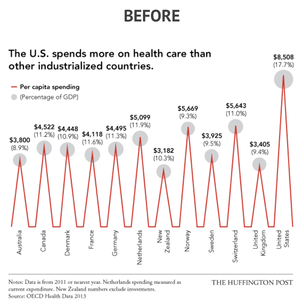
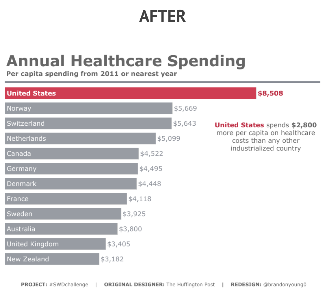
For this submission, I redesigned a graph around healthcare spending by country, originally created by The Huffington Post. I felt the original graph could benefit from a few enhancements to help to sell the story a little better. I used Tableau to redesign using a more traditional bar chart and sorted the data in descending order to make it easier for the user to read. I also used color to help US stand out to follow with the commentary and decided to focus in on only one of the metrics (per capita), since both metrics told a similar story and felt repetitive. You can see more of my designs/redesigns on Twitter.
Ben
I came across this graph, from the Kansas City citizen satisfaction survey, a while back and it stuck with me because of all the best-practice advice it violates. I wrote a blog post on my process as well.
Alistair
For this month's #SWDChallenge, I've taken the "Anatomy of Winning Ted Talks" Viz, which included a 3-d stacked pie chart. I've simplified this viz, showing it instead as a bar chart. I think it seems easier to differentiate between the different reasons and removes some of the 'chart junk'.
Alexander
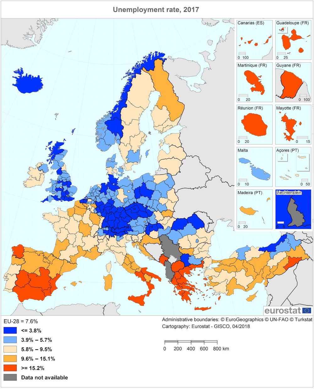
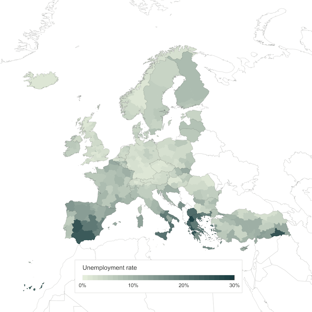
Some time ago, Eurostat tweeted a map depicting the 2017 regional unemployment rates in the European Union. While I found the data very interesting, I felt that the way they were visualised overemphasised some of the differences. Using R and the extremely handy eurostat R package I recreated the map using a single colour gradient (see Mapping quantitative data to color" by Gehlenborg & Wang), which I think allows for a more accurate and fairer comparison of the different regions.
BLOG
Aparna
Anna
For this challenge I have chosen viz from Health Policy journal and have I have created a new viz in Tableau. Reading the article I realized that the main purpose of this viz is to stress the distribution of waiting times (its skewness). That's why I didn't label the values (because it is all in text). I didn't include Australia because it doesn't bring any value to the picture and it isn't mentioned in text. The palette of colors is to stress that majority of patients (blue) is waiting less than 6 months for the treatment (it is the main point in article).
Agata
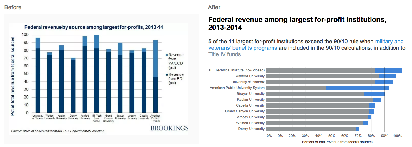
For this month's #SWDchallenge, I used #Tableau to remake a graph from the Brookings Institution that highlights the largest for-profit colleges that would exceed the 90/10 federal funding limit if military and veterans’ benefits were included in the 90/10 calculation. While this graph contains relevant and interesting information, I felt that it took a lot of effort on my part to extract the meaningful data. It was especially difficult to identify the institutions that exceeded the 90/10 rule, which was the main point of the graph. For a full description of my process, click here.
LinkedIn
Adam
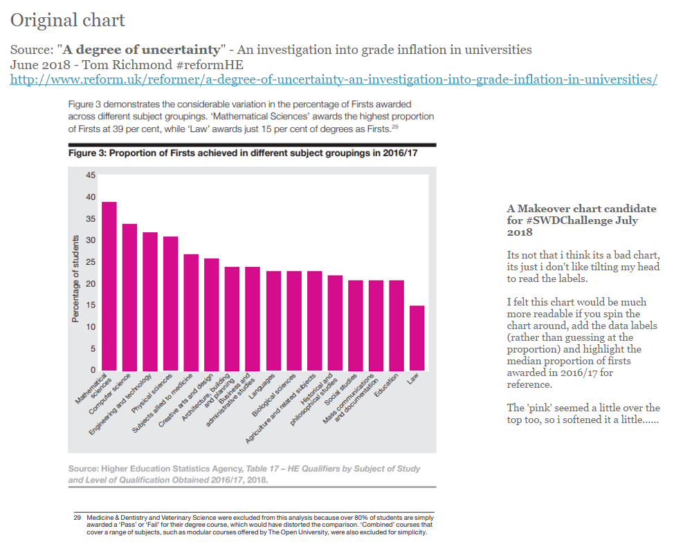
I've gone for a simple spin round of the axis on the humble bar chart. Nothing too fancy just a little bit easier to read.
Interactive viz | Blog | Twitter | LinkedIn
Click "like" if you've made it to the bottom—this helps us know that the time it takes to pull this together is worthwhile! Check out the #SWDchallenge page for more, including details on the next challenge. Thanks for reading!


