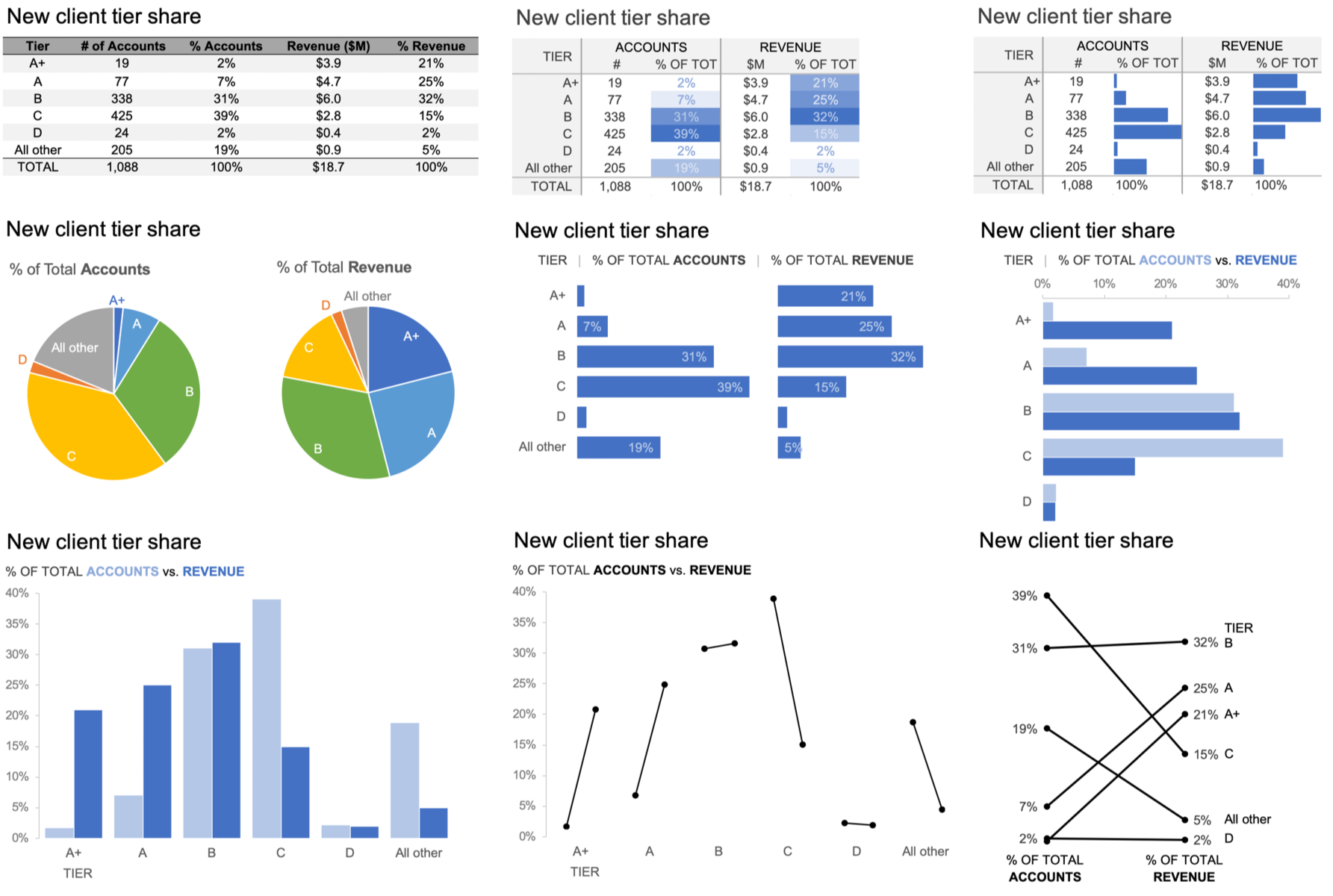
how I improved the table
The October #SWDchallenge was taken directly from the pages of my new book, storytelling with data: Let’s Practice!—which is where the solution I’ll share with you here hails from as well.
As a reminder, the challenge was this:
Exercise 2.1 | Knaflic, Cole. Storytelling With Data: Let’s Practice! Wiley, © 2019.
The following details how I approached the exercise.
STEP 1: When I encounter this table, I start reading and scanning down columns and across rows. In terms of specific observations, I might start by noticing that the majority of accounts are in Tiers B and C, while Tiers A and A+—though they don’t make up a huge number (or percentage) of accounts—do make up a meaningful amount of revenue. In terms of questions, I wonder if the tiers are in order: I would think A+ belongs above A and am confused that they don’t appear that way in the table (perhaps due to alphabetical sorting?).
I wish there was a “Total” row at the bottom, because in the absence of this I find myself wanting to add up numbers. In fact, it’s when I start to do that when I notice some bigger issues. The third column (% Accounts)—which I assume means percent of total accounts—sums to 81.16%. The final column (% Revenue)—which I assume means percent of total revenue—sums to 95%. So now I’m unsure whether these really are percent of total or something else. If they are, then there must be some “Other” or “Non-tier” category that I’d want to include in order to have the full picture.
When I focus on the numbers themselves, two digits of significance (places past the decimal point) seem like a lot for the % Accounts column given the scale of the numbers. When showing data like this, you should be thoughtful about the appropriate level of detail. There isn’t necessarily a single “right” answer, but you want to avoid too many digits of significance. This can make the numbers themselves harder to interpret and recall and may convey a false sense of accuracy. Is the difference between 7.08% and 7.09% meaningful? If not, we can drop a digit by rounding. Here, given the scale of the numbers and differences between them, I would round to whole numbers across all except the fourth column depicting revenue. There we are already summarizing in millions and it seems like we would lose important differences between the dollar volumes by rounding to a whole number, so there I’d round to one digit past the decimal point.
Figure 2.1b is an improved table that addresses the preceding points.
FIGURE 2.1b | Knaflic, Cole. Storytelling With Data: Let’s Practice! Wiley, © 2019.
STEP 2: There are additional improvements I can make to this table. When tables are designed well, the actual design fades to the background so that we focus on the numbers in a way that makes sense. I recommend against shading every other row and instead am an advocate for white space (and limited light borders) to set apart columns and rows as needed. Speaking of white space, I typically avoid center-aligned text in graphs (because it creates hanging text and jagged edges that look messy) in favor of left- or right-aligning text. In the case of tables, however, I do sometimes opt for center alignment because of the separation this creates between columns (another common practice in tables is to right-align numbers or align by decimal point, which allows you to easily eyeball relative size). I can group the accounts-related columns and revenue-related columns with a single title (and under that, number and percent), which will reduce some redundancy of titles and also give me more space to be specific about what the columns represent. Doing so also allows me to make the columns narrower so the table overall takes up less space. These are some specific tips—I’ll also put forth a couple of more general ones: consider the zigzagging “z” and where your eyes are drawn.
Consider the zigzagging “z”: Without other visual cues, your audience will typically start at the top left of your visual (for example, your table) and do zigzagging “z’s” across to take in the information. When we think about applying this to how we design our tables, it means you want to put the most important data at the top and at the left—when you can do so in the context of the overall data in a way that makes sense. In other words, if there are super-categories or data that needs to be taken into account together, keep them in the order that makes sense. In this particular example, I’d sort my tiers starting with the top (that is indeed A+) and decreasing as we move down the table. Going left to right, I’m happy enough with the way it is structured. I want to keep the distribution of accounts and percent of accounts next to each other since those relate to each other. If revenue were more important than accounts, I could move the two revenue columns leftwards, but I can also use other ways to focus attention there. Let’s discuss that next.
Where are your eyes drawn? Similarly to how we focus attention thoughtfully in graphs as part of explanatory analysis (something we’ll explore in detail in Chapter 4), we can also focus our audience’s attention in tabular data to establish hierarchy of information. This can be especially useful in instances where you can’t put the most important stuff leftward or at the top (because other constraints dictate the ordering). Despite this, you can still indicate relative importance to your viewers. Look back to Figure 2.1b: where are your eyes drawn? Mine go to the very first row where the column titles are Tier, # of Accounts, and so on. This isn’t even the data! Rather than use up ink and draw attention there, I can be conscious about where I want to direct attention in the data and take intentional steps to get my audience to look there. This can be done through sparing use of color or by outlining a specific cell or column or row. Adding visual aspects to some of the data in the table is another way to draw attention there: colors and pictures grab our attention when they are used judiciously.
If we assume the primary comparison we’d like our audience to make is between the distribution of % Accounts compared to % Revenue, I could apply heatmapping (using relative intensity of color to indicate relative value) to just those two columns. See Figure 2.1c.
FIGURE 2.1c | Knaflic, Cole. Storytelling With Data: Let’s Practice! Wiley, © 2019.
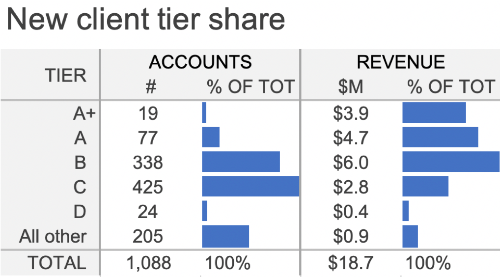
As another approach, I could embed horizontal bar charts in place of the heatmapping. See Figure 2.1d. This does work quite well to direct attention to those columns and allows us to see how the shape of the distribution varies across the two. However, the specific comparison between % Accounts and % Revenue for a given tier is harder, since these bars aren’t aligned to a common baseline. Tip: If you are working in Excel, conditional formatting is available that will allow you to create heatmapping or embedded bars in a table with ease.
FIGURE 2.1d | Knaflic, Cole. Storytelling With Data: Let’s Practice! Wiley, © 2019.
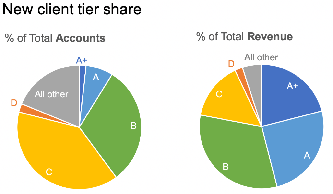
STEP 3: Let’s take it a step further and focus on the data that is in the bars in Figure 2.1d and review some different ways we could graph it. When I hear a term like “percent of total,” it makes me think of parts of a whole—which might cause us to look to the pie chart. In this case, since we are interested in both % of Accounts and % of Revenue, we could depict this with a pair of pies. See Figure 2.1e.
FIGURE 2.1e | Knaflic, Cole. Storytelling With Data: Let’s Practice! Wiley, © 2019.
I’m not a big fan of pies—I sometimes joke that there’s one thing worse than a single pie: two pies!
Let me back up, though, and say that pies can work well if we want to make the point that one piece of the whole is very small, or another piece of the whole is very big. The challenge for me is that pies break down pretty quickly if we want to say anything more nuanced than that. This is because our eyes’ ability to accurately measure and compare areas is limited, so when the segments are similar in size, it is difficult for us to assess which is bigger or by how much. If that’s a comparison that is important, we’ll want to represent it differently.
In this instance, the primary comparison we want our audience to make is between the various segments in the pie on the left and those in the pie on the right. This is difficult for two reasons: the area challenge mentioned above and the spatial separation between pies. This is further compounded by the fact that the segments are in different places on the right as a result of how the data differs between the breakdown on the left compared to the right. Basically, if any of the data is different between the pies (which it should be if we have something interesting to say about it!) then all the pieces are in different places across the two pies—making them hard to compare. In general, you want to identify the primary comparison you want your audience to make and put those things as physically close together and align to a common baseline to make that comparison easy.
Let’s start by aligning each measure to its own baseline, with a view similar to the bars embedded in the table previously. See Figure 2.1f.
FIGURE 2.1f | Knaflic, Cole. Storytelling With Data: Let’s Practice! Wiley, © 2019.
In Figure 2.1f, it’s very easy for us to compare the % of Total Accounts across tiers. It’s also easy to compare the % of Total Revenue across tiers. I can attempt to compare accounts to revenue, but this is harder because they aren’t aligned to a common baseline. If I want to allow for that as well, then I could pull both of these series into a single graph. See Figure 2.1g.
FIGURE 2.1g | Knaflic, Cole. Storytelling With Data: Let’s Practice! Wiley, © 2019.
With the arrangement in Figure 2.1g, the easiest comparison for me to make is, for a given tier, the % of Total Accounts compared to the % of Total Revenue. These elements are both the closest together and they are aligned to a common baseline. Bingo!
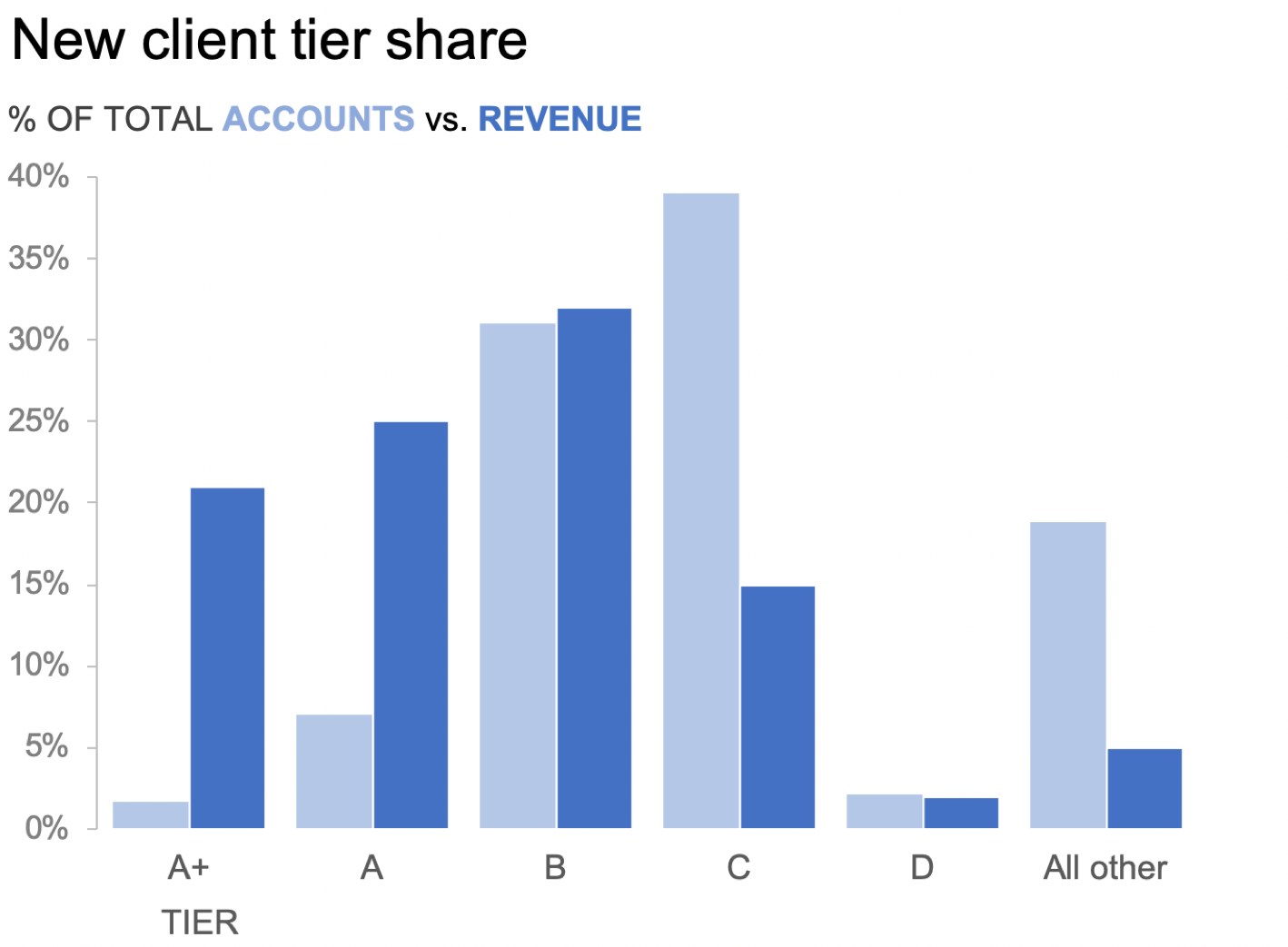
We could also flip this graph on its side into a vertical bar chart, or column chart. See Figure 2.1h.
FIGURE 2.1h | Knaflic, Cole. Storytelling With Data: Let’s Practice! Wiley, © 2019.
When we depict data in this manner, the primary comparison our eyes are making is the endpoints of the paired bars relative to each other and to the baseline. Let’s draw some lines to further highlight this comparison. See Figure 2.1i.
FIGURE 2.1i | Knaflic, Cole. Storytelling With Data: Let’s Practice! Wiley, © 2019.
Now that we’ve drawn the lines, we don’t need the bars anymore. I’ve removed those in Figure 2.1j.
FIGURE 2.1j | Knaflic, Cole. Storytelling With Data: Let’s Practice! Wiley, © 2019.
Next, I’ll collapse all of these lines and label everything directly. This yields the slopegraph shown in Figure 2.1k.
FIGURE 2.1k | Knaflic, Cole. Storytelling With Data: Let’s Practice! Wiley, © 2019.
Slopegraph is really just a fancy word for a line graph that only has two points in it. By drawing lines between the % of Total Accounts and % of Total Revenue for a given tier, we can quickly see where the two measures differ. Revenue as a proportion of total is quite a lot lower for Tier C and All other (indicated by lines sloping downwards), while revenue as a proportion of total is much higher for tiers A+ and A. In other words, though A+ and A make up a very small proportion of accounts (9% combined), together they account for nearly 50% of revenue!
We’ve looked at a number of ways to visualize this data. You likely made your own observations along the way about what worked well and what did not. What I’ve illustrated isn’t exhaustive; I could have added a dot plot to the mix or calculated revenue per account and visualized that. That said, we don’t typically have to go through every possible view of the data to find one that works. Perhaps both absolute values and percent of total are important, in which case the table might be the easiest way to show these different measures after all. If we can narrow our focus to a specific comparison or two, or a specific point we want to make, that will help us choose a way to show the data that will facilitate this.
Any data can be graphed countless different ways. This exercise illustrates how moving through different representations of our data allows us to more (or less) easily see different things. Allow yourself time to iterate and complete the additional exercises that will give you more practice at this important junction in the process!
The preceding solution was excerpted from storytelling with data: Let’s Practice! If you enjoyed this and would like more guided exercises to help you learn through practice and illustration, be sure to check it out.
I’m not the only one who solved this exercise—more than 80 people participated in this month’s challenge. We are working on an exciting new resource where you’ll be able to view all of these (and more!) very soon.
The November challenge will launch the week of the 4th and will run the entire month of November. We’ll be going back to basics, with a twist. As those in the US prepare to carve their Thanksgiving bird, I encourage everyone around the world to carve out time to participate in the November challenge!


