#SWDchallenge: bars AND lines
UPDATE: Five lucky participants this month will received signed copies of storytelling with data: Let's Practice! Recipients will be chosen at random, so all you need to do is participate for your chance to win!
This month, we’re taking it back to the basics—bar charts and line graphs—but with a twist. We’re going to use bars and lines together.
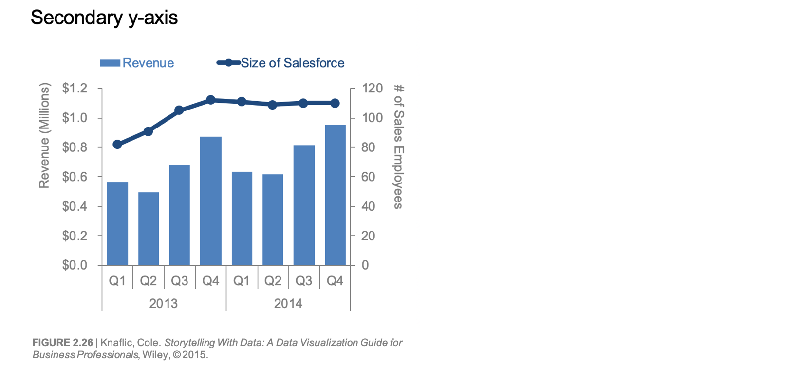
When we use bars and lines in a single visual, it’s common practice to utilize a dual or secondary y-axis (you may also see this referred to as a combination chart). This is something I typically advise against. Why? No matter how clearly things are titled and labeled, there is work involved on the part of the viewer to figure out which data series to read against which y-axis. We can avoid that work by employing an alternative approach.
Take the following example, which shows revenue and size of salesforce.
Everything is titled and labeled. This means if I spend some time, I can figure out how to read it. Revenue is depicted by blue bars. Revenue is in dollars. This means I read it against the left y-axis. So then by process of elimination, I must read Size of Salesforce against the right y-axis. I read the axis title on the right-hand side and this is confirmed. I have figured out how to read this graph.
But I don’t want my audience to have to undertake this work. Instead, I’d recommend one of the following two alternatives.
In Alternative 1, the secondary y-axis is still present, I’ve simply elected not to show it (in this case, I eliminated the primary y-axis as well). Instead, I titled and labeled each data series directly. In Alternative 2, I made two separate graphs, but organized them so they still look like a single visual and the x-axis is meant to be read across both. Since they are separate graphs, I can title and label both y-axes on the left-hand side. With each of these approaches, I’ve eliminated the question of whether to look left or right to read a given data series against its axis, thus alleviating the work of the traditional secondary y-axis. (Related note: when showing data any of these ways you imply there is a connection between the various data series, so make sure that makes sense!)
These certainly aren’t the only alternatives to a secondary axis or ways to approach the challenge of plotting multiple data series of different dimensions or graph types together. But this is where I’ll pause and turn things over to you...
the challenge
Using whatever interesting data you think would work well in this situation, plot bars and line(s) together. You may decide in spite of what you’ve read above that you’d like to employ a secondary y-axis and that’s fine (reasonable people can disagree on approaches)—of utmost importance is that you design a graph that is intuitive not only to you, but to others looking at it as well!
If you need help finding data, check out this list of publicly available data sources.
NEW! This month, we’ll be running the challenge inside an exciting resource we’ve been building: the SWD community. We are still fully in beta testing mode, but hoping that won’t hinder participation (as added incentive, I’ll be awarding a signed copy of my book to five participants who will be chosen at random!). If you’re feeling motivated by the bars and lines challenge and adventurous when it comes to navigating while we continue to refine, please indicate your interest here by adding your email, name and the invite code #SWDchallenge and we’ll follow up with details.
DEADLINE: Share your creation in the community by November 30th at 5PM PST. As always, feel free to share on social media at any point using #SWDchallenge. We’ll follow up with a recap post detailing our observations near the end of November.
I look forward to some beautiful bars and lovely lines this month!
related resources
Be Careful With Dual Axis Charts - Steve Wexler, Data Revelations
Three Ways to Use Dual Axis Charts in Tableau - Ryan Sleeper, Playfair Data
Why Not to Use Two Axes, and What to Use Instead - Lisa Charlotte Rost, Datawrapper
On Dual Axis Design Matter - Daniel Zvinca, Logbis
Dual-Scaled Axes in Graphs: Are They Ever the Best Solution? - Stephen Few, Perceptual Edge


