designing in style
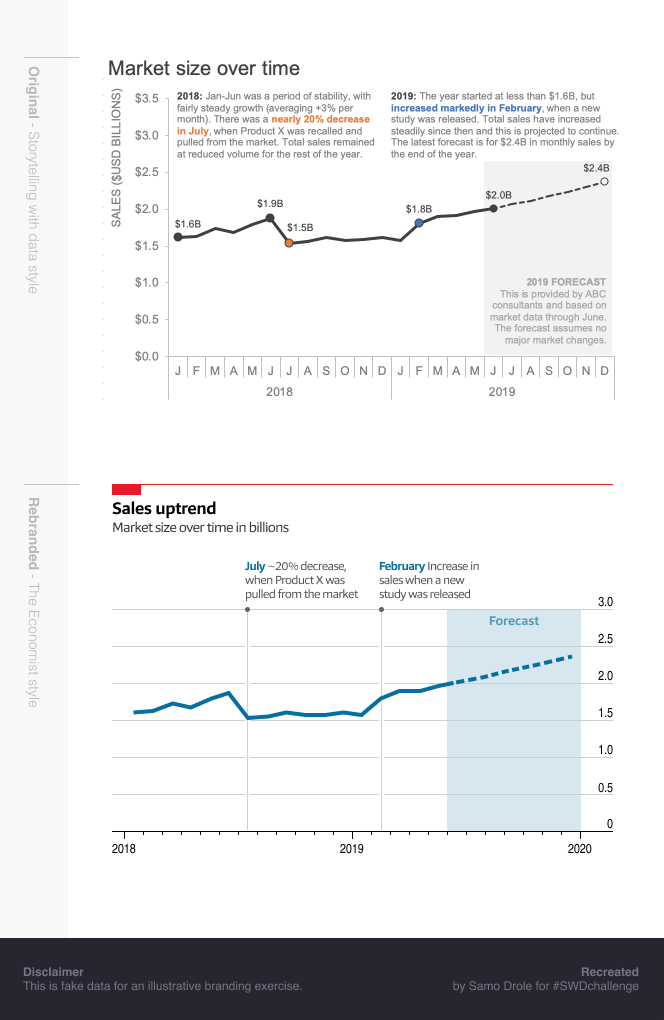
This month, we explored the concept of brand in data storytelling and received an enthusiastic response with fifty-eight exercises in re-branding an example graph. Brands represented spanned consumer products (Ben & Jerry’s, Coca-Cola, Lego, Guinness), restaurants (Chipotle, Subway, McDonald’s), retailers (Target, Whole Foods, IKEA), specialty apparel (Nike, lululemon, Zara, Patagonia), entertainment (Netflix, Sesame Street, Harry Potter, Vogue), sports (Cricket World Cup), universities (Virginia Tech and University of Washington) and many more—we encourage you to scroll through the entire post to see how designing in the style of a given brand can create a totally different look and feel for the exact same data.
At storytelling with data, we’re also learning about this aspect of design. Many readers agreed that while this was a fun, low-risk challenge to try something new, they discovered that it’s easy to go overboard into a space we typically don’t want to be (cluttered visuals, too much color, cutesy images and the like). Graphs are still meant to convey a message and we should strive to make our visuals as accessible as possible with effective chart titles, axis labels and annotations (as makes sense). That said, there were many examples of how effective brand can be when it’s thoughtfully applied to data storytelling. Branding done well goes beyond design elements—font, color and logos—evoking a feeling and perhaps an emotional connection.
Let’s recount some specific examples illustrating how brand can enhance several data storytelling best practices:
For a specific audience, branding can make the data accessible.
Neil cleverly incorporated design elements of the London Underground (mimicking the District line with similar green and line thickness, using data markers in the style of the station stops) resulting in a visual that feels familiar to a rider—they already know how to read this graph!
For a completely different audience, Pris achieved accessibility with creative application of Sesame Street elements: data markers depicted as cookies, utilizing the alphabet for axis labels and annotations (“J is for July”). She also cleverly incorporated a data-driven character (The Count!) to tell the story to toddlers, or perhaps their caregivers.
Kate created a graph that feels accessible to a Chipotle customer as she mimicked the hand-written, artistic feel of the menu in her font choice.
Branding can be used to make the takeaway clear.
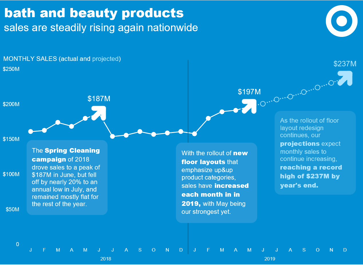
Mike and Claire designed their visuals to enhance the data’s positive results by incorporating Target’s up & up arrow logos as the data markers and contrasting Patagonia’s logo colors with a black area graph to simulate a rising landscape.
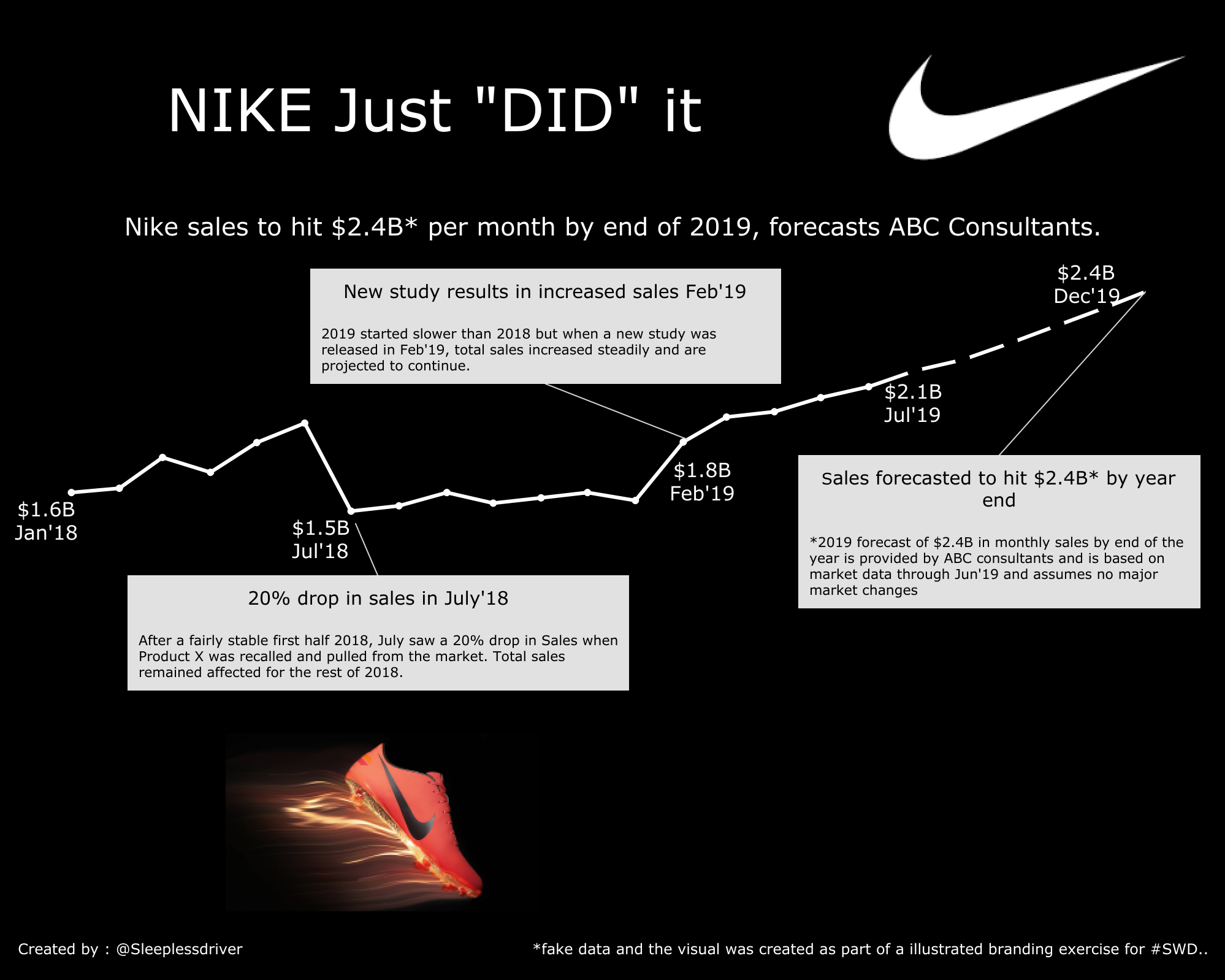
Several readers cleverly wrote effective takeaway titles inspired by the brand’s taglines/slogans: Karan’s “Nike Just Did It,”, Leah’s Pawsitive Outlook (Rover.com), and Kate’s Bold Predictions (Sharpie).
Branding can help you show that you understand the audience.
Branding goes beyond simply using company colors. Frans emulated more than the color palette of Dutch brand Coolblue; instead emulating the typeface, the layout, and the casual tone of the company’s language in the headline. Similarly, Sarah replicated the relaxed, counter-cultural feel of the Ben and Jerry’s brand, right down to the dimensions of her chosen canvas, which could easily be interpreted as the label to a pint of ice cream. Without all of these elements working together, an audience might feel that something was a bit off; but in combination, they enhance the audience’s comfort, familiarity, and receptiveness to the message.
This applies not only to what is present, but what is absent; high-end brands such as Chanel, Vogue, and Apple often value minimalist approaches to their branding, and Jeffrey, Adam, and Georgios, respectively, produced faithful homages to these brands.
To everyone who submitted examples: THANK YOU for taking the time to create and share your work! The submissions are posted below in reverse alphabetical order to give visibility to those at the end of the alphabet. If you tweeted or thought you submitted one but don't see it here, upload your submission as a .png here and we'll work to include any late entries this week (tweeting on its own isn't enough—we don't have time to scrape Twitter for entries.)
The next monthly challenge will launch on July 1st. Until then, check out the archives of previous challenges on our #SWDchallenge page. Happy reading!
Tania
I decided to focus on a non-profit brand that I think is iconic: the American Red Cross. My process was: browse their website to get a qualitative feel of the brand aesthetic, search on Google for "Red Cross brand standards", which luckily directed me to a great PDF where the group explains how to use their colors, fonts and tone of voice. Search for examples of data that the Red Cross has published to understand how this has been done before. Take a stab at my own Red Cross graphic!
Sumeet
I really loved working on rebrand #SWDChallenge. My first thought was to use "Coca Cola" as brand and use it as theme. I have used Tableau tool for this create this viz. I usually, avoid dark colors. However, this time I wanted to try something new. Whole Viz is created using 2 colors - Red and White.
Sudheer
Simone
Simon
After deciding to rebrand in the style of my sons favourite building bricks I researched the best font (Legothick) and the brands RGB colours. I added a touch of fun with the bad figure pointing to the negative comment while a happier one points to a more positive sentiment.
Sarah
I wanted to find a theme that would be immediately familiar to people both in and outside of the UK, where I live. Given that (most) people like ice cream I decided to mimic the instantly recognizable Ben & Jerry's branding. I found a style guide of theirs online which explained how to apply the green rolling hills and the white fluffy clouds, both of which I build in PowerPoint. I also added my disclaimer to a wooden sign as an added touch.
Samo
Ratesh
Inspired by the ongoing ICC Cricket World Cup 2019, I have re-branded the viz. The colors and design elements of CWC19 are really catchy and appealing.
Pris
For me, the hardest part of the June challenge wasn't the data prep or visualisation. Instead, it was deciding on a brand. Seeing the term 'ABC consultant' in Cole's original chart, I wondered to myself who the ABC consultant would be. Naturally, that drifted towards the idea of Sesame Street. I started by cleaning the data through Alteryx to use in Tableau. As Tableau prefers tall data, I had to transpose the data, prepare the dates and create a column with the Actual or Forecast. From there, I focused on design and made adjustments to my chart accordingly. Taking a look at reference pictures from Sesame Street episodes, posters and books, I knew I needed the iconic green street sign, script font to simulate the bubbly and childish Sesame Street persona. I originally also wanted a wider palette of colours to replicate the diversity of Sesame Street characters. However, I decided this would distract from the chart itself so I limited it back to a solid colour. I drew out several prototypes of my visualisation in a notebook, putting labels to various parts. Ideas included a line chart with a kite at the end with a flat image sky/green hills background to give a playful energy. However, I couldn't find an appropriate image with a balance of colours and space so I ditched that idea. Telling my mates about my Sesame Street Meets Wall Street idea, they suggested featuring The Count. It made perfect sense! Who else would care about the market obsessively? This then led me to the question "Why would they care though?" Sesame Street character probably don't care about money but they seem to care about cookies. The idea had solidified in my mind and from there, I took liberties with the data to make it cookie related.
Penola
Inspired by Whole Foods Market and wanted to highlight the use of "chalks", since they are an important part of their heritage. Used the "chalk" for summative purposes and applied the brand guideline for in-store signage text/proportion. In lieu of the circular font, used Aileron and League Spartan.
Paulo
Following the Airbnb guideline designs, I re-branded the line chart with the company standards.
Pablo
Got really carried away with this month's #SWDChallenge and re-branded the graph with Netflix’s branding!
Link
Olga
I decided to use UNIQLO branding, because I like it's simplicity. Did not use the dedicate UNIQLO font, but the closest one (DIN).
Neil
I decided to rebrand the original chart using one of the UK's most recognisable and iconic brands, the London Underground, and had a lot of fun recreating the look of a Tube Line (current and under construction) for the Actual and Forecast sales figures using Tableau
Naveen
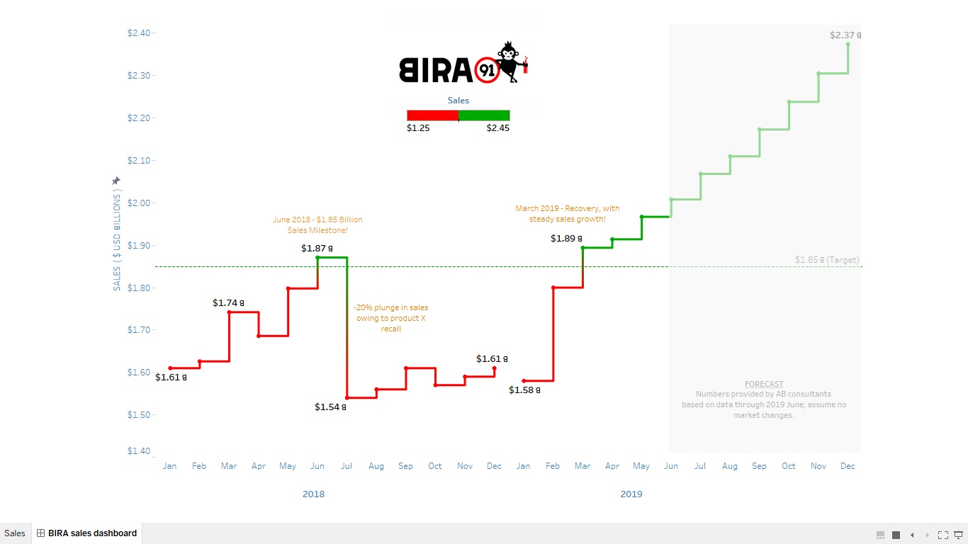
I have used Bira 91 (craft beer brand, India) to re-brand graph!
Monika
This viz shows performance of Nescafe over a particular period of time, and its forecast for the coming few months.
Mitchell
Inspired by a Blu-Ray of Blade Runner 2049 I decided to use the iconic broken front and restrict myself to colour palettes from Roger Deakins' Oscar winning cinematography. As their are two district locations in the film (LA - Green and rainy, Las Vegas - Orange and dusty) it was challenging to make something that did not look garish and over the top on one hand and on the other not to make something that didn't really wear the influence of the film's mood and feel. I felt I had to keep the background white whilst using Excel defaults but I think with more time a different background colour could have worked. In the end I decided to use the bold reds and blues from the posters for axis text and data labels, Used Joi's hair and skin tones for the line graph and titles, variations on the posters background colours for the selected commentary on the graph and a muted green for the axis lines. The final stylistic choice was to narrow the forecast line as it went further from actuals. Like tears in rain.
Mike
Target has 39 different distinct, internal brands. Thirty-nine! And it turns out, I'm already familiar with a lot of them (Archer Farms; Original Use; Room Essentials; Boots & Barkley; Simply Balanced; Goodfellow & Co.; Threshold; Market Pantry), but the one I chose to focus on was its generic-equivalent brand for basic household products: up & up. The brand's products, according to Target, are "designed to deliver performance and value that consistently beats national-brand products in testing." The design language incorporates bold colors, a rounded arrow as the primary logo, and a combination of tightly-kerned Helvetica Black and tightly-kerned Helvetica for most of its products. I used the next-best thing--Arial--and replicated the up&up arrow for use as a marker, highlighting important datapoints, in this chart. For a print piece I wouldn't use a solid color as the background, but I was imagining this chart being shown as a projection, and in that situation I think it works. (up & up branding incorporates both color text/white background and white text/color background.)
Liz
I chose Lululemon because I regularly practice yoga on one of their mats and I am familiar with their yoga clothing. Their manifesto (their company values) is printed with white text on a red background, so I followed that color scheme in my visualization. I also found the font they use and incorporated that as well. I went through different sections of the company's website and saw that they sell much more than yoga and running clothes, so I included those newer offerings in my timeline. I made this visualization in Tableau.
Lisa
This month’s challenge to re-brand a chart gave me a new appreciation for graphic designers, typography experts, and those who build brands and develop brand guidelines for organizations.
Blog
Linda
The style I selected is that of the company I work for, the A.D. Makepeace Company, which is the largest cranberry grower in the world and the largest private property owner in eastern Massachusetts. Although the company is now as well known for state-of-the-art real estate development and production of engineered soils (think roof gardens - you can't just use any ol' dirt) as we are for being a 165-year-old cranberry grower that helped to found the Ocean Spray co-op, we've retained the historic cranberry theme in our branding. We use a type family called Mrs. Eaves, which has an feel that balances elegance and rustic-ness. Our color scheme is always a combination of olive green and red (bright red in charts, a more muted maroon in other applications, like interior furnishings). Our language is formal; we do not use abbreviations. The "cream swirls" graphic in the background is a reflection of our logo, which is a woodcut image of a cranberry vine. I do a lot of line charts in presentations, given the cranberry vine look. (Did you know that many cranberry vines are a hundred years old?)
Leah
I used Rover.com (a happy, dog-loving brand) as inspiration. After browsing their website and making note of ‘dog people’ vocabulary, I went in search of ‘Rover.com branding elements’. I found two treasure troves: Rover.com Brand Style Guide excerpts, and a Rover.com blog post containing 11 data visualization charts. I used Photoshop’s eyedropper to identify brand colors and recreate the yellow title banner, then Font Squirrel Matcherator to find the closest matching fonts. I mimicked Rover.com’s data viz layout: title/subtitle, summary and chart title on top, then a generous use of dotted lines, call-outs, and big colors. Using a big bold font for my data labels, paradoxically, made the numbers too big to quickly decipher. I tried subscripting the B(illion). That worked better: the numbers now pop. 82% of Rover.com’s charts include a caricature so I added a happy dog. I experimented with a second, frustrated-looking dog next to the Product Recall call-out, but the brand is ‘happy’, not ‘frustrated’. I also positioned the happy dog looking forward in time, drawing attention to the up-trending forecast. The hardest part was choosing words to represent the brand. I have a new respect for people who write copy true to a brand’s voice!
Kate
Sharpie uses the word “bold” often in their marketing and with hashtags like #uncapthepossibilities and #uncapwhatsinside Sharpie focuses on empowering and inspiring individuals to be creative with their products. So I choose to focus on the positive, and emphasize the predictions of sales growth in my viz. Also what’s more “on brand” than creating the viz with the actual product?
Blog
Karandeep
I am new to the field of data visualization and I am trying to learn more about it with every passing day. I work in an IT company and my inspiration for re branding is the different organisations I was a part of. I went through the websites of all my past recruiters and tried to come up with the visualization. The font I chose for the 'Sales' measure is inspired from my current organisation’s logo.
Karan
I have rebranded the original idea using Nike as my brand of choice. The black backdrop and the "Swoosh" logo along with the "Futura" font makes for a pleasing to eye brand visual.
Julia
I thought that $2B is an abstract sum, so I've re-plotted the values in number of McDonald's BigMacs (taking $5.58 per BigMac). Still, the numbers are large, but the exercise turned out to be at least a bit funny - just think, if a company's income was counted in burgers!
Joost
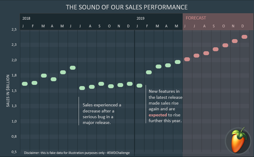
Besides data visualisation, I am also a big fan of music production. I have been using the FL Studio music production software for years, so I decided to rebrand the visuals for this months #SWDChallenge to FL Studio.
Jerome
Pacman eats his way out of declining sales. CHOMP!
Jeffrey
Jared
For this month's challenge, I found my inspiration by simply glancing down at the task bar on my PC and seeing the Spotify icon. From there, I looked up Spotify's colour palette, font, and downloaded their icon. I also used the app as inspiration. I looked at how font is used to draw a user's attention, as well as how shapes are used on the screen to break things up.
James
This re-brand was inspired by the Manhattan Project Beer Company, a brand that has a very identifiable theme in the branding of their products. Specifically, this re-brand focused on the product that opened my eyes to the magnificence of the beverages they make- the Hoppenheimer. The inspiration I drew came directly from the Hoppenheimer can, and the cans of other seasonal beers that the Manhattan Project produces (although some aren’t really seasonal). I did adjust the data to create a new, very made up, story behind the data- that the release of new beers impacts Hoppenheimer sales negatively in the short term, but does not inhibit long term growth of the product.
Iram
I have joined Twitter only in March 2019, but since then it has become an integral part of my life. It is where I got a wonderful Dataviz community. Different challenges like #MakeoverMonday, #Workoutwednesday #SWDChallenge push you to do better each day. Hence, I have used Twitter as my inspiration for this SWDChallenge, as it is what we all are connected with!!
Helen
Although it may seem as though it has a very distinctive style, I found upon Googling that actually there are many fonts and styles associated with Harry Potter – they vary between the books and the movies, and between different editions of the books. I focused on the fonts used in the movies, particularly on movie posters, as these felt the most familiar to me and are probably the most recognizable. I noticed most movie posters are quite dark, with gold and silver lettering. The words are not usually completely centered – they often trickle off to one side. The posters also often had a stormy sky as a background, but I decided this was overkill for this project! The inspiration for the wording at the bottom was taken from the Marauder’s Map (Messrs’ Moony, Wormtail, Padfoot & Prongs are proud to present…) and Ministry of Magic documents, which often used arrows and lines to separate text. The broomsticks were really just a bit of fun – though I took care to orient them in the correct way!
Haley
I chose to re-brand the graph for my alma mater, Virginia Tech! I started by reviewing the style guide and getting the RGB codes for the iconic VT colors: Chicago Maroon and Burnt Orange. I also downloaded the font Acherus, which was used in the style guide. Because Virginia Tech is a university known for STEM fields, I wanted the chart to have a good level of detail. I added the shaded boxes to make it more clear which months were being analyzed, emphasized the Jul and Feb month labels, added the % increase to compare with the % decrease, and aligned labels for the 2 important events (recall + new study) with the months when they occurred. Overall, I tried to keep things simple and clean but still informative.
Gianni
This is my my submission to #SWDchallenge: re-Branding a line chart inspired by the Ducati brand. I enjoyed finding the right Ducati red and the font and I learned new things.
Georgios
I wanted to make a minimalist, monochrome plot with lots of white space and as little text as possible.
Frans
For this month's #SWDchallenge I rebranded an existing graph in the style of one of my favorite (Dutch) brands: Coolblue. An extremely customer-oriented and also enormous funny brand.
Emily
Although this is more "artsy" than a typical data visualization, I wanted to bring in the hand-drawn look Chipotle uses for many of its branded materials.
Emanuel
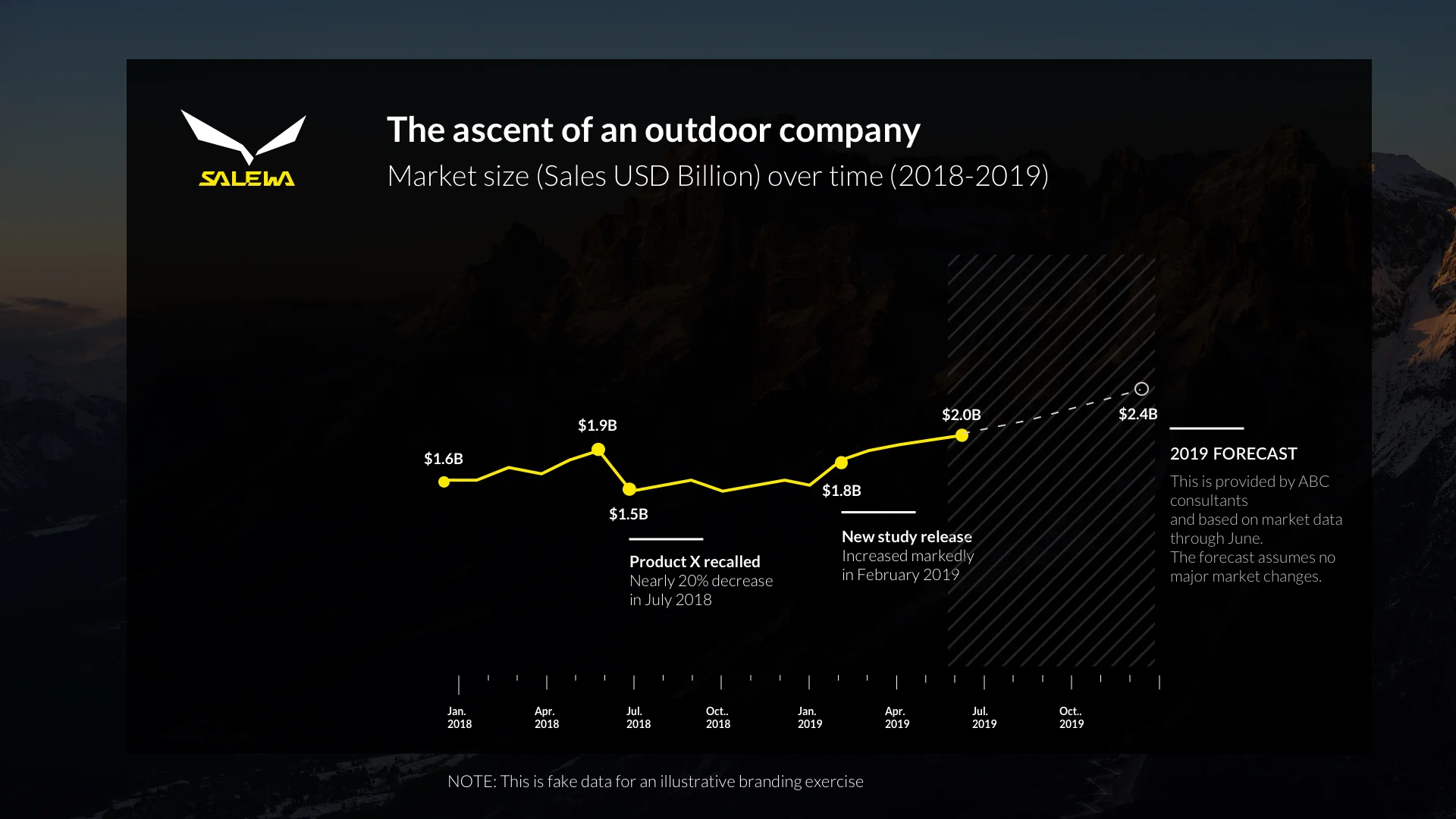
My first challenge - and the same task in which I feel quite comfortable as Interaction Designer. Probably my mountain boot and the upcoming mountain weather in Bavaria, Munich inspired me and also the trend in the line graphics led me somehow to visualize the ascent of an outdoor company. Salewa's new brand design is concise and emphasizes the pure outdoor feeling of the Dolomite Mountains. This feeling, combined with a simple and contrasting design, I then tried to pack into the visualization. First i tried to redo it in Flourish Studio but then due to limitation in time and functionality i did it in Sketch App.
Ela
For this month rebranding SWDChallenge I wanted to incorporate a logo change in fashion industry into sales figures. I believe that branding and all the associations that come with it can influence company's profit. Logo change can be tricky. ZARA's clothes can be very colorful but ZARA's logo is minimalistic. That is why I used only white, black and grey colors.
Domart
Just Ikea Ad Googling, I tried to capture the essence of the brand's advertisements. The boundary between Forecast and actual may not be very precisely placed. I tried to re-instate the simplicity of Ikea ads with their distinctive sign: My graph is an Ikea product, it has its "price tag" with important information.
Dmitrijs
I used IKEA brand guideline and I tried to find a balance between IKEA's minimalist style and keeping just enough details assuming it could be a graph presented at meeting.
Diane
The descriptive text in the SWD-style design made me interested in calculating the percent change for Feb 2019 (as result of new study being released) and the percent increase in 2019 forecasted sales over 2018 actual sales. This data informed my decision to change the chart style. I chose to emphasize the year-to-year sales comparison, which highlights the impact of the market changes made each year and the forecasted increase in sales (assuming no additional major market changes). My organization just launched a new branding campaign. I used our new style guide for the colors and typeface.
Dennis
I started creating a graph using the Apple-style but soon after the started I had some ideas of showing those results on an iPhone. Again this idea changed and resulted in the final idea, were Siri answers the question. The question contains information regarding the y-axis, the dotted line, etc.
Link
Dave
I choose Amul - dairy product brand from India. Inspiration was to be consistent with Amul's style of marketing with the famous Amul girl and their witty tag lines.
Claire
Maybe it was the sweltering summer heat, or maybe it was the peaks of this line chart that immediately made me think: MOUNTAINS. Specifically, Patagonia’s mountain logo. Their web presence suggests that they like to keep things simple, personable, and laid-back with just a touch of fun. I wanted my chart to mirror the simplicity and color/font schemes of their logo, so I used color very sparingly (just two highlighted data points and the sunrise background). I found that the font Beirut approximated their logo pretty well, and I kept the rest of the pared-down text lighter with a simple sans-serif (Arial). Then I added a pun for a title because, why not? It seemed to fit the company's laid-back persona. Admittedly the branded chart is a little much for everyday reporting, but the line chart/mountain comparison was too much fun to resist.
Link
Chris
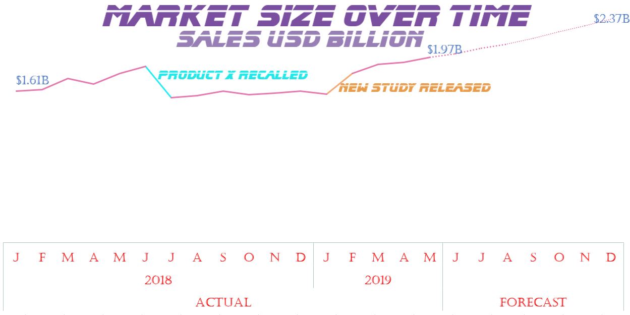
A slightly humourous take on the news that Salesforce will be acquiring Tableau. A Tableau chart with Salesforce branding. This one was tough, Salesforce is a brand associated with light blues and whites, which are hard colours to use together for dataviz. Without much more than the cloud the viz was rather lifeless so I used further imagery from sfdc to bring it to life a little. I also used a darker blue from their site to help elements stand out.
Charles
For this month's submission, I decided to go against my usual instincts: I usually stay FAR AWAY from graphs with a black background, but here I am... Playing soccer in an over-35 league, I have been using Sells goalkeeping gloves for the better part of the last decade. It was then a no-brainer for me to use their brand as my template!
Catherine
I re-branded the graph using the University of Washington's branding. They have a web page specifying all the requirements for their font, colors, and logo usage. I used R to make the visualization and learned a bunch about how to include images on ggplot charts.
Carrie
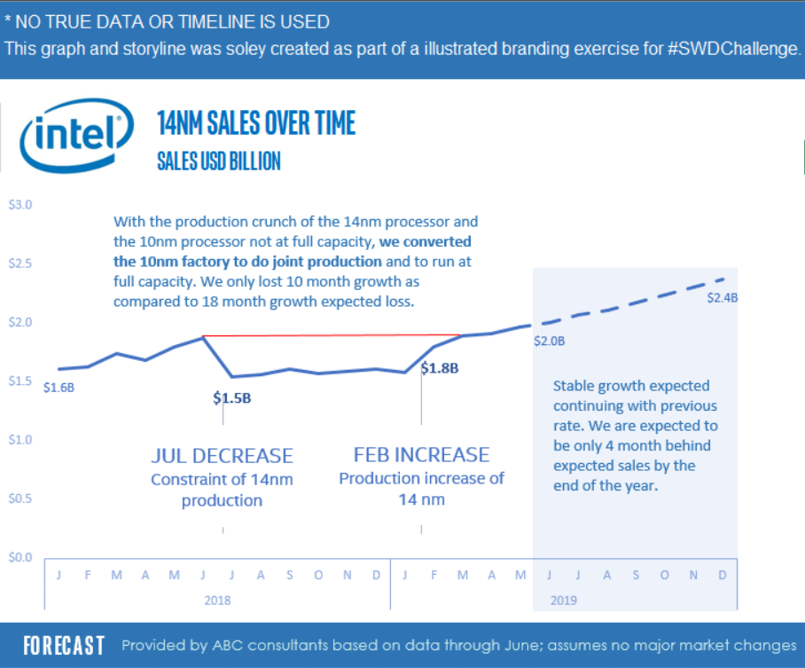
We were at full capacity in 14 nanometer processors production and the 10nm processor was not fully ready for full production. This lead to constraints for 14nm sales. The production team transformed one of the 10nm sites to coproduction which lead to a quicker resolve. NO TRUE DATA OR TIMELINE WAS USED
Ash
I decided to combine two data visualization community projects, #SWDchallenge (obviously) and #MakeoverMonday! In other words, I chose #MakeoverMonday (the book and site) as my rebrand and source of design inspiration.
Arthur
This month we were challenged to re-brand an existing chart and selected Subway who underwent their own identity rebranding in the past few years. The new brand introduced a new color scheme which was drawn upon and the distinctive arrows, which were continued over in the new design, were also leveraged. Research was conducted online and, since the new rebrand was extensively studied at the time, there was a lot of discussion to draw from. As the original chart shows a sales forecast, the arrow from the logo type was also incorporated into the chart to clarify that was a forecast into the future. A JavaScript charting library was used with range ticks to emulate the axis styling of the original chart with arrowed ranges to fit better with the more organic lines incorporated in the design of the Subway brand. Using a live chart enables the major points and transitions to be labeled on the chart while dynamic tooltips reveal the exact values of less significant data points on hover or tap on mobile. A heavier font was also used for axis to better fit the weight of the brand logo.
Ankit
Bira 91 is the Indian craft beer brand manufactured by B9 Beverages Pvt. Ltd. Inspiration was taken from their well designed website. The color scheme along and the logo has been taken from their website while rebranding the visualization.
Andy
Beer and dataviz? Well, why not? Brewdog are brand masters and have a really distinct style. Choosing the right saturation for the background was the biggest challenge. I had to iterate on several different versions. I don't think this brand style makes for a super-readable chart, but I like the way it looks. Now I'm off to my fridge to open a cold one!
Link
Allison
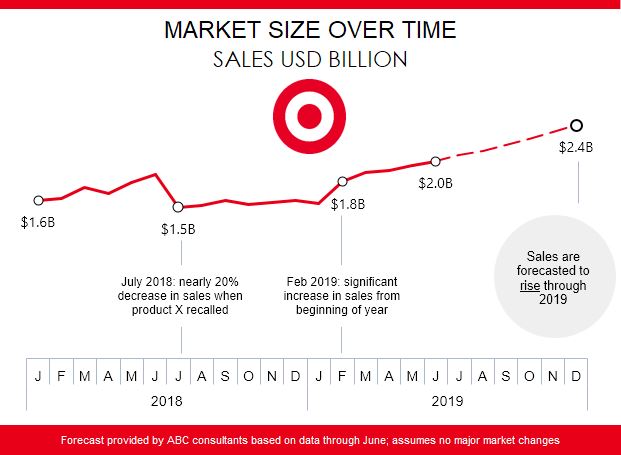
This was a fun challenge and it was also my first time participating. It is amazing how a few simple stylistic choices can really impact the branding and presentation. For inspiration, I looked at Target's website and noticed that they often provide information inside of a circle, so I incorporated that design into my submission with the forecast narrative. I tried to keep it visually simple and clean, utilizing Target's red, white, and gray.
Alexander
My aim was to use Sixt's unique and well known identity combined with their social media ads which usually refer to the latest developments in society and politics. Their font seems to be Helvetica, which I didn't have readily available so I went with "Bahnschrift Condensed" which - for me - looks like the original unless you compare them next to each other. In terms of colour, I picked the orange straight from the logo and kept it consistent with their brand identity by using black as the main font and white for the call outs.
Link
Adina
For the "rebrand it!" challenge I was influenced by many hours watching YouTube videos with my toddler, so I chose a Sesame Street theme. I made the data represent Elmo video views on YouTube, and changed the scale to millions, since that made more sense than billions. I attributed the dip in view count to a copyright dispute that restricted content in some regions. Then I found a Sesame Street font on (including the cool Sesame Street sign with custom text!). The font is very heavy and didn't work for anything but the graph titles, so I used Calibri for the rest of the text, since it is used on the Sesame Street website for their own content. I used the sign colors for the graph and created a border to mimic the sign. I added some "fun" elements to match the brand, such as Elmo explaining the forecast. I added the same data to the graph in a second series to create little "noses" on the data points. I think the overall look is simple and a little bit fun, as is fitting for the Sesame Street brand.
Adam
Such a fun one this month, I chose to re-brand my FAKE data in a VOGUE esk style. capitalising on the cosmopolitan elegance of the Didot font used in their branding.
Abhishek
Inspired by Nike
Click ♥ if you've made it to the bottom—this helps us know that the time it takes to pull this together is worthwhile! Check out the #SWDchallenge page for more. Thanks for reading!


