#SWDchallenge: makeover magic

“That’s not the best graph for this data.” 

“This is confusing.”

“I’d change the colors.”

“Toss it and start over!”

Have you ever found yourself reacting with any of the preceding or similar sentiments when faced with a graph or slide? Perhaps you’ve even thought to yourself, “I could do this better!” This month, I present you with exactly this opportunity.

Before sharing the example, there is one important point I would be remiss not to mention. When we critique and makeover graphs in the wild, we typically lack insight into the context and constraints faced by the original designer. For this exercise, I release you from these considerations—in fact, I welcome you to make assumptions liberally for the purpose of your makeover (please outline those you do make in your commentary). Outside of this exercise, however, please bear this facet of data visualization critique in mind and frame your approach accordingly (for more on this and related musings, have a listen to our very first podcast episode, the art of feedback).


The challenge

The remit this month is a simple one: consider the following data visualization and how you can make it better. Specifically, you might identify clutter to eliminate, reflect on an appropriate chart type, determine a specific takeaway to highlight, and perhaps even use this data as the basis of a more robust story. Show us all the magic of a great makeover!

Download the graph and data.

Share your creation in the SWD community by September 30th at 5PM ET. If there is specific feedback or input that you would find helpful, include that detail in your commentary. Please take some time also to browse others’ submissions, and share your input via comments and datapoints over the course of the month.


Related resources

Here are a few of our related resources. If you are aware of other great ones, please share in your submission commentary.

  • Watch SWD makeovers (YouTube playlist)

  • Read SWD makeovers (many more on our blog!)

  • Recognize this example? It’s a modified version of Let’s Practice! Exercise 8.6; you’ll find a plethora of makeover examples in the practice with cole sections of the book

#SWDchallenge: known to novel


“Just a handful of common visuals will meet the majority of your everyday needs.” This is a sentence I’ve said more than once when teaching people to create graphs that make sense in a business setting. That doesn’t mean that there aren’t situations that call for a more novel approach. It does mean that we need to be thoughtful in how we approach these scenarios when we are using the less familiar visual to communicate to others.

When I’ve needed to do this in the past, one strategy I’ve relied on is to show and explain the transition from known to novel. Let me illustrate.

In my new book, storytelling with you: plan, create, and deliver a stellar presentation, one scenario uses a bar chart to introduce a dot plot to a mixed audience in a live setting. Below is the initial bar chart.


After building up to the bar chart and explaining how to interpret it, I replace the ends of the bars with circles. This is particularly powerful live, when you see the circles appear over the ends of the bars.


When transitioning from known to novel in a live setting, it can be useful to focus people on a specific data point in the known view, and then use that to reorient your audience in the novel view. For example, I could call attention to the 8.1 overall liking score for the Original bar, and then call attention to the circle for Original in this latest view, which depicts that same score of 8.1.

I then collapse the three circles onto a single line so that I can layer on additional dimensions, eventually building up to the following dot plot.


I mentioned earlier that this progression comes from a case study used in my new book, storytelling with you. I’ll be delivering that full presentation live, and you can watch the worldwide premiere of it on September 22. (Premium members can see it sooner, and chat with me, one week earlier, in a special preview event on September 15.)

For another example, here’s a summary visual of steps Alex used recently to demystify the horizon chart:

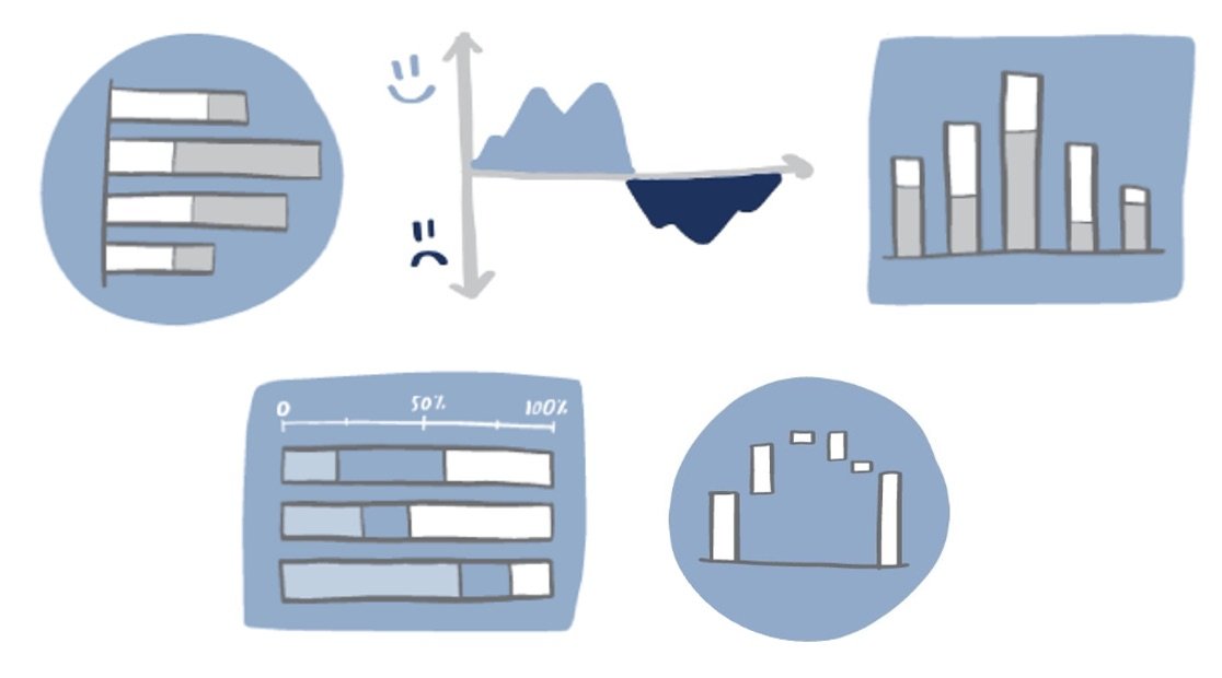
Alex also shares sketching as a strategy she uses to get from a standard graph to something new. You can see an example of this in the intro image to this post.

These are just a few examples. Consider how you might start with a typical stacked bar chart and move from that to a diverging setup or add a second dimension to a simple line graph to yield a connected scatterplot—there are so many possibilities!

The challenge

Identify and explain or illustrate the transition from a commonly known graph to a less familiar form. Feel free to upload multiple images if needed (similar to what I’ve done in the first example shared), or create a single view that shows the progression or transition (similar to what Alex did in the second example above). In the case where you upload multiple images, I recommend making the complicated or less-familiar visual the primary one. I’ll also suggest that you title your submission following this structure: From [insert name of common graph] to [insert name of less familiar varietal]. Following this naming structure, I’d title the first example I shared From bars to dot plot (don’t forget to tune in September 22nd to see me talk through it!).

Share your creation in the SWD community by Friday, September 30th at 5PM ET. If you need help sourcing data, check out this list of publicly available data sources. If there is specific feedback or input that you would find helpful, include that detail in your commentary. Take some time also to browse others’ submissions, and share your input via comments and datapoints over the course of the month.

Related resources

Here are a few related resources. If you are aware of other good ones, please share in your submission commentary.

#SWDchallenge: envision education!

 
back to school.jpeg
 

What comes to mind when you hear “back-to-school?” The crisp feeling in the morning air and the blank slate of a new academic year? The jittery anticipation leading up to the first day of school after a carefree summer? Seeing friends—or your crush—after a summer apart? Or maybe now you see things from the parent’s perspective: receiving your child’s classroom assignment, shopping for school supplies, seeing the schedule fill up with activities, or just feeling the passage of time. Looking at “back-to-school” through the lens of our careers, maybe it’s a reminder that we should be sure to carve out time for professional development in the coming months. 

Education means something very personal to each of us. It is also an important aspect of ensuring opportunity and improving quality of life. Your challenge this month is to find some data on education that’s compelling to you, analyze it, and create a visual that makes the “so-what?” stand out.

Rather than being prescriptive on a specific type of visual, this challenge is an opportunity to practice many aspects of effective data storytelling, including visual choice, color, and words. Let’s discuss these a bit more.

Visual choice means representing the data visually to easily enable the “a-ha!” moment of understanding. When you analyze data, you already know what’s interesting. To someone seeing your work for the first time, choosing an effective visual—whether graph, table or text—means you’ve enabled them to see what you already know is interesting in the data.. 

Color, when used sparingly, is one of your most strategic tools when it comes to the visual design of your data stories. Consider using color not to make a graph colorful, but rather as a visual cue to help direct your audience’s attention, signaling what is most important and indicating where to look.

Words make your data accessible. They’re the best way to indicate to your audience what you want them to understand in the data. There are some words that must be present in every visual: every graph and every axis needs a title (exceptions will be rare!). Don’t make your audience work or make assumptions to try to decipher what they are looking at. Beyond that, think about how you can use words to make the “so what?” of your visual clear through takeaway titles and annotations.

Here’s an example. I found some data cited in an article from The Roane County Reporter, my hometown newspaper in Spencer, West Virginia. The data compares high school students’ grades during in-person learning (2019 and early 2020) to distance learning implemented during the pandemic. 

Below you can see the progression from tabular data to making the takeaway stand out, through graph choice, adding color and finally, words. Notice how you immediately get the “so-what?” in the final visual. 

data visualization vs data storytelling.png

Next, it’s your turn! 

The challenge

Find some data of interest related to education, analyze it and create a visual that makes the “so-what?” stand out. Submit your creation in the community by Sep 30th at 3 pm PT. No need to show the progression like I did above; you can simply share your final product.

You have free range within the topic of education—most importantly, use this challenge as an opportunity to celebrate the importance of continuous learning in our society. If there is any specific feedback or input that you would find helpful, include that in your submission commentary. 

If you need help finding data, check out our list of publicly available data; or get inspiration from our February 2018 Education + Black History Month’s challenge and collaboration with data.world. You can also get ideas from other community members’ visualizations related to education: in the Search option, simply filter for “Education” as shown below.

filter.png

Related resources

Here are a few related resources (not a comprehensive list). If you are aware of other good ones, please share in your submission commentary.