recapping radials
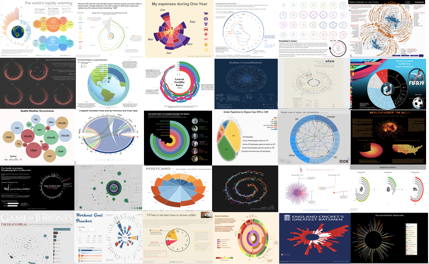
A sampling of radial chart submissions received this month
This month’s challenge was to find a dataset that makes sense to visualize in circular form—including but not limited to chord diagrams, coxcomb charts, polar area diagrams, spider charts, or sunbursts—and share what you learned about the process. We received over 50 examples of radial charts, with topics including exercise, climate change, activities performed during a 12 or 24-hour period, and music as the Tableau community recently finished creating 2019 Iron Viz qualifiers.
Participants were largely united in their evaluation of this challenge—finding a subject that fits a circular view is hard! Even harder was evaluating whether the final radial graph was effective at all. Many were quick to point out that they’d be inclined to choose a different type of graph, but appreciated the spirit of the exercise and realized they had learned something in the process. Our intent with the #SWDchallenge is to give the community a platform to practice trying something new in a low-risk environment. While this challenge seemed to push most of us outside of our comfort zones, that discomfort itself is immensely valuable for what it teaches us about our work and ourselves. Without experimentation, we never discover what unexpected approach might be applicable in an uncommon setting, or what technical skills we might enjoy developing. Conversely, it also gives us insight into what attempts are better suited for the intentional discard.
The key lesson from this month is that is that evaluating our own work can be a challenge—particularly when designing graphs for someone other than ourselves. In our workshops, we demonstrate one technique to step outside of your own head: solicit feedback from a friend or colleague. Show them your visual and have them talk you though their reactions. To which elements do they pay attention? What questions do they still have? This feedback process gives valuable input if your graph is working as you intended—and where to focus your rework if needed.
While radial charts may be aesthetically pleasing—humans are naturally drawn to circles and curves—circular visuals are often in conflict with the effective communication of data. If your goal is an attention-getting chart (without much concern over whether the data gets transformed into knowledge or action) then a radial chart may suffice. But keep in mind that you are more likely creating visual art than effective data visualization.
For those of you who did submit examples, THANK YOU for taking the time to create and share your work. The entries below are posted in alphabetical order by first name. If you tweeted or thought you submitted one but don't see it here, upload your submission as a .png here and we'll work to include any late entries this week (tweeting on its own isn't enough—we don't have time to scrape Twitter for entries.)
The next monthly challenge will launch on August 1st. Until then, check out the archives of previous challenges on our #SWDchallenge page. Happy practicing!
Adam
Showcasing a Radial Bar chart for this months SWDChallenge, deciding to present Michael Jackson's UK Peak charting singles positions, data sourced from Official Charts.com
Blog
Adina
I used the data from FiveThirtyEight's Halloween candy ranking story to create this sunburst diagram. The original story included a regression analysis of each candy attribute (chocolate, fruit, crispy, etc.), but the sunburst diagram allows the comparison of different attribute combinations, not just each one separately.
Allison
At first, I wasn't sure if I would attempt this month's challenge because I was nervous about creating a radial visualization. As someone who only opened Tableau for the first time in February 2019, is entirely self-taught, and hasn't thought about trigonometry since high school, I knew I had some work to do!
I began by considering what types of visualizations lend themselves well to this type of view. I tend to almost always err on the side of a simple bar chart to convey the big idea, but I decided to keep an open mind. I also wanted to tell a story about something that would be relatable and interesting. That’s when I thought about climate change. I realized that if I look at global warming over time, I could use a radial visualization to see interesting spikes and trends. I read through a bunch of tutorials and practiced creating radial charts (Kevin Flerlage’s tutorial was especially helpful). I’m not naturally the most mathematically inclined, so I spent way too long playing around with the radius, but I finally made it look right!
Past the radial viz, I wanted to provide a context of what this means for the world currently as well as in the future. I researched implications for continued warming of the world and shared outcomes that scientists think are likely if we reach a 2 degree Celsius warming. I also shared steps individuals can take to help combat climate change (however I really think governments and corporations need to make changes as well). Overall this was a fun challenge that helped me acquire lots of new skills!
LINK
Amanda
Radial charts proved to be a challenge for me, but I appreciate this blog pushing me to try something totally new. I am a sports fanatic, so when I found QB data online, I was excited to put it to use.
Anand
This is a network visualization connecting Directors and Companies in the Tata Group (public information). When the network stabilizes, it is interesting to see that it neatly segregates into two groups of companies. There are many common directors, but the network is clearly split. This was quite an interesting pattern to see.
Andy
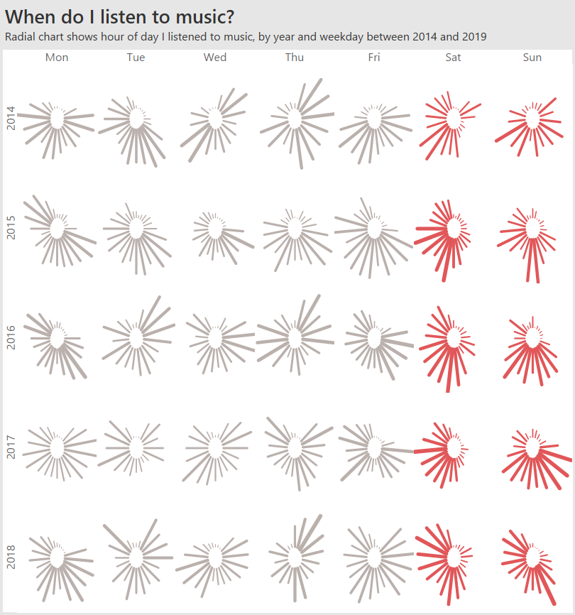
Great fun. I've never built a radial chart before. I took 5 years of my music listening data and started with a matrix of Weekday/Year. In each cell, I drew a radial bar chart - one bar for each hour in the day. The longer the bar? The more tracks I listened to. I'm pleased with the outcome, but the static version is not readable. I could add some clever annotations to help. The interactive version does allow for insight. I added highlighting and a tutorial overlay to assist the interactive explorer. A bar chart version is way more readable, but even I have to admit the radial version is more appealing to the eye!
Blog
Angie
I was inspired by the Rhythm of Food example to look at how food interests change over time. Non-dairy milks are of special interest to me as my daughter has a milk allergy and will soon be at the age where she *would* be moving on to cows milk, but we will need to find an alternative, and I also am trying to better understand the environmental impact of the different non-dairy milks. Oat milk seems to frequently be out of stock at my local Whole Foods so it was no surprise to me that it was a very hot "milk" in terms of search, but I did not realize it was nearing the same level as soy milk. I did find the Dec to Jan spike across all milks quite interesting and unexpected. I used Excel to create the chart.
Arthur
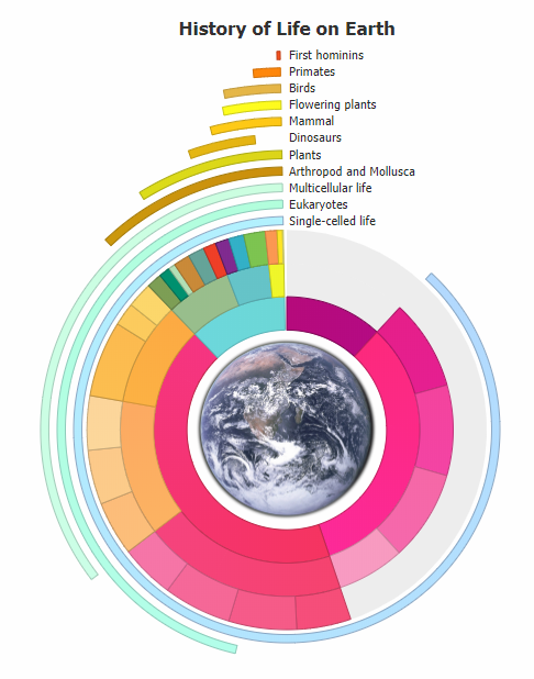
Radial charts include many different types of of charts and I selected two of them for this challenge: the radial bar chart and nested pie chart. A radial bar chart, also known as a circular bar chart, displays the history of life on earth and provides context of the relative time periods for each form of live. The nested pie chart, rendered as a donut chart to display the earth image within, outlines the specific time periods and eras in which life came to be. Combined, they form an infographic where the sum of the parts not only convey the data, but also together represent the earth as it's own circular chart visual. The chart has been kept clean of labels and utilizes dynamic tooltips to show additional information the viewer is interested in on hover or tap. You can view the live radial chart to explore this interactivity directly.
Brian
Maximum duration of western hemisphere eclipses for years 2000-2099 grouped by month:
Catherine B
It was hard for me to find a subject with data that could be well represented with a circular chart. I had to search for a long time. I think that they can be used only few times: insights will rarely be best represented with those kind of charts. Here, I chose a pie chart. Yes, a PIE CHART! Even if billions of people think we should never use them. In this particular case, I believe it was appropriate because I added a clock to make it clear that we are talking about a moment of the day. Not only the pie chart shows part of a whole, but it also represents a specific time of the day. Did I convince you to sometimes use a pie chart? I have to give credit to Udemy for this helpful video. Ok, let's drink a coffee… but only if it is between 9:30 am and 11:30 am !
Interactive viz
Catherine W
I used R to create a circle packed chart showing the breakdown for different weather patterns by season in Seattle. Larger circles indicate more of that weather pattern.
Blog
Chris
Finding a subject was a real challenge, I'm not a big fan of radial charts and forcing something to be radial for the sake of it seemed wrong. I used time in the end because it felt the most natural. Others have commented on how difficult it is to represent a 24hr clock in a single circle - I opted to stick with 24hrs in 360 degrees due to the difficulty of visualising the data any other way. I'm not sure how easy the chart is to interpret but I love the patterns and visual appeal of the result. I think this appeal overrides a lot of the downsides of the radial chart and the difficulties in reading it.
Link
Claire
Although I was intimidated by this month's challenge (I'd never plotted data on a radial chart before), it ended up being a textbook demonstration of the benefits of data viz. I chose a dataset at random (Chicago public transportation ridership for 2017) and plotted the values. They were disappointingly consistent over the course of the year, which made for a pretty boring radial chart. I decided to instead plot the percentage change in ridership (compared to average weekday and weekend values), and I was excited to see that the chart - and the data - were suddenly much more interesting! I could see the outliers, and I could point to them to tell a story about what was happening in Chicago in 2017.
Link
Daniel
I used Tableau to visualize the major killer / victim combinations across the entire Game of Thrones 7 seasons. Each dot represents a unique Killer and victim combination and is sized by the actual number of deaths for this combination.
Dennis
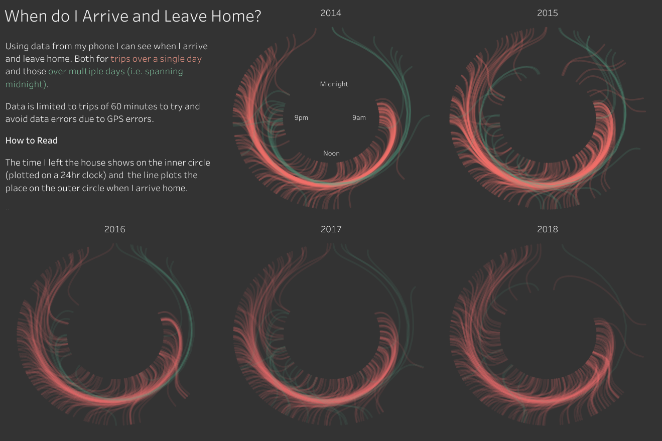
The idea for this visual was born about two years ago at one of my customers. At that time the idea didn't work out the way it was supposed to, but I think it does now. Having data that never takes more than 60 minutes (the thing that went wrong 2 years ago) makes it easy to read the results. To make sure the attention is focused on today I use gray colors for all other parts.
Link
Eddie
A prototype of a radial view to display the sister city connections.
Edwin
I created this radial graph just to show the different eras of Boy Bands throughout the years. Each line on the graph represents a single boy band and the length of the line represents how high their peak song got on the billboard charts. I intentionally distorted the order of the chart to switch up on the coloring of the chart for an aesthetic look but serves no purpose in helping the chart overall.
LINK
Ela
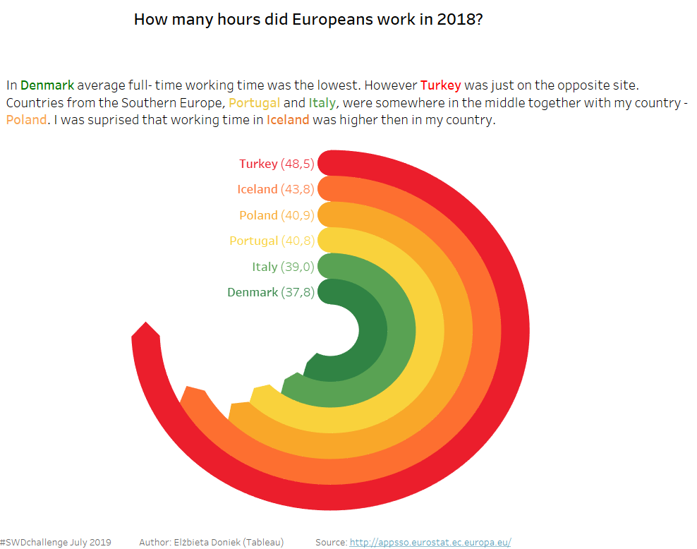
I wanted to find out if there was any correlation between geographical orientation and working hours for European countries in 2018.
Interactive viz
Elvira
I wanted to compare amount as well as categories of my expenses in each month. The data starts from July 2018, that's why January is not on top :)
Franck
It is a remake of a dataviz featured in Visual Capitalist's article Animation: Global Population by Region From 1950 to 2100, which was inspired by geographer Simon Kuestenmacher. For this remake, the main idea was to make it more connected to our Earth (as I found the original pie chart and bar chart lacking this feeling). So I use a disk. The increase of this disk encodes the increase of the global population over years. In this disk, the area of each cell encodes the population of its corresponding region.
Link | Source article
Frans
Short of time creating a brand new radial dataviz for this months #swdchallenge, so I tweaked my 'Does size matter' viz slightly.
Georgios
I find concentric circles fascinating and the first thing that came to mind was to make something that would look like the rings in the Apple Watch activity app.
Link
Hanna
During the #MakeoverMonday with game of thrones data I came up with an idea of creating radial bars - each bar representing a single episode in the series - that I could then place around the throne. In a way the bars would be an extension of the swords that the throne is made of. I'm not sure this qualifies for the challenge as it is not fully radial, but I thought this method fitted perfectly with the topic.
Hesham
This is my first SWD challenge submission. This visualisation made in Tableau and the data preparation was made in Alteryx. It allows the user to interact with the visualisation by clicking on their Zodiac sign, doing so the user get to know the history of their sign and when they are most likely to see their constellation and also how their constellation looks like.
Interactive viz
James
A radial stacked bar chart looking at English Cricket's Greatest batsmen - I love radial charts!
Link
Jared
The inspiration for this viz comes from the many hours I've spent playing Tekken 7 with my daughter during the school holidays. It turns out she's a bit of a natural!
Link
Jerome
My utilization illustrates the number of pickups throughout the year of 2016 based on all 365 days, and the 24 hours within those days.
Johanie
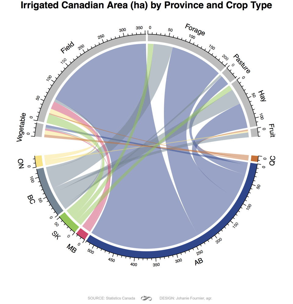
I made my first chord diagram with R for this challenge. I used Statistic Canada data for irrigated area. It's not so easy to play with the aesthetics for this type of graph because it's doesn't work as ggplot but it still possible to do something good. Code is on my blog.
Kate
I was excited at first by this challenge, then after a few days felt uninspired. Lucky for me R.J. Andrews of Info We Trust’s weekly data viz inspiration email hit my inbox on July 3rd, and I found the spark. (If you haven’t signed up for these yet- highly recommend, they’ve all been delightful). R.J. highlighted a chart authored by Thomas Jefferson which displayed the fruit and vegetable availability of a local Washington D.C. farmers market from 1801-1808. I re-designed this into a radial viz and added modern seasonal availability data of the vegetables Jefferson recorded. I had fun learning about some of the veggies that have fallen out of “fashion” and playing around with 19th-century design elements. I write more about my lessons learned in my blog.
Lance
I found this challenge particularly difficult. I am not sure what other platforms are like creating radial charts but I use Tableau and I found creating this type of chart in Tableau a little convoluted! While I appreciate my entry is not as aesthetically pleasing as pretty much all of the examples provided, as a first attempt I am relatively happy. Despite the difficulties it was a great learning experience completing this challenge and well that's what this process is all about!
Leah
I believe time data plots well in a radial graph representing a 24-hour analog clock. I used Seattle collision data to create a high-level view of accident trends throughout the day. I experimented quite a bit with use of color, finally deciding to let the graph (and white space) speak for itself. This plot was created using R.
Ligia
The chart was done on PowerPoint to demonstrate that the data visualization techniques can be used in all tools all the time. The charts show in a simple way how unemployment come impacting the Brazilian people.
Link
Lisa
For this month's challenge, I was fortunate to find quite a few helpful blog posts and video tutorials on building radial charts in Tableau. As I was getting happily lost in the learning process, time was running out, so I kept the challenge simple by creating a radial bar chart. I chose to tell a clear story about the inequality of life expectancy of women around the world. Although not a chart I typically use, I can now see how radial bar charts can work effectively to catch the eye and attention of an audience.
Link
Liz
I had done this type of visualization only once before, so it took me some time to find data that would fit. I decided to focus on international travel since I recently traveled to France and the Netherlands. I found this information from the US Travel Association and used Tableau to make the visualization.
Lori
For this month's challenge, I tried to think of data that naturally occur in circles. I thought of a clock face, and then located some data about toddlers' sleep times. I don't really have fancy data viz technology, but I created this in Excel + PowerPoint. If someone had the technology, I think it would be awesome to be able to hover to see the specific sleep and wake times.
Link
Matthew
One of my favorite video games is FIFA. This visualization is a breakdown of my favorite team MN United. I have never used Sunburst charts, and am not a fan of Pie or Donut. This did take me out of my comfort zone.
Michael
This is my first #SWDchallenge. I was crunched for time but wanted to give it a go. I have never produced a radial chart before so a lot of time went into learning a new technique in Tableau. My story telling suffered as a result but excited to continue to improve my SWD skills.
Neil
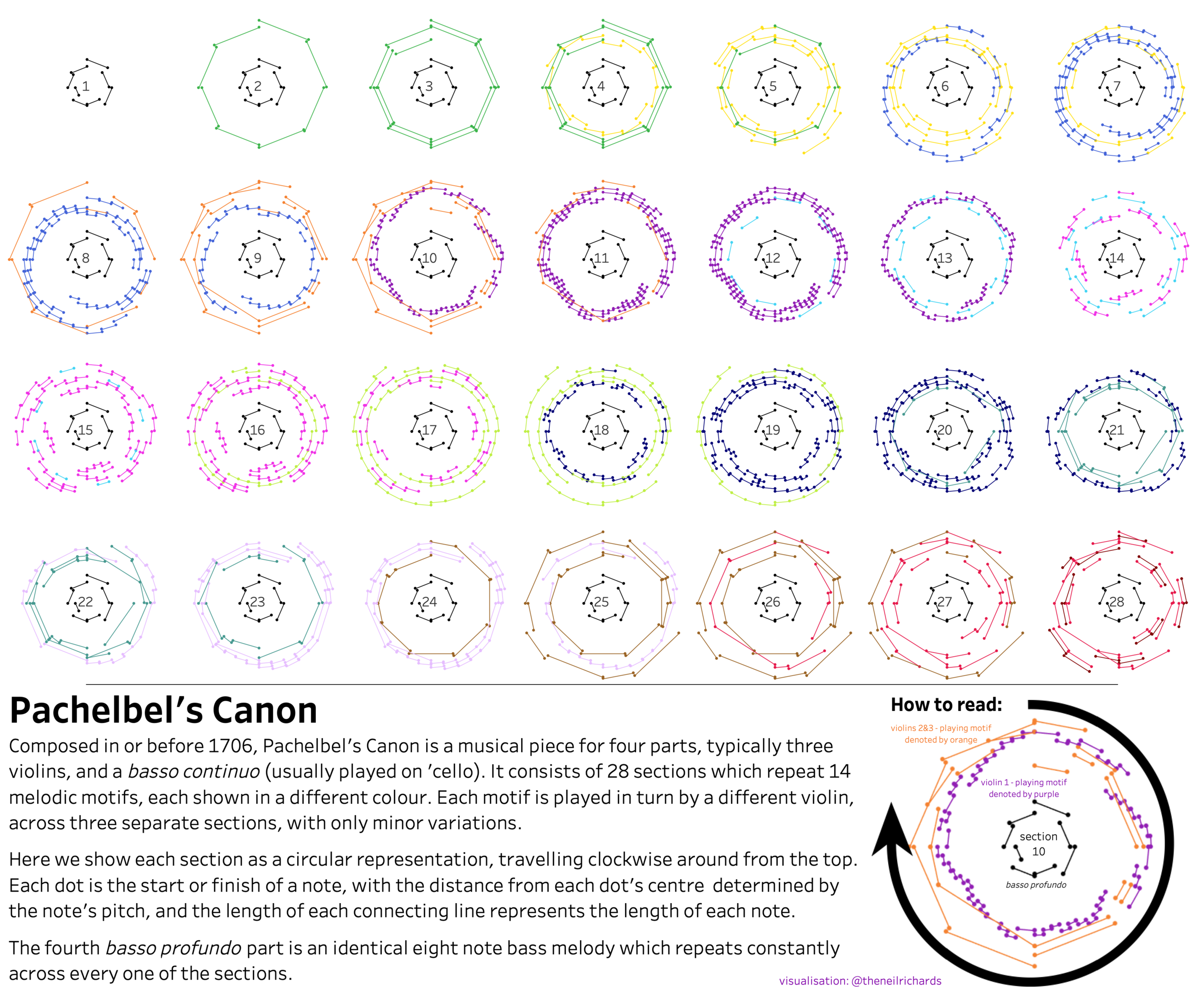
I wanted to combine visualising music with a radial chart - given the cyclical nature of Pachelbel's canon there are so many ways I could do this. In the end I settle on this small multiple version visualising each of the 28 sections - we see how the motifs change and follow each other in sequence while the basso profundo part never once changes.
Interactive version synced with music | Website
Pris
Heartbreak can feel endless cycle --Wake up, feel, think too much, and repeat. I chose to rework an old side project mapping out how often the heartbroken consulted their modern day seer, Google. Using Google Trends data, I tried to recreate the somber time loop experience using a radial bar chart. Through the accompanying line chart, bar chart and text, I wanted to highlight the spikes in searches occurring throughout the day.
Rahul
This was a chart built by me a year ago. I saw this chart on Tableau first by Adam Crahen (@acrahen) and Robreto Reif (@robertoreif) article helped me to create this chart.
Interactive viz | Data source | Website
Robert
I decided to first look at nice circular graphs and which requirements they would pose for the data. I saw a very nice circular graph in the rawgraphs gallery, made by Frederik Ruys called The rise and flow of political parties. It was so nice that I immediately decided to go with that type of graph. I soon found out that rawgraphs does not offer this as a standard graph. They have a standard bump chart which is horizontal and you have to make it circular yourself. I think in the future rawgraphs will offer it as a standard graph type, it definitely should be. After that I looked through Gapminder for a dataset. As I was kind of in a hurry I decided to go with the first dataset that would meet the requirements posed by the chart, which was the fertility dataset.
Romina
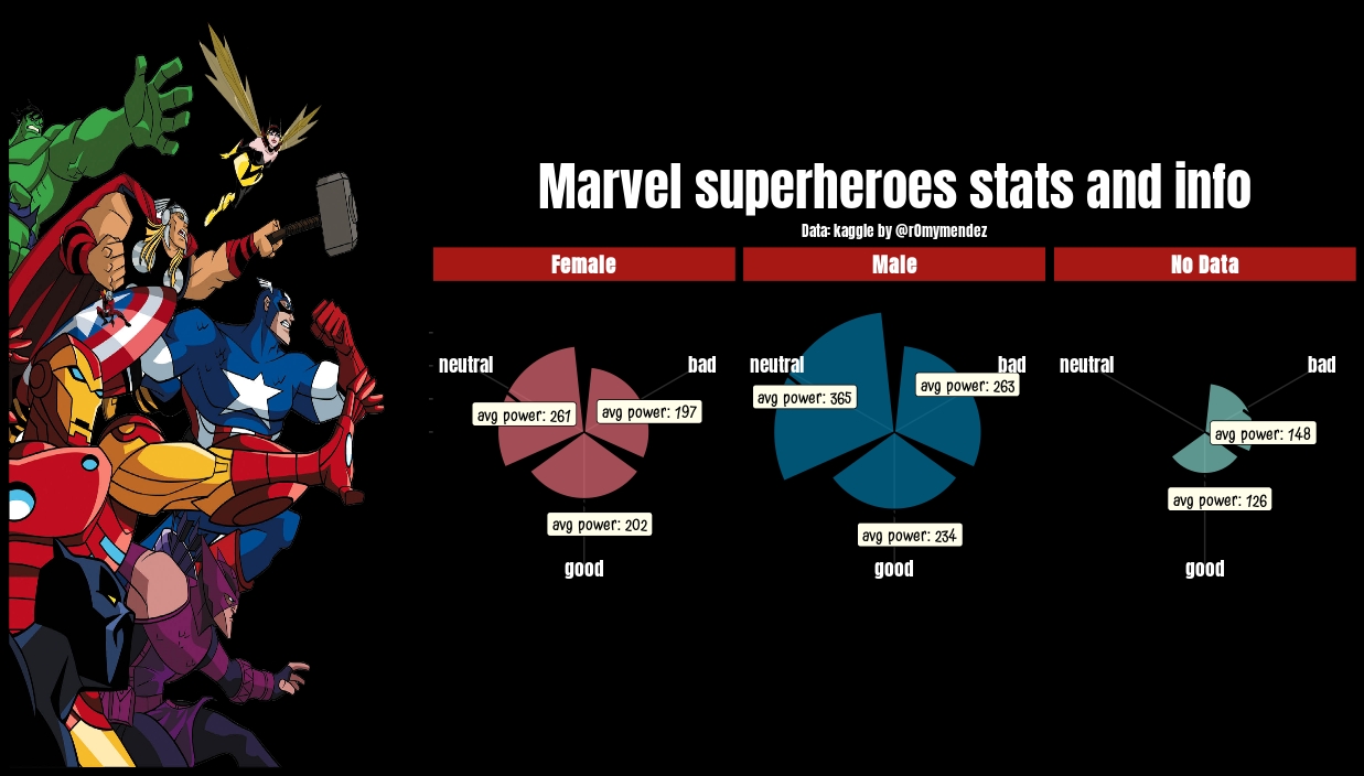
Marvel superheroes stats and info, it is a visualization about the characters.
Website
Samo
Visualization for all on-screen kills across eight seasons of Game of Thrones where I choose a radial chart to communicate seasons total kills and episodes break down.
Sebastián
Simon B
For my radial viz I decided to encode country and winners through a sunburst and then when titles were wine through radial circles, sized by decade titles. My aim was to show when players and countries dominated the Wimbledon Championships.
Interactive viz | Website
Simon R
Used inspiration from a blog by Bora Beran to have a go at a Coxcomb chart showing average monthly minimum and maximum temperatures for the city of London. Quite a steep learning curve and need to go back and drill into all the table calcs to create it but pleased with the look.
Vasa
A makeover of a segment of a visual story done in 2013, this time focusing on time spent online in our learning management system. It aims to show that e-learning helps students engage with the material even after class time.
Link | Data source
Vijaya
Kiva.org is an online crowdfunding platform to extend financial services to poor and financially excluded people around the world. The radial bar is one of the apt charts for visualizing the loan sanctions by the Kiva organization based on the sector of the loan borrowers. This representation of the data gives a bird-eye-view of the most and least sectors that has loan approvals. Data Source Credit: kaggle
LinkedIn
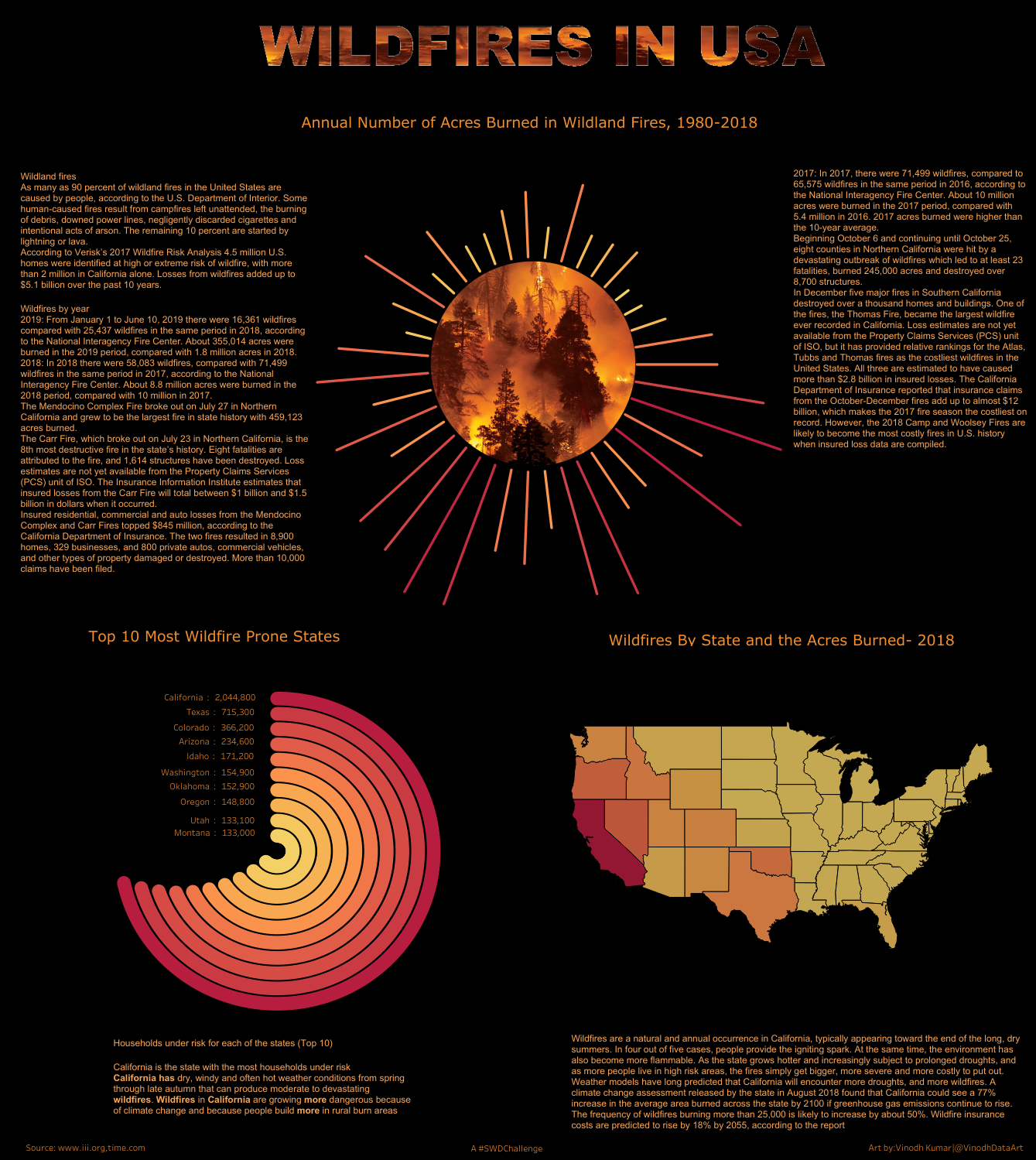
Vinodh
A look at the wildfires in USA from 1980-2018. California is the most wildfire prone state and 90% of it is human triggered.
Yvan
I made this visualization few months ago to track my yearly distance goal, by month and by week. Interactive visualization
Zak
This viz represents daily temperature, precipitation, and severe weather events between June 1, 2017 and June 1, 2019. I downloaded data from the Brackett Creek SNOTEL station in the Bridger Mountains outside of Bozeman, MT. This visualization was created entirely in R.
Click ♥ if you've made it to the bottom—this helps us know that the time it takes to pull this together is worthwhile! Check out the #SWDchallenge page for more. Thanks for reading!
