what is a slopegraph?
This article is part of our back-to-basics blog series called what is…?, where we’ll break down some common topics and questions posed to us. We’ve covered much of the content in previous posts, so this series allows us to bring together many disparate resources, creating a single source for your learning. We believe it’s important to take an occasional pulse on foundational knowledge, regardless of where you are in your learning journey. The success of many visualizations is dependent on a solid understanding of basic concepts. So whether you’re learning this for the first time, reading to reinforce core principles, or looking for resources to share with others—like our new comprehensive chart guide—please join us as we revisit and embrace the basics.
A slopegraph looks like a line graph, but with an important difference: there are only two data points for each line. This might sound like a small distinction, but in practice it means something important: that we can compare two categorical variables, which we couldn’t normally do in a regular line graph.
How does a slopegraph work?
When we use slopegraphs, we are trying to show one specific thing: is the value in the first column higher, lower, or the same as the value in the second column? That change is easy to see when we connect those values with lines, because the lines will slope up or down, in the direction of the change.
The steeper the slope, the bigger the change; and, if one thing is going up more dramatically than its neighbors, a slopegraph will make that easier to see than a traditional line graph would.
What kind of data can be used in a slopegraph?
Slopegraphs can be used with either continuous data or categorical data.
For slopegraphs that show a beginning and end point in time, it shows how values have changed over the intervening period.
For slopegraphs that show categorical comparisons, it shows which data series are markedly different across the two categories, and in which direction.
Continuous data: highlighting change over time
A line graph with multiple series, each measured at multiple points in time, can quickly become visually cluttered. If the values in each series tend to fluctuate over time, the noisiness in the graph can obscure overall patterns of growth or decline. When you’re more interested in communicating “change over time” rather than each individual time period’s variations—or if you want to emphasize one particular series that is rising or falling notably, compared to others—a slopegraph is an option to consider.
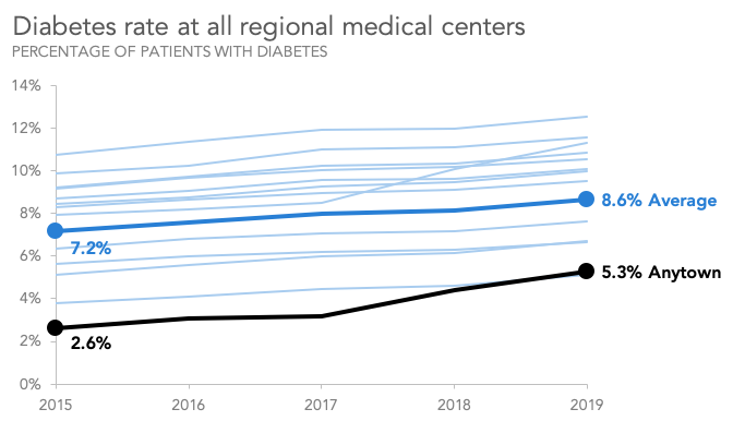
For example, take this line graph of diabetes rates at medical centers in our area.
Each line represents one of our region’s thirteen medical centers. Our region, Anytown, had one of the lowest patient diabetes rates in the area for the past five years, but it seemed to tick upward notably between 2017 and 2019.
A slopegraph can help to call that out more obviously, and can point out which other centers had a similar increase.
Categorical data: highlighting differences between two categories
When we compare two categories that have a common scale, a slopegraph can be an excellent way to show how things compare across those categories.
Imagine, for instance, that we work for a movie studio. We released six films in 2019, and we want to compare the overall audience ratings of these movies with the ratings of people in the key 18-34-year-old demographic. We could show these results as paired bar charts:
This view certainly makes it easy to compare the ratings of the key demographic to the overall ratings within a single film, but a slopegraph would make the differences across the entire slate of films more obvious and prominent.
(We can also “zoom in” to see the detailed differences between each category, because slopegraphs, like line charts in general, do not necessarily have to start with a zero baseline; bar charts do not allow us this flexibility.)
What are some reasons not to use a slopegraph?
When working with continuous, time-series data, it’s important to remember that slopegraphs, by design, show the difference between a starting point and an ending point ONLY. We are thus excluding any and all data from the middle part of our time period. If that information provides essential context, then using a standard line chart would be a better choice.
Slopegraphs are not the best choice for categorical data when there’s no real connection between the selected categories. (That’s when slopegraphs wind up looking like piles of dried spaghetti dropped on the floor.) An ideal categorical slopegraph uses related (but not necessarily causally related) categories.
One last caveat is that slopegraphs, like all line graphs, are primarily meant to emphasize the change between two values, or the comparative rates of change across several series—not the absolute quantities of those values. Use a bar chart if it’s important to convey that your sales grew by precisely 20% or $300,000; use a slopegraph to show that your sales went up faster than your competitors’, or that they increased while other offices’ sales decreased.
Where can I practice or see more slopegraph examples?
Make some of your own, in whatever tool you’re most comfortable. The storytelling with data community would be a great place to start! Try any or all of these quick exercises:
If you’d like to see some creative takes on slopegraphs, check out this #SWDchallenge, which was all about this particular chart type.
You can continue your journey through our full what is…? chart series, by browsing other common visuals like lines and pies, or explore our comprehensive chart guide page for additional chart types.


