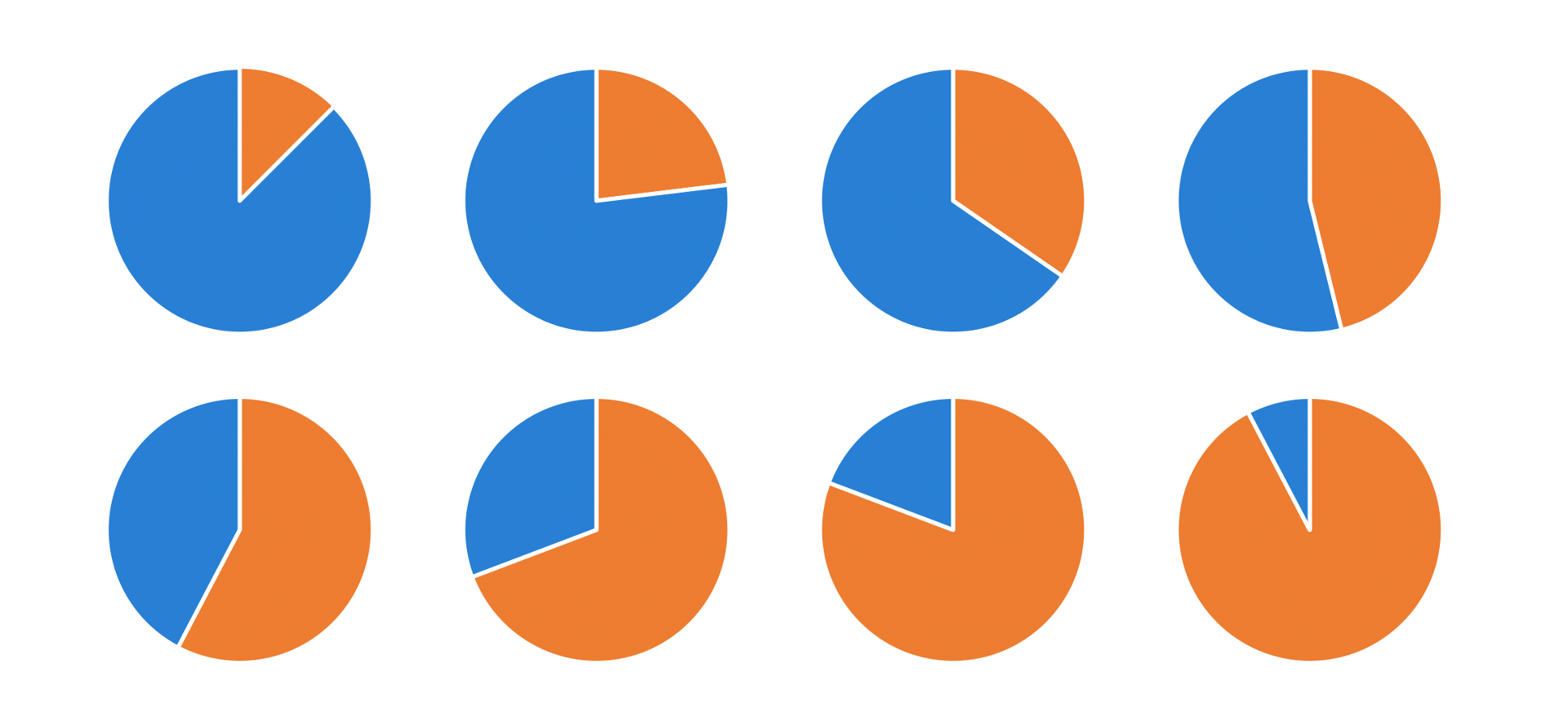
#SWDchallenge: make a perfect pie
It may surprise you to see a pie chart challenge from storytelling with data. Pies are one of those people-love-to-hate ‘em graphs. I’ve had my own mixed relationship with them over the years, from declaring “death to pies!” to yielding to constraints that might just make a pie a tenable choice. The common condemnations of pie charts are mainly due to instances of poor use. If we denounced every type of graph that gets misused, we might never visualize anything again!
Nearly every graph has a perfect use case—including the pie. And so (with short and simple prelude) that is the challenge I pose to you: identify a perfect use case for a pie chart and make a great one. You can read up on what makes a good pie chart and see examples in our recent what is a pie chart? article and will find more in the related resources section below.
If you’ve been following the SWD challenge but haven’t yet participated: this is the month to start! Keep it easy, make a nice pie. If you’ve been doing challenges regularly to push yourself, you can certainly do so with this topic, too. We welcome you to get creative in how you use the pie (though perhaps a bigger challenge would be to embrace the straightforward form!).
the challenge
Find some data of interest that will lend itself well and create and share a pie chart.
If you need help finding data, check out this list of publicly available data sources. For this particular challenge, we also welcome you to generate simple data (for example, something generic like percent sales by region), please include a footnote that makes this clear.
Share your creation in the SWD community by August 31st at 5PM PDT. If there is any specific feedback or input that you would find helpful, include that detail in your commentary. Take some time also to check out others' submissions and share your thoughts via comments and datapoints over the course of the month.
related resources
Here are a few examples and resources to point you to related to pie charts (not a comprehensive list). If you are aware of other good ones, please share in your submission commentary.
An Illustrated Tour of the Pie Chart Study Results (Robert Kosara)
F**k it, let’s use pie charts (Jon Schwabish)
1801: pie chart on An Interactive Timeline of the Most Iconic Infographics (RJ Andrews)
Understanding Pie Charts (Robert Kosara)
When Pie Charts Are Okay (Seriously) (Ann Emery)
Why humans love pie charts (Manuel Lima)
Historical SWD posts: what is a pie chart?, how to make a better pie chart, an updated post on pies, 45 pie charts—never say never… (in light of our topic, and to present a more balanced view, I’ve intentionally omitted the historical blatantly anti-pie posts)
I look forward to seeing some phenomenal pies this month!
