#SWDchallenge: build a table
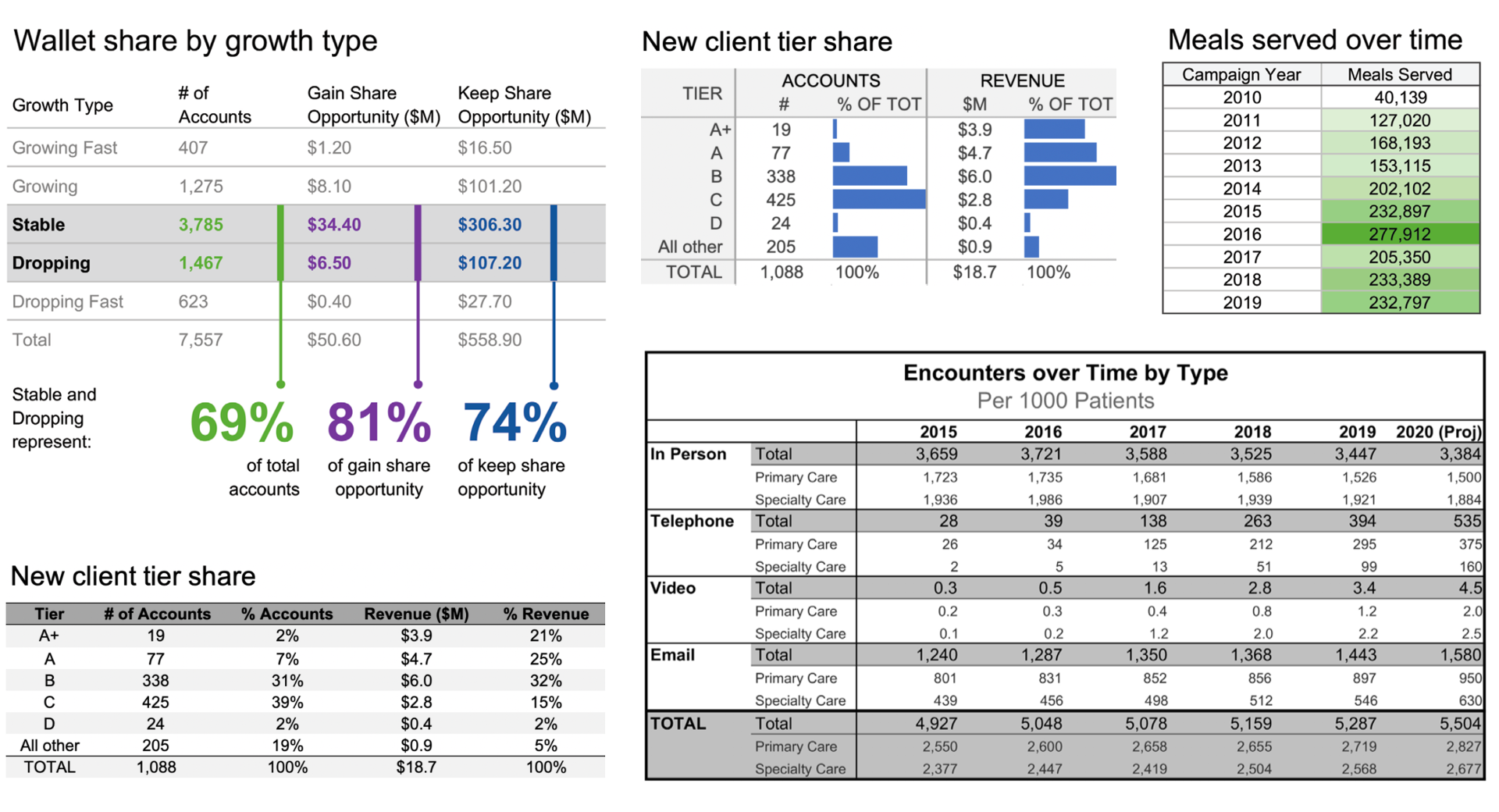
Tables can be a great way to structure information. When we first summarize and aggregate data, it’s not uncommon that we put it into a table. Reflecting back on my youth, I can recall making tables in early science courses (before I can remember making graphs) to record the results of experiments. More recently, in projects at home with my own kids, we organized the data we collected in tables as a step before we visualized it. Tables appeal to the organizer within me: with columns and rows, we can make everything line up nicely, sort appropriately, and title and label to make the contents clear.
Tables haven’t historically received a lot of love from storytelling with data. There are a mere handful of posts that laud them (listed in the Related Resources section below). In workshops, we often advise against the use of them in a presentation (people stop paying attention to the words you are saying as they read and process). When we encounter a table from a client, we generally remake it into something else.
We steer people away from tables because visual information (graphs) is typically faster to process than verbal (tables). However, speed of processing is not the only possible goal. In some cases, there is simply more information than a single graph (or even collection of graphs) will be able to effectively display. Tables can work well when you need to show multiple units of measure together, if you’re communicating to a mixed audience who each wants to see their specific row or column of interest, or to drive a conversation where it’s important to talk through things line by line.
When it comes to table design, there are a few questions worth asking yourself:
Is the table organized in a way that makes it obvious how I want people to use it?
Are the rows and columns easy to distinguish? Can I make design choices that encourage people to read the data either vertically or horizontally?
Is the text in the table aligned in a way that makes it easier to understand?
Is it clear how the data within the table relates?
Where will the audience’s attention be drawn? How can I make it clear where I want people to focus or the relative order in which they should process the information?
We plan to follow up with a more robust post on tables later this month, so stay tuned for that. Feel free to share your table best practices in your submission commentary.
What I’ve outlined here are simply a few common use cases we see in a business setting—there are certainly other reasons to embrace tables, too, and I look forward to seeing them illustrated through your challenge submissions.
the challenge
Find some data of interest that will lend itself well and create and share a table.
Per usual, feel free to take liberties with this edict. While my commentary has focused mainly on numeric tables, your table need not plot data—there are other types of information that can be structured in a table as well. Redesigning an existing table to improve it would be another twist that would be welcome. If you’d like to incorporate visual components within your table, that works, too. Or you can stick to the straightforward and design a great, simple table.
If you need help finding data, check out this list of publicly available data sources.
Share your creation in the SWD community by September 30th at 5PM PDT. If there is any specific feedback or input that you would find helpful, include that detail in your commentary. Take some time also to check out others' submissions and share your thoughts via comments and datapoints over the course of the month.
related resources
Here are a few examples and resources to point you to related to tables (not a comprehensive list). If you are aware of other good ones, please let us know in your submission commentary.
Data Looks Better Naked: Data Tables (Darkhorse Analytics)
Design Better Data Tables (Matthew Ström)
Historical SWD posts: tables that make sense, grables and taphs, visual battle: table vs graph
I look forward to seeing a ton of tables this month!
