your graph skeleton shouldn't be spooky
As I write this, it’s mid October. I’m looking at my neighbor’s lawn, and it is covered with vampires, mummies, ghosts, goblins, and most of all: skeletons. Obviously, it’s meant to be fun for Halloween. Sort of pretend-scary. But there’s another place where skeletons should NEVER be scary: in our graphs.
My colleague Alex was the first person I heard refer to the underlying structure of a graph as its “skeleton.” This includes all the features that give form and shape to your graph, but that ideally—like bones—we never even really notice or see. The skeleton frames and structures our graph, but doesn’t include the data itself.
If we don’t take the time to organize the skeleton of a chart thoughtfully and intentionally, our data won’t be appropriately supported. To an audience, something will always seem a little bit amiss.
Here’s a chart with a very spooky skeleton:
I’m REALLY noticing the bones here. The skeleton is so distracting, I can’t pay attention to the data or the message. The gridlines are overwhelming, making the legend and the data series barely legible. Our axes have diagonal text, lots of extra zeroes and duplicative information, and an absence of helpful titles. The chart title could stand some changes in color, positioning, capitalization, and word choice.
let’s fix this skeleton
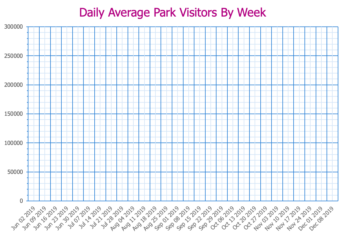
First, I’ll remove the data, so we’re just left for now with a pile of bones.
There are nearly 100 gridlines here, and that’s about 100 too many. We see this sometimes when designers are trying to mimic old analog graph paper. It’s fine as a visual metaphor, but practically speaking, it’s clutter. Getting rid of gridlines, and replacing them with muted axis lines, is my first step in putting my skeleton back together.
Next, I’ll clean up my x-axis by removing the repeated “2019” and rotating my text to be horizontal, and I’ll add an axis title to make it clear what we’re showing.
The numbers on the y-axis can be simplified by showing them as thousands. I’ll also add an axis title to reflect that. The tick mark intervals can be closer together, maybe every 25,000 visitors rather than every 50,000; my preference is to minimize the number of gaps between tick marks, as long as the intervals are logical and the text doesn’t feel too cramped.
The last thing to change is the title. I’ll make it left-aligned (to help frame the chart more), sentence case (so that it’s easier to read), and a neutral color (rather than the same reddish-purple as my “in-state” data series). I’ll also rewrite it slightly, adding a subheader, so that the metric I’m using in my chart is clearer to the viewer.
Look at how orderly my skeleton is now! Rather than being distracting and obtrusive, it quietly provides structure for the visualization I’m creating. Instead of a spooky skeleton, my graph now has good bones.
now bring back the data
When I put the original data series lines back in—making no changes whatsoever to their formatting or layout—the improved skeleton makes the information much easier to see and understand.
With my data on this improved skeleton, it’s now easier for me to identify how I could refine this visual even more. I’ll remove the “total” series (since it doesn’t add any new information), and I’ll include some helpful annotations to the lines that remain, instead of keeping the legend. This way, I’m making sure that my audience can not only see my data, but understand what insight they’re meant to understand after looking at it.
So remember: skeletons are important to think about all year round, not just at Halloween. The only place where it’s OK for them to be spooky is in our decorations.
Want to learn more about how small design decisions can lead to big impacts? Cole walks you through ten specific tips in our video, “it’s the little things.” Check it out!


