how education looks
Last month, we invited you to envision education by sourcing some compelling data related to schools, academia, or learning and producing a visual that makes the “so what?” clear. Thirty community members accepted the challenge. Other than the theme of “education,” we intentionally provided very few constraints for creators this month, so we were curious to see what specific ideas and approaches people chose to pursue.
Some topics were popular in multiple senses of the word—they came up in several submissions, and received positive feedback from the community. These included back-to-school shopping (Jacob’s record-setting spending in 2021 and Ashley’s parents vs teens fashion inspiration), COVID-19’s impact on educational outcomes (Robyn’s Australian lockdown length, Tran’s delivery of remote learning, Jill’s mental health in educators, and Kevin’s impact on college enrollment), and demographic disparities (Nicole’s mental health link, Lucia’s university graduation rates, Zoe’s lessening education gap, and Yuki’s representation in STEM).
Creators of this month’s submissions demonstrated many aspects of effective data storytelling, including clever choices of visualization types, sparing and focused uses of color, and the smart application of words to frame the communication. Let’s take a look at a few of the submissions that exemplified each aspect.
Visual choice
An effective visual will represent the data in a way that can easily enable readers to experience an “a-ha!” moment of understanding. Jennifer paired simple text with a bar chart to display how much American teachers spend out-of-pocket on classroom supplies.
Josephine used a line chart to compare how dataviz practitioners have learned and taught through the years and Stela compared how the proportion of accepted medical students in the U.S. has changed over time.
Color
When used sparingly, color is a powerful tool in the visual design of your data stories. Line utilized two colors in her French baccalaureate test—green to call attention to a large data point, and yellow to evoke a call to action on a lesser data point—because she thoughtfully kept the rest of the visual in a muted palette.
Words
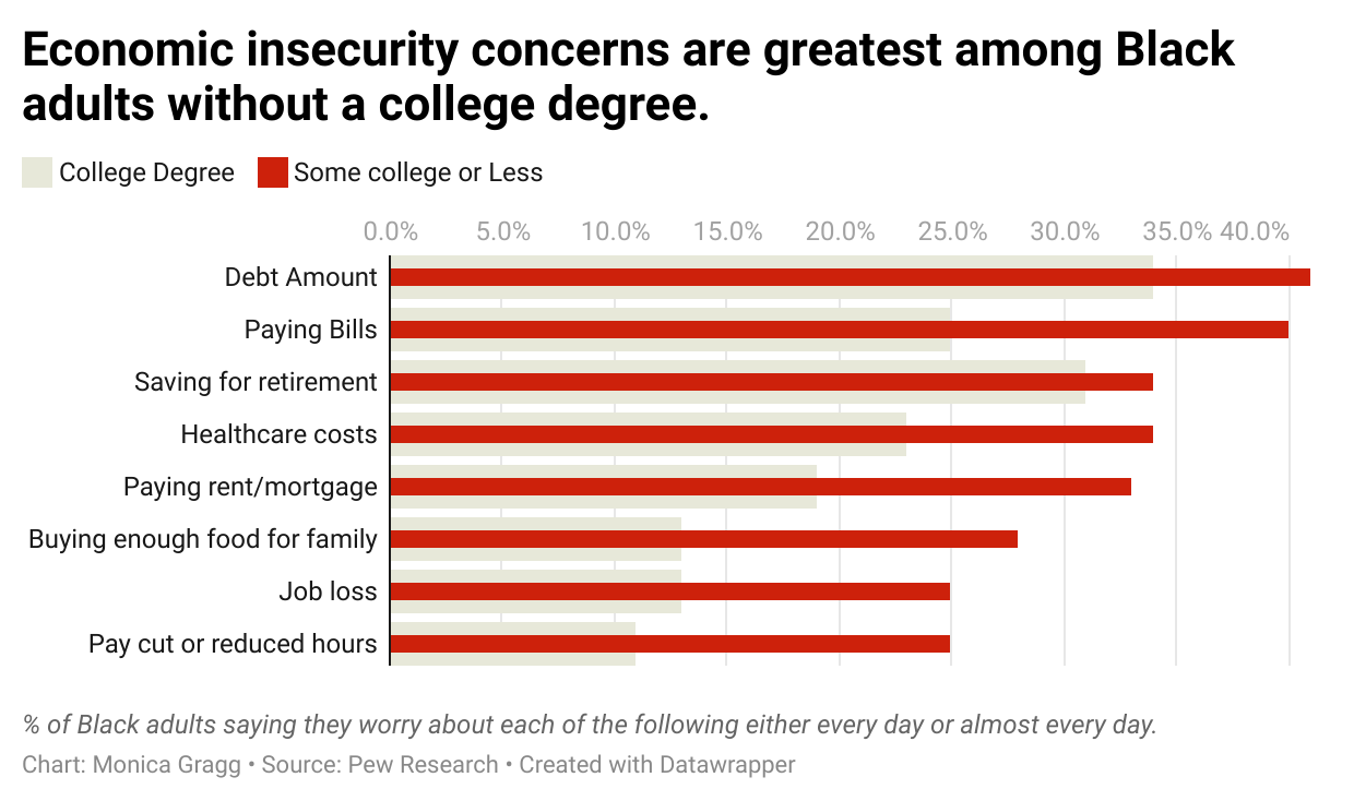
Words bring your data to life—they’re the best way to tell your audience what you want them to understand, and are vitally important if our data stories are going to be at their most effective. Lee’s We’re failing to value our teachers submission made good use of annotations to provide supporting context. Monica paired a strong takeaway title with a striking choice of color (red) to highlight that across the board, African-Americans without a college degree have more economic insecurity concerns than those with a degree.
These examples are just a sampling of the visuals we received this month—big thanks to everyone who shared their work. We encourage you to check out all the submissions in the community. If you haven’t yet participated in a challenge, the time is now to flex your makeover muscles and show us how you’d improve this underwhelming graph in the October 2021 challenge.
Did you miss it? Watch the replay from our recent YouTube livestream where the entire storytelling with data team was together illustrating how to transform underwhelming graphs into compelling data stories. Subscribe to our YouTube channel to never miss out on practical tips and tricks that you can incorporate into your role.


