maps!
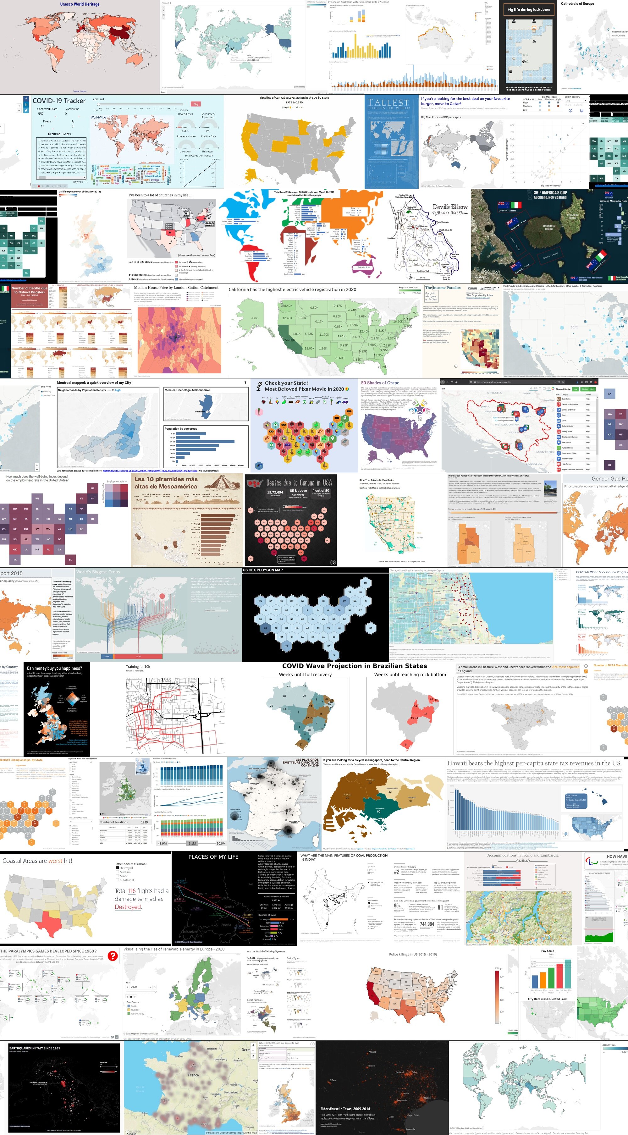
March’s SWDchallenge was a popular one! Fifty-eight people found data that lent itself to visual representation in a map, and shared their creations with the community. As Alex mentioned, the SWD team doesn’t typically encounter many geospatial examples from our custom workshop clients, so this month’s theme was a fun “detour” into a different visual type than our norm.
People used a variety of tools to create their maps; the most popular choice was Tableau, but folks also created in World Map Builder, Illustrator, QGIS, R, and Excel.
Let’s look at some of the overarching use cases from March MAPness.
Maps used for orientation
Many submissions used a map to provide the reader an overview of a subject, or as a tool to help locate something. Kate used Excel, QGIS and Illustrator to highlight where to find certified Neapolitan pizza. Jacob created a map of his family’s property to help visitors on horseback not get lost, and Lisa was inspired by the map-themed live event to visualize European cathedrals in Datawrapper.

Pizza locator by Kate McKerlie
Maps used for categorical comparison
We saw examples of maps being used to show how a discrete variable differs by geography. Maxene created a compelling infographic of writing systems across the world. Zsuzsanna explored the calendar years in which she lived in certain European countries, and Yuki’s hex-tile map of the most beloved Pixar movie by state garnered much community discussion.

Submission by Yuki Lai
Maps used for quantitative comparison
The most popular use for a map was to visualize how a quantitative metric is distributed geographically.
Lance showed us which state has the highest number of NCAA men’s basketball championships, while Laron explored the variation of per-capita state tax revenue. Emre, a first-time SWDchallenge participant, showed how COVID-19 vaccination rates are progressing across the world.

Submission by Emre Can Okten
Popular entries (in terms of datapoints and views) included Sunil’s tutorial on how to create a hex polygon map in Tableau, Diego’s Italian earthquakes, Katy’s money-to-happiness in the UK, Solomon’s natural disaster deaths, and the aforementioned Pixar movie by Yuki.
Big thanks to everyone who experienced March MAPness this month! You can browse all entries in the community, and be sure to participate by leaving comments and datapoints on those you like. We encourage you to take on the current challenge and build your data storytelling muscle as well.
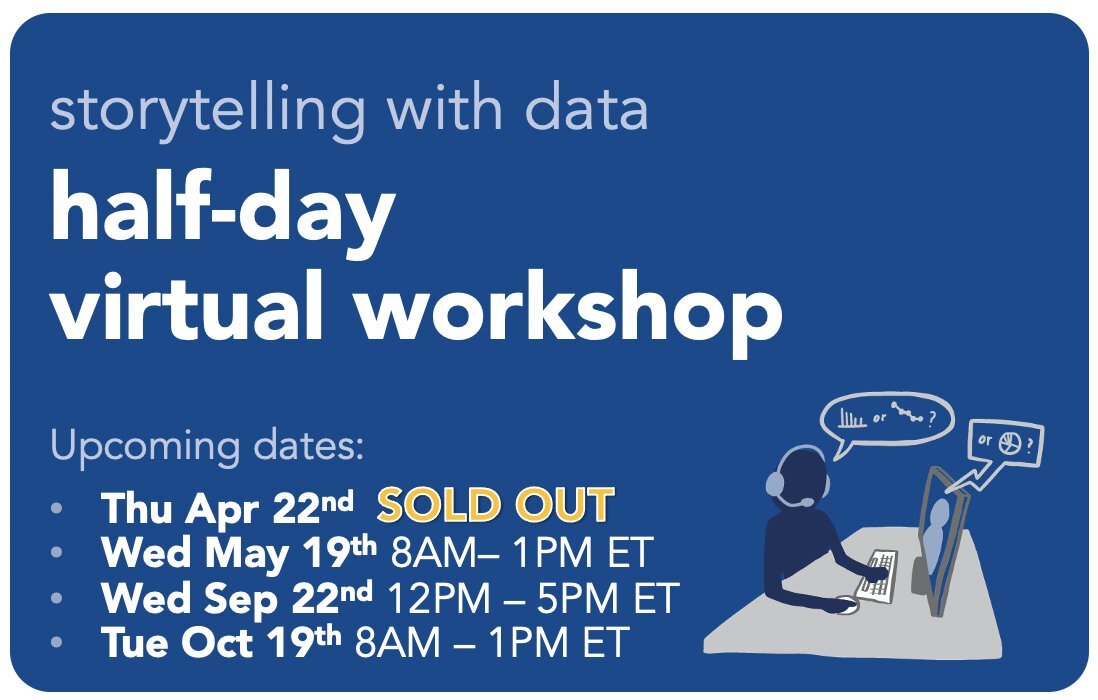
Our 2021 schedule for individual learning is set! Are you responsible for representing data in your day-to-day job? Is it important for you to be able to tell stories through graphs and presentations? If you ever find yourself needing to communicate something to someone using data, sign up for an upcoming half-day virtual workshop and move beyond simply showing data to telling a data-driven story. Learn more.