#SWDchallenge: visualizing cycles
To everything (turn, turn, turn) / There is a season (turn, turn, turn) — The Byrds
We realize that this challenge is kicking off a few days into January, rather than exactly on the 1st. It’s later than we would prefer; but honestly, sometimes time can be a challenge…and this month, time is a challenge for you too!
It is common to see time graphed linearly, on a horizontal left-to-right axis, as though time marched in a single direction forever. But in the way we experience, think about, and discuss time, we often perceive it as cyclical. Each day is one single rotation of the globe (denoted by two rotations of the hour hand around an analog clock); a month is one trip of the moon around the Earth; a year is one trip of the Earth around the sun; and so on. There are also those things that happen annually (e.g., back-to-school season, holiday season, spring cleaning) that remind us not only of the passage of time, but of how every year has a rhythm to it.
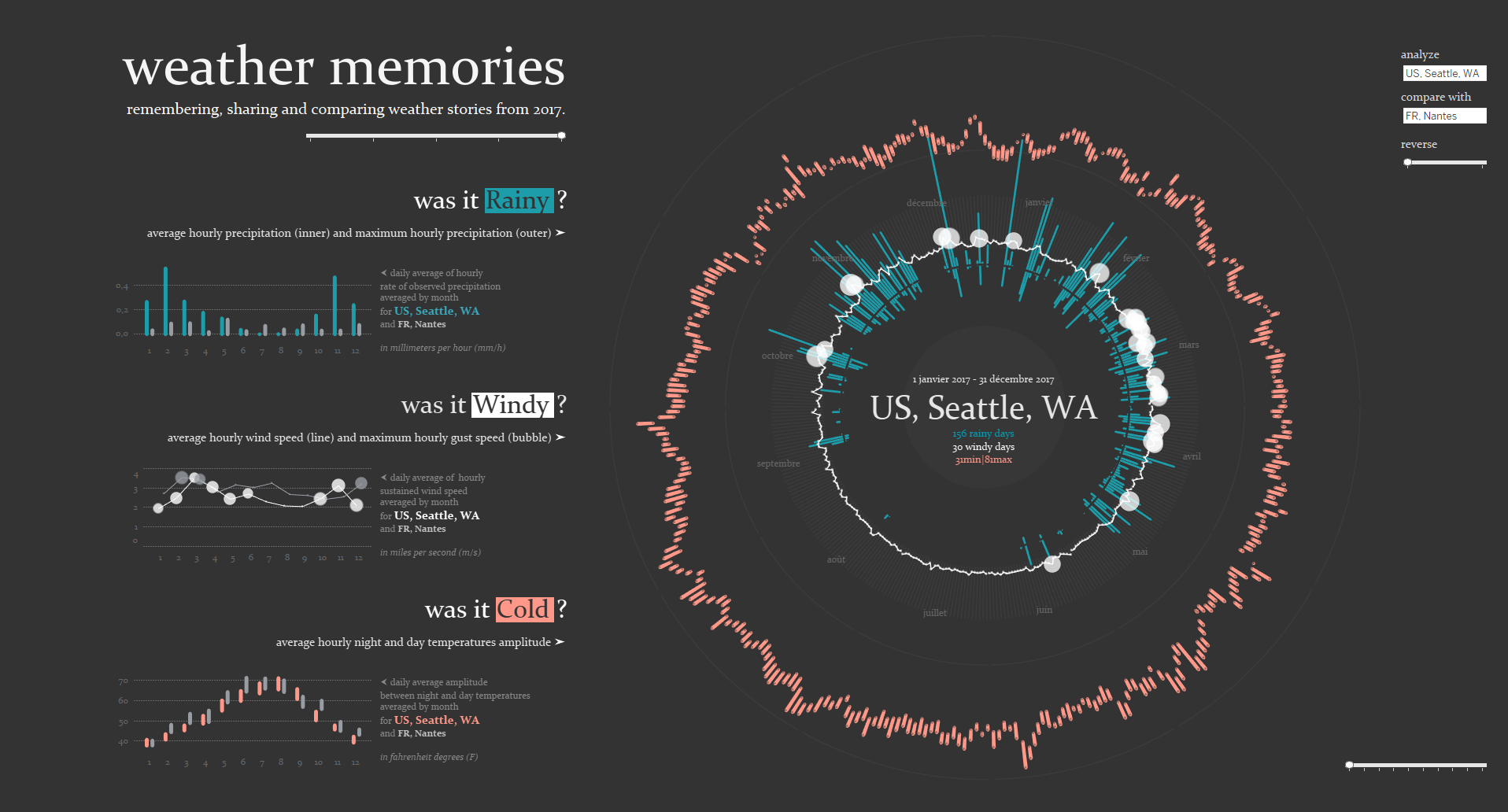
When visualizing things that happen on a cycle, choosing to use a single line graph might not be the most meaningful or effective way to do so. As an alternative, we could explore a radial chart, like this one created by Ludovic Tavernier:
We could also try one of the many varieties of polar area charts, like Florence Nightingale’s famous “Coxcomb” diagram:
When we’re talking about “cyclical” data, it’s possible that a graph called a “cycle plot,” like this one created by Jon Schwabish and inspired by a Kennedy Elliott original, will be a good option to consider:
The challenge
This month, use any data set that shows cyclical information, and visualize it in whatever way you think would be the most effective. Share your creation in the SWD Community by Monday, January 31st at 5PM PT. If there is any specific feedback or input that you would find helpful, include that detail in your commentary.
How will you choose to depict your cyclical data? Are any of the chart types mentioned above the best choice for you, or is there another way that you think will most effectively demonstrate the insights you want to convey? We can’t wait to see what you come up with!


