do you need a data story?
As someone who works at storytelling with data, I'm excited to see the art of storytelling gaining momentum. However, it's crucial to acknowledge a potentially surprising truth: not every dataset, report, or dashboard needs a story.
Understand why you are communicating
To assess when a story would be appropriate and useful, it's helpful first to recognize the primary purpose of your communication. Many dashboards and regular reports exist to monitor critical business metrics, providing a comprehensive overview of performance at a glance. Other interactive tools are meant for exploring key indicators and dimensions, allowing users to identify areas that require further investigation.
In these cases, the data supports exploratory analysis rather than explanatory communication. The intent is not to tell a singular message but to provide a framework for discovering multiple potential insights. Designing for story in these situations could actually limit the tool’s effectiveness at ongoing monitoring and exploration.
Use story to engage and drive action
When you need to explain critical insights to others so they can understand and act on them, a more narrative approach is beneficial. For instance, when you discover valuable insights via your dashboard and need to present them to stakeholders, a data story can help explain the findings, convey the urgency, and inspire action—as the example below demonstrates.
These graphs are used in a university’s quarterly report to communicate where research funds are coming from and how much of it is being spent. The graph and table on the left show quarterly investment by funding source, while the information on the right shows quarterly spending.
Curate a story for the audience
Imagine I am a data analyst for the university, and my team generates this report every quarter. While updating the latest numbers, I notice that funding is increasing at a faster pace than spending. Digging into the category details, I find that the largest gap between funding and spending exists within industry-sponsored research. This is an important insight that I want to make sure university leadership is aware of and acts upon to ensure that research budgets are applied most effectively.
Unfortunately, the existing report format does not highlight this finding clearly enough, if at all. Changing the visual could be a solution, but may be challenging for an audience accustomed to the current format. Instead, I decide to create a summary slide (shown below) to place at the beginning of the latest report. This will help keep the existing format intact, but also highlight the opportunity discovered in the data.
Using the prime real estate of the slide title, I quickly summarize the main point with a pithy takeaway. I make comparing the overall funding and spending trends easier by bringing them into the same line chart (on the left), and creating a separate dot plot to display the current breakdown by category (on the right). I also design the graphs to be more straightforward by eliminating clutter and providing emphasis on the key elements I want my audience to see.
You’ll notice that I’ve increased the amount of text on the slide to make the point clear and explicitly mention the recommended action. To make the dense information more scannable, I create two easily discernible sections with heading text in all capital letters. I also want to ensure that it’s easy to navigate between reading and examining the visuals, so I use similar colors in the written text as I do to emphasize the key data points.
Differentiate live and written reports
Now, imagine I have to present in person to my audience, which provides a unique opportunity to walk them through a story before diving into the data. Since I will be delivering my findings live, the audience’s focus will be on me, so I make my slides more sparse and apply animation to support my talking points. Below is what the final slide progression looks like.
Balance reports and stories
It's important to note that reports and stories aren't mutually exclusive. Rather, they can complement each other quite well. A thoughtfully designed report can serve as the foundation for a data story, providing the critical metrics and visualizations that you can then expand upon in a more narrative format.
The key is to understand your audience and the purpose of your data presentation, then choose the appropriate approach accordingly. Use reporting when you want to provide regular, at-a-glance insights that enable quick decision-making. Turn to storytelling when you need to dive deeper, explain complex findings, or drive specific actions based on your data analysis.
Remember, effective data communication is about more than just showing numbers—it's about making the information meaningful and actionable for your audience. Whether you're using a dashboard report or crafting a data story, always keep your end users in mind and focus on delivering insights that will truly make a difference.
For another example of transitioning from report to data story, watch our exploring and explaining seminar.
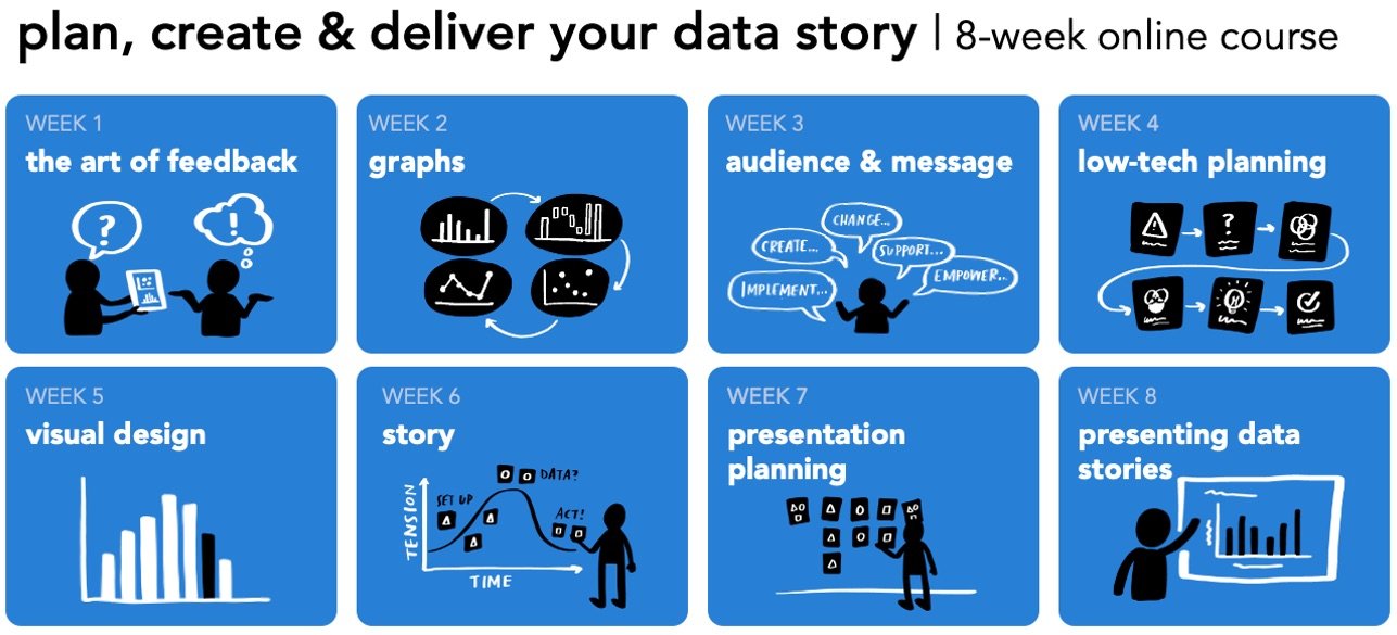
Do you want to learn to create and communicate a powerful data story? Join our upcoming 8-week online course: plan, create, and deliver your data story. Data storytellers Amy and Simon will guide you through the world of storytelling with data, teaching a repeatable process to plan in helpful ways (articulating a clear message and distilling critical content to support it), create effective materials (graphs, slides, and presentations), and communicate it all in a way that gets your audience’s attention, builds your credibility, and drives action. Learn more and register today.


