"animation" with power point
In this post, I discuss leveraging animation in PowerPoint to build the story you want to tell and show what it can look like live in a video with narration.
displaying numbers of different magnitudes
In my workshops, one common question is how to best display numbers of very different magnitudes. In this post, I explore several potential approaches, remaking a less-than-ideal visual from the media.
start with a blank piece of paper
I think this might be one of my best pieces of advice when it comes to communicating effectively with data: start with a blank piece of paper. Check out this post to learn why!
quick tip: left uppermost align title text
I've commented in the past about the important role that text plays in data visualization: in short, it helps to make the information you provide more accessible to your audience. But where should you place your text for it to best play its role? When it comes to chart and axis titles and legend, my recommendation is to left uppermost justify. Check out this post, where I outline my thinking on this topic and illustrate via example.
bar charts must have a zero baseline
This is one rule of data visualization that I see broken too often: when it comes to bar charts, the y-axis must begin at zero. Check out this post, where we'll look at a specific example and discuss why.
crushing on your data viz
I like the idea of "crushing" on one's data viz. I find myself saying this again and again, but plotting data in a graphing program should be the first step in data visualization, not the last. After doing that, in this post I outline the typical steps I find myself going through and questions I routinely ask to get to the final ready-for-consumption visual.
gridlines are gratuitous
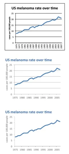
Gridlines typically act as nothing more than clutter, unnecessarily competing for attention with your data. Don't let them. In this post, I discuss gridlines, why they usually aren't necessary and look at an example illustrating the power removing gridlines from your visuals can have.
what makes good data visualization?
Looking at David McCandless' illustration of what makes for effective information design inspired me to articulate my own point of view. In this post, I briefly discuss the importance of affordances, accessibility, and aesthetics in data visualization.
simple vs. sexy
I recently tested out the Circos tool for visualizing matrix data. In this post, I discuss my trial and some general considerations (both pros and cons) when it comes to using "sexy" or novel data visualizations.


