#SWDchallenge: stack it up!
This month, we invite you to explore the power of a stacked graph. Your mission is to find a scenario where a stacked graph shines as a visualization that makes the point of your communication unmistakable.
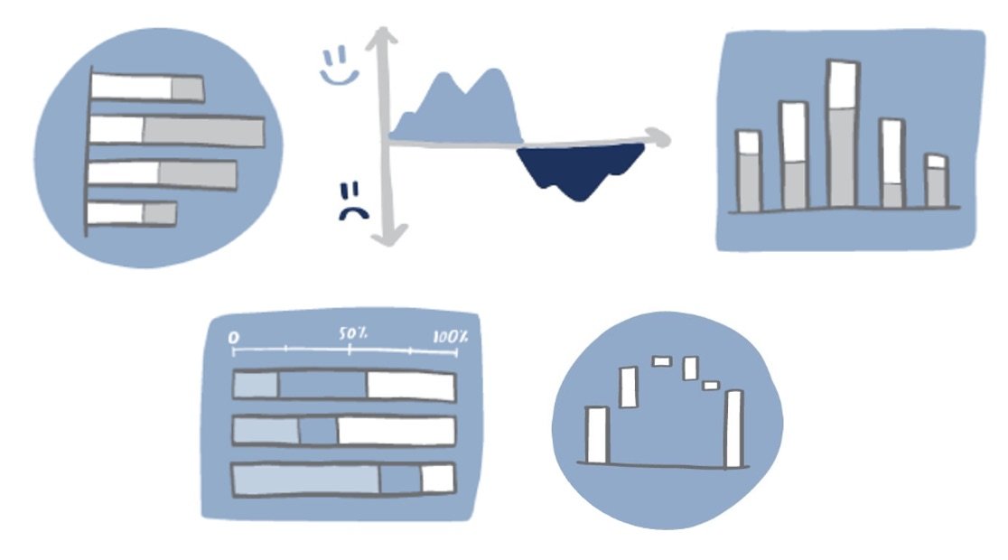
Both stacked bar charts and area graphs (which are essentially stacked line graphs) can represent data in either absolute values or percentages. Each of these graph types has its strengths and challenges, demanding thoughtful design to convey your insights effectively.
Stacked charts can be powerful visuals in a variety of scenarios, like showing opportunity or highlighting a change in relative proportions. They are particularly effective when you need to:
show how individual components contribute to a total,
compare the parts of multiple totals, or
illustrate changes in composition over time.
Regardless of the situation and your choice of stacked graph, you’ll want to apply thoughtful design considerations when using them:
Limit the number of categories. Too many categories can make the chart cluttered and difficult to read. Aim for simplicity.
Be intentional with your sort order. Place the most important category at the baseline to make it easier to compare across groups.
Apply color strategically. Rather than using color simply to make categorical distinctions, employ it to highlight key insights and ensure that your chart is accessible to all viewers.
Use your words. Add annotations and labels to guide your audience through the data and highlight the most important points.
The challenge
Identify a dataset or scenario where a stacked chart would be appropriate, and design one that clearly communicates an intended message. As you build your graph, keep in mind the design considerations mentioned above.
Share your creation in the SWD community by September 30 at 5PM PT. Provide a brief explanation of why you chose a stacked chart and how your design choices help to make the data story clear. If there is any specific feedback or input that you would find helpful, also include that detail in your commentary. Take some time to browse others’ submissions, and share your input via comments and datapoints.
Related resources
In addition to the examples linked above, explore these related articles:
