#SWDchallenge: radial data viz
Readers were challenged to find a dataset that lends itself to being visualized in radial form, which could include chord diagrams, coxcomb charts, polar area diagrams, radar plots, sunbursts, and more. While not all data is visualized effectively in circular form, there are several examples where a radial chart has been successful. We challenged you to explore, create and share your radial practice in the July 2019 #SWDchallenge.
#SWDchallenge: rebrand it!
Branding applied to data storytelling is much more than a specific font, logo or template color. Instead, thoughtfully incorporating aspects of an organization’s brand into the design of a graph can evoke a feeling or perhaps an emotional connection to the message the graph conveys. This month, readers were challenged to re-brand an example graph in a brand style of their choosing.
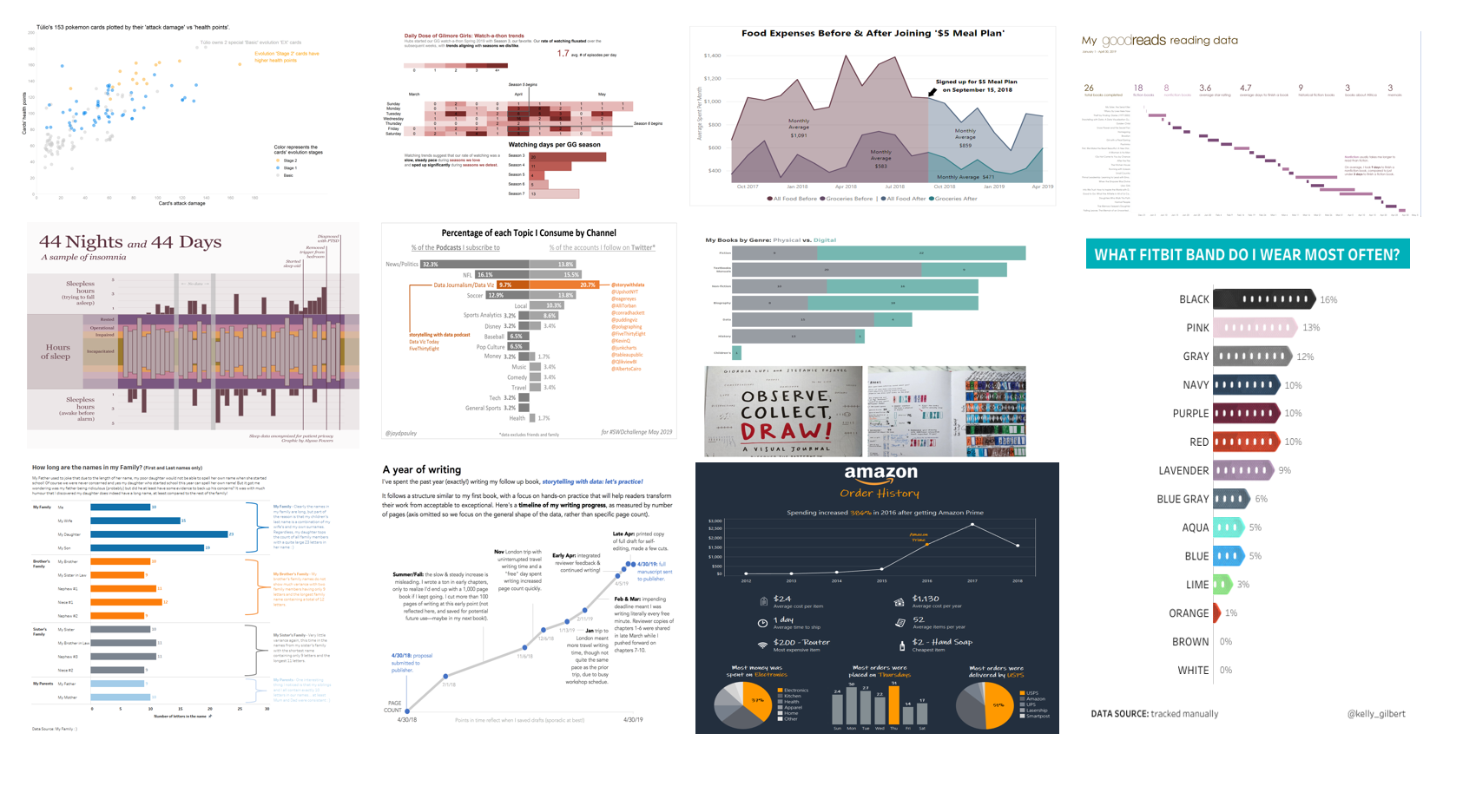
visualizing artisanal data
Fifty-three readers submitted visualizations created from their unique, bespoke datasets. By collecting and analyzing data that we own 100%, it allows us to identify and bring to light elements we know to be undoubtably true. Click the link to see the full post and be inspired to create and visualize your own artisanal data!
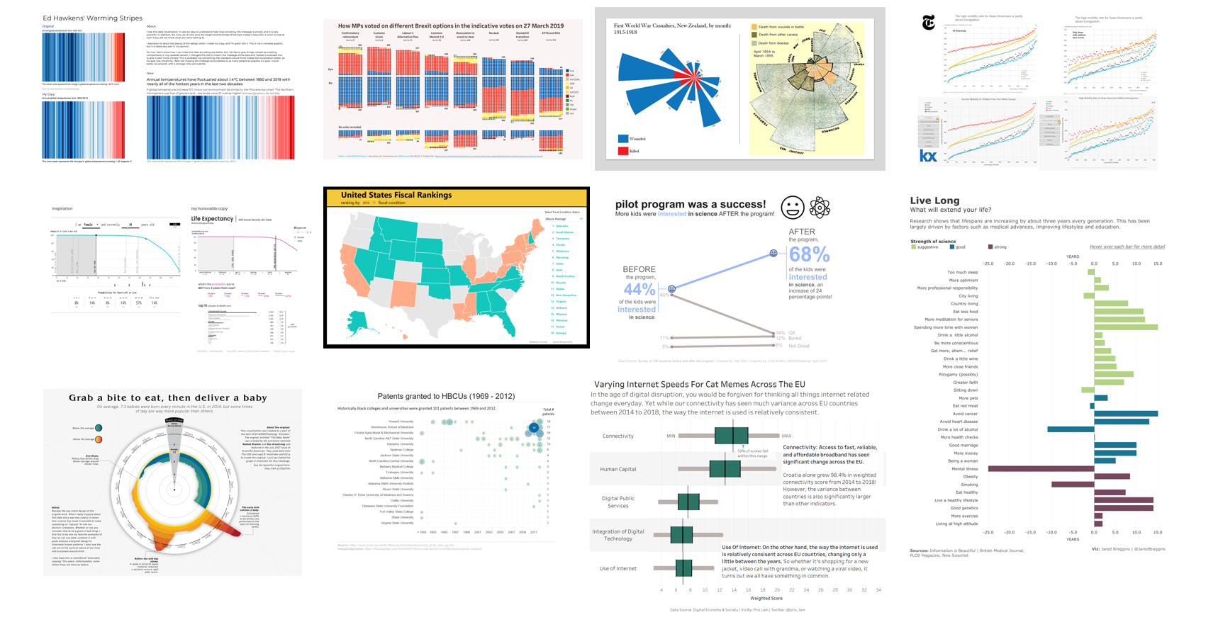
everyone's emulations
Fifty-four readers submitted emulations this month with sources of inspiration ranging from Minard to Nadieh Bremer to FiveThirtyEight and even storytelling with data. Click the link to see the full recap post, including each submission and related commentary.
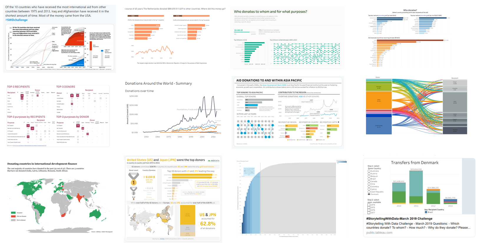
how YOU visualized it
69 different ways to visualize the same data! This underscores that in data visualization there isn’t a single “right” answer. Check out the full post to browse many ways to visualize AidData answering the question, “Who donates?” and more.
#SWDchallenge: visualize THIS data!
There is no single “right” way to graph data. Any data can be visualized multiple ways, and variant views of the data allow us to see different things. This month’s challenge is to see this in practice: we challenged our readers to show us how they’d visualize the same dataset.
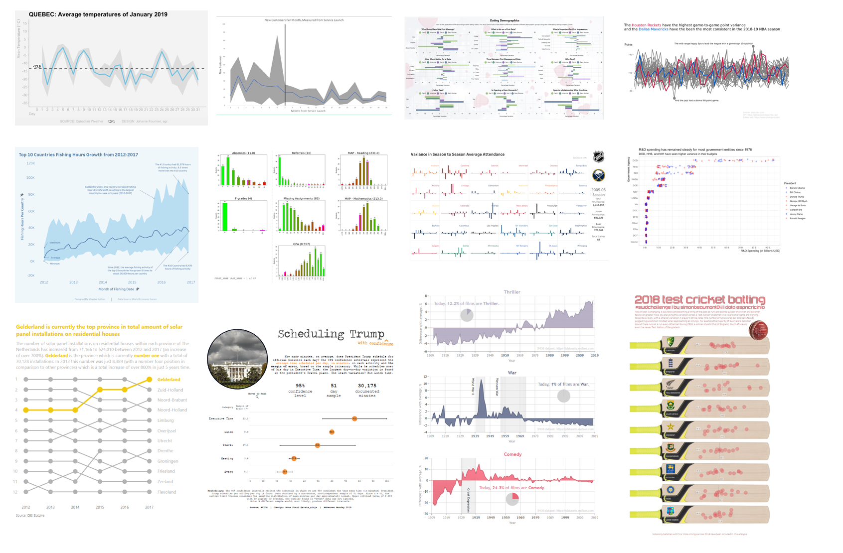
various views of variability
Wow, tons of variation in the ways people chose to display variability! Check out 41 visualizations of variability in data—featuring box plots, histograms, violins, reference bands and more—with topics ranging from weather to sports to love. Click to see the recap post that includes all the submissions.
new year, new tools!
We saw a wide variety of tools used in the first challenge of 2019: from the familiar to new players on the market and from drag & drop GUI solutions to programming languages. Read on to see the wide array of instruments available for visualizing data and learn from others as they attempt these tools for the first time.
September #SWDchallenge recap: MAKEOVER edition
We had a record participation in September with 96 people sharing their makeovers of the dual pie chart visual. Submissions ranged from slopegraphs to bar charts to dot plots and beyond. Click the link below to see the full recap post, including each submission and related commentary.
