an expression of ignorance
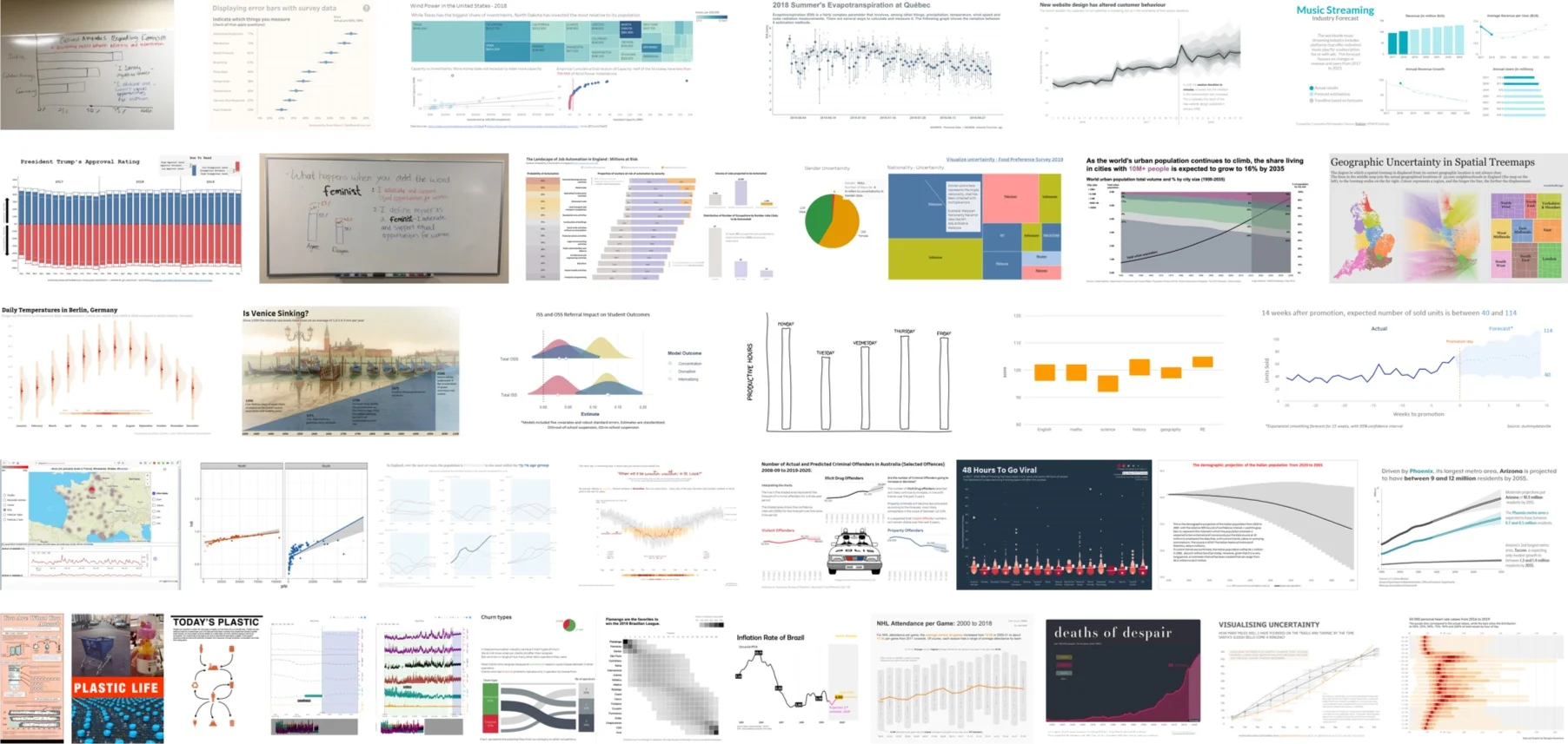
Nearly 40 people responded to our challenge this month, in which we asked participants to identify a situation where it was important to convey uncertainty, and then design a visualization that made that uncertainty clear to the audience. Alberto Cairo, who addresses uncertainty in his upcoming book “How Charts Lie,” provided his thoughts on the challenge, and contributed signed copies of his book for three lucky participants. Our community took a variety of different approaches to the challenge, which makes this month’s gallery an excellent collection of ideas on how to represent uncertainty in different situations.
#SWDchallenge: visualize uncertainty
People like things that are concrete and certain: and so, when we plot our data in a solid point, line, or bar on a graph, it’s easy for people to consider it “truth.” There are times when that is appropriate, and times when it definitely isn’t. Many times, there is uncertainty that we ought to convey in order to provide a more complete picture to the audience. This month’s challenge requires you to identify a scenario and data where there is inherent uncertainty, and design a visualization that makes that clear.

you can take it with you
This month, we offered you an #SWDchallenge created by author, speaker, and technical evangelist Andy Cotgreave, and centered around the way more and more of us are consuming our information: via our mobile devices. While large-format desktop monitors likely won’t be disappearing anytime soon, we must consider mobile devices as a common form factor for all types of personal and professional communications—including charts. More than 20 people took on the task of identifying a visualization they originally created for a desktop viewing experience, and re-factoring it to be useful on a mobile device.

#SWDchallenge: redesigning for mobile
Most of us are lucky to have large screens or multiple monitors to design on. The temptation to pack loads of information into a display is difficult to resist. But resist we must: mobile is mandatory. As such, your challenge this month, from guest contributor Andy Cotgreave, is to find a chart or dashboard you originally designed to be consumed on a monitor, and redesign it for mobile.

recapping radials
Over fifty readers submitted their radial charts with topics ranging from music to exercise to climate change and much, much more! Participants were largely united in their evaluation of this challenge: finding a dataset that lends itself to a circular view is hard! Click the full post for all examples submitted and more discussion on data visualization vs data art and the feedback process to determine your visual is working as you intended.
#SWDchallenge: radial data viz
Readers were challenged to find a dataset that lends itself to being visualized in radial form, which could include chord diagrams, coxcomb charts, polar area diagrams, radar plots, sunbursts, and more. While not all data is visualized effectively in circular form, there are several examples where a radial chart has been successful. We challenged you to explore, create and share your radial practice in the July 2019 #SWDchallenge.
designing in style
This month’s challenge was to re-brand a storytelling with data style graph in the style of your choosing. Fifty-eight readers submitted their re-designs with everything from McDonald’s to Vogue to Harry Potter and much, much more! Click to see the entire post and how effective brand can be when it’s thoughtfully incorporated into data storytelling.
#SWDchallenge: rebrand it!
Branding applied to data storytelling is much more than a specific font, logo or template color. Instead, thoughtfully incorporating aspects of an organization’s brand into the design of a graph can evoke a feeling or perhaps an emotional connection to the message the graph conveys. This month, readers were challenged to re-brand an example graph in a brand style of their choosing.